Brush Assets - Feedback

The rest of the interface should follow for the exact same reasons.

:diamonds: The active tool settings should not be in the properties editor. That’s not what that editor is for.
:diamonds: The active tool settings should not be displayed in three different places at once. That is redundant/wasteful.
:diamonds: The active tool settings should not have any settings, that aren’t active tool related. For example, notice how the SELECT BOX active tool has settings for transform and workspace:

:diamonds: The active tool settings should not be far away from the tool palette to reduce mouse travel and communicate the relation between the tool and the settings for that tool.

2 Likes

As for the visualization of brushes in the interface. I think there are two options, one is more costly to implement, the second is easier to realize.

1.To each brush to make a video animation as it passes over the sphere (pop-up tooltip in the form of a miniature window).

2. A GIF consisting of two pictures: the initial and final phase. I think this is the best option.
(when the cursor is placed over a brush, a popup window appears after 3 seconds showing the brush in two slides, but it only works if the show preview is checked in the menu. Professionals can turn off this checkbox it will not annoy them, and beginners can learn the mechanics of each brush)

This is a quick sketch of what I’m talking about. I can take this job and realize this, for each brush, only I need psd with original pictures icons.

3 Likes

so this is not related to the asset shelf per se. I do agree in this case!

Can you imagine Blender binary size if it came with videos or gifs for tooltips? :smiley:

4 Likes

Although it goes off topic, in my opinion this proposal groups and distributes the interface elements in a coherent way, I think it leaves everything where it should be, both with the attributes vertically or horizontally. Anyone who opened Blender for the first time could relate all the elements. Every time I look at it it convinces me more.

If you take the resolution of 256х256 (that’s what I meant), it’s 4-4.5 megabytes for 90 brushes. ZB could not do this with a program weight of several GB (about 2GB). :smile:

1 Like

Little update, I’ve mostly been focusing on fixes, not new features or design changes so far.

Now fixed:

  • Quick tooltips & missing asset name in tooltip
  • Assign/remove/change shortcut missing from context menu (or crashing in popup)
  • Add to Quick Favorites missing from context menu
  • Active brush highlight broken on Windows
  • “Reset to Default” using wrong value for asset shelf preview size (reported here)
  • Duplicating brush doesn’t activate it properly

We’ve found some issues with grease pencil v3 and the brush assets changes. Some are addressed already but a bit more work is needed still. We’re considering to turn the fill brush into a tool and bringing back an eraser tool (from which you can select any eraser brush).

13 Likes

A couple of observations, mainly from the Grease Pencil perspective:

Grease Pencil: Great for Draw brushes, but material settings not yet included
The system is great for creating and organizing Draw brushes, a lovely improvement compared to the old way.
Edit: Sorry, I was wrong about the material settings not supported. It’s working perfectly. It was just me pushing the wrong pin button…
The assets don’t cover material settings pinned to the brush though, like line type (line, dot, squares) and texture image + settings. These settings heavily define the outcome of the brush.
So at the moment the feature is half usable, I would say, because textured brushes are not supported. There is still need for the ‘Load Brushes’ button we have in 4.2 LTS and before, to import textured brushes. Would be nice of course when that was covered by the brush asset system.

Grease Pencil: Big UI change, hardly any profit
No doubt this is a big UI change: about 50% of the Grease Pencil tools disappear from the tool bar and move to the shelf at the bottom. In the shelf they have a different order. So there goes a large portion of the muscle memory of the entire Grease Pencil user base…
The sad thing is: apart from the draw brushes, the system has virtually no added value for GP users. Where 3D mesh brushes have tons of settings, GP tools work mainly with radius and strength (and some very contextual settings you would never create an asset for). The vast majority of GP users will just use the Essentials and never create an brush asset, because there is no use case for that.
So for GP the deal isn’t that sweet: the need to adept to large UI changes, but no benefits in return.

UI: The bottom position of the shelf is not ideal
From a design point of view, I would say the bottom position of the shelf is not the best choice. Having tools at the bottom and tool settings at the top: that will mean a lot of extra miles for eyes and hand.
The shelf contains tools, so a panel on the left, near the tool bar, would make much more sense to me.

5 Likes

About UI changes, I’m assuming you’re talking about sculpt and weight paint modes in second point when you’re saying they only change radius and strength. I agree that it doesn’t make much sense to customize those brushes at the moment, but I’ll say keeping shelf for those are valuable for three reasons:

  1. GP might receive sculpt brushes and weight paint tools in the future that are more customizable, and if they’re not saveable as assets because they’re old tools will put as back in the situation from which we’re trying to escape now.
  2. I think while its big muscle memory change now, its better to just power through it once and get used to new system, because if you have half of tools which are in asset shelf and other half which are in toolbar your muscle momery gets screwed hard. You’ll have to remember where to look for and position your hand depending on mode you’re in and tool you have selected. It’s gonna be nightmare. Its better to have consistency across modes.
  3. Asset shelf isn’t mandatory (and maybe can even be disabled in startup file). In old system brushes could be accessed in two places: toolbar, left to tool settings, and in properties editor or sidebar of 3D viewport with big selector. Both of those places are still working for new assets. So if somebody doesn’t want to travel up and down with cursor to change between brushes and their settings, they can still use top and left places they’re used to and have muscle memory for.

I think brush names are an absolute necessary. Most users myself included aren’t going to make customs thumbnails every time we make a custom brush or slightly different variation of an existing one. That plus when people start accruing large brush libraries trying to find the right brush based on pictures alone will be a frustrating and time consuming process. Having the name only show up in the tool tip only adds to the amount of time it takes to find the brush you’re looking since you have to hover over and wait for it to pop up for each brush. Sculpting should be fast and fluid process and having to hunt down the right brush every time u wanna switch only gets in the way of that.

2 Likes

Dalai Felinto asked me to give some feedback on the brush assets:


This works great:

Hotkeys
Being able to set hotkey for activating brush assets works great! This works better than before now that each brush is a separate asset.

Asset shelf panel popup
I really like the asset shelf panel popup (shift + space). Brush assets are now way better organized compared to other sculpting softwares.


Could be improved

Option to put UI vertically on left side of 3d view
It could be worth making an option to put the brush asset UI on the left side and be able to make it wider, so that brush names can be read easier. This would help the user to identify the brushes more easily.

Display unsaved brush asset
If the brush asset is edited without being updated this could be communicated to the user by a simple asterisk (*) after the menu item “Update asset”. This would be very similair to how unsaved images are marked with an asterisk
Clipboard - 3 augusti 2024 kl. 17_52

Display asset shelf panel hotkey
Standard hotkey for bringing up the asset shelf panel does not show when hovering over the asset shelf panel “button”. Displaying the hotkey could increase discoverability
thumb-Clipboard - 3 augusti 2024 kl. 17_54

More brush presets
Adding more presets for cloth brushes and vector displacement
We could use brushes from the demo files Demo Files — blender.org
Worth noting that icons needs to be created for those brush assets

Screen grab active object for brush icon
Add an option to render the current object in order to quickly create an icon for a brush. Using the same render functionality that assets in the asset browser uses would work great.

10 Likes

I disagree with that one. Assets are meant to be used just as regular brushes. I create (lets say) Cavity brush once, and in each of my projects I adjust settings and work with them. If every time I adjust settings it showed asterix not only would it be annoying, but might confuse some users, as they might think they need to update asset otherwise they’ll be lost when file is closed (because that’s what happens with images) and accidentally overwrite their assets. Updating asset isn’t something user should be doing often anyway.

On the way from Julien with their thumbnails.

That’s easily doable (famous last words) with add-on tbh and probably better to be that (like VDM Baker), we can develop something and put in on extensions platform.

@JulienKaspar was working on the Call for Content: Default Brushes , he has about a hundred presets there I suppose you could pick 60-70, better organization with more categories and some icons are needed there too.

When you change brush settings and save the file, the following day, when you start Blender and reopen the file, those settings are gone.

That is unfortunate. Blender should be smart enough to always remember settings.

This makes the ‘Essentials’ brushes also very dominant. These essentials are immutable for users, as far as I know, so now we have defaults the user can’t change. That’s unfortunate too.

The only way to get own settings, is duplicating Essentials brushes one by one, adding them that way to the User asset collection. That’s tedious. Or am I missing something?
Perhaps a batch command to duplicate all essential brushes to the user collection would come in handy, then.

2 Likes

If its same file and brush settings weren’t saved and restored on load that’s a bug

1 Like

I’m really happy with the general workflow, it’s so much faster to select brushes. Thanks to the devs for all the work that went into this and the love that sculpt mode is getting! Here is some feedback of mine.

I’ve personally changed the shortcut from Shift+Space to just B, as I think it’s much faster to use, requires a single finger and it’s conveniently located at the bottom of my keyboard, but that’s my preference. Some things that I deem more important:

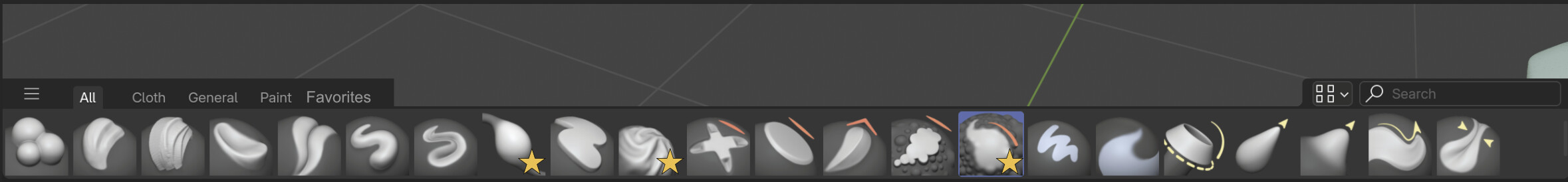
Ability to set favorite brushes

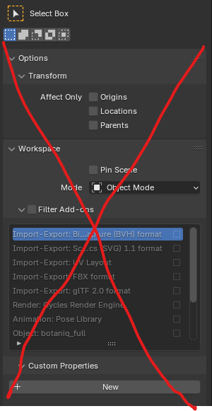
It would be very handy if I could mark as favorite a brush, and then if I could have a tab just for my favorite brushes. I have made a very quick mockup above. I’ve added a “Favorites” tab to the shelf and stars to mark the brushes I’ve set as favorite. I find myself using mostly always the same brushes and it could be handy to have a way to filter them in the bottom shelf. I understand there is the option of using Quick Favorites, but it’s textual and lives in a separate menu. I could also create duplicate assets, but if the brush is exactly the same, I’d rather not duplicate it.

Accelerators in the asset shelf popover

In Blender, menus tend to have accelerators, which is to say, one letter per menu item that has an underscore so that it indicates that by pressing that letter you’re going to select that option. Example:

image

See: G, D, S, etc.

Could we have the same for the popover? In this way, I could select a brush with one key press.

Display brush names on multiple lines

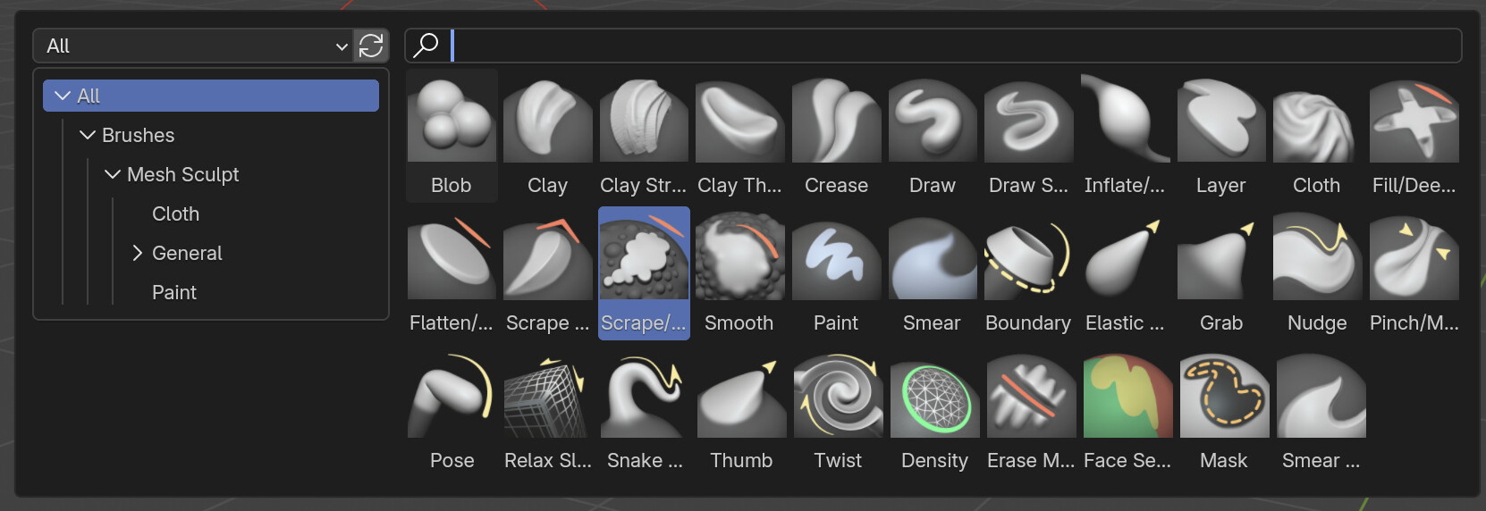
In the popover, the names of brushes are cut when they don’t fit:

see: Flatten/…, Scrape/… Elastic…, etc.
Couldn’t it be possible to have two lines available for the label, so that each name is shown completely? I think that if a user creates variants of the same brush, for example, Scrape 1, Scrape 2, etc., labels could be cut, which could be annoying.

10 Likes

Finally been testing the brush assets a bit and expanding my library with the new features. Here are some notes of issues I found. (Not sure if there’s overlap with already mentioned issues):

  • Sorting of the brushes needs to be improved a bit more

    1. Currently the brushes are sorted first by catalog (alphabetically) and then by brush name (alphabetically). I realized there’s a third sorting missing here:
      First and foremost it should sort by catalog hierarchy.
      This way related brushes are next to each other. This issue is very noticeable on big libraries with lots of nested catalogs.
    2. Eventually the user should get get control over the order.
      Manual catalog (maybe even brush) ordering instead of purely alphabetical is more and more important on big libraries.
  • Scrolling with MMB or a pen is a big issue on the asset shelf. I don’t think it’s just about fixing the buggines and sensitivity. Some people suggest horizontal scrolling, which could be more intuitive. But perhaps smooth vertical scrolling will be best. Only snap the rows once scrolling stops.

  • There’s no visual feedback yet on which brush settings are edited and deviate from the saved asset. This is very important for the release. You need to know which assets have been edited and need to be saved, and why.

    • There are also settings that do not need to be saved, like the brush thumbnail. That should also be communicated somewhere or get visual feedback.
  • We need support to use the same name for multiple brushes. Maybe by splitting each brush asset into its own .blend file? This is only really a problem when having the same brushes across multiple painting modes or multiple object types. Right now the essentials always have the suffix “Vertex”, “Texture”, “Weight” and “Stroke” to fix this. Not ideal.

  • It’s not possible to assign User Library brushes to another Catalog. Needs to be fixed for the release.

  • When creating a brush it’s not possible to create a new Catalog at the same time. Related issue is that you cannot assign it to an existing Catalog of another library (Like Essentials) to create that Catalog for the Library of the new brush (common for new brushes in the User Library).

  • You cannot update Essentials brushes. We mentioned this as a very important ToDo when we were still working on the drafting/override implementation of brush assets. This is a vital ToDo that we can’t miss for the release. If this is not implemented, users will be stuck to Essentials brushes they won’t use, and maybe even duplicate all Essentials brushes to their User Library to be able to edit them.

14 Likes

I guess obvious question, but what happens if a user does update/change an essential brush and then later installs a new version of Blender? Are they overridden, duplicated, left untouched.
What if some essential brushes are improved/enhanced in a later release, do you not get the better brushes or once shipped will essential brushes be locked in stone forever, never be changed except by a user on their local install.

1 Like

We were working on a feature to save any changes to Essential brushes in your preferences. So any changes are not actually saved on the brush asset itself. That way you can ‘Reset’ the essentials brush to the original any time.
Basically similarly to how it is in older Blender releases. Any brush can be reset to the original brush that shipped with Blender, which is common to do when a new release updated the brush.

But in this case I’d imagine that only specifically the settings that the user changed will not update in new releases, unless the user reverts the brush to the original asset.

1 Like

I would find this bit annoying tbh. Your point makes sense from asset creators POV, but in regular everyday use of brushes if everytime I change something like strength field becomes different color it would be little distracting.