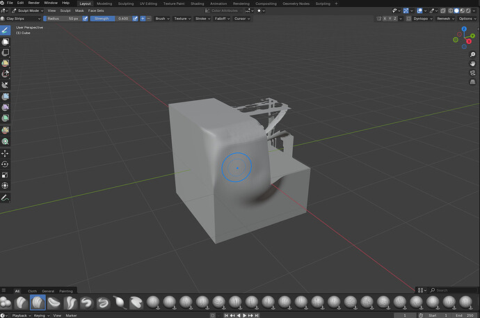
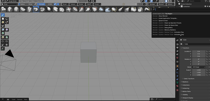
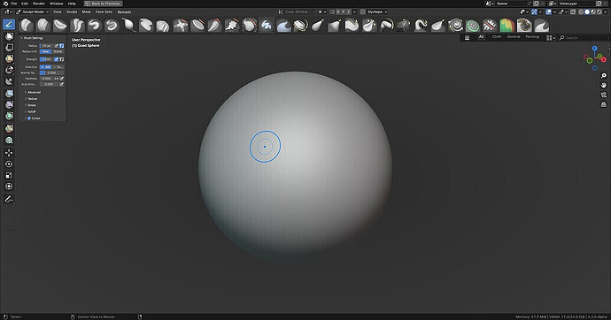
Its fixed. But there is strange viewport bug in that build, when you move your viewport camera and release it makes viewport background lighter for a split second. Its not there in today’s build.
I don’t know if I can agree with that argument.
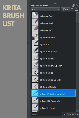
I’m not sure if I am allowed to discuss or share photos of other programs here, but I can say that in other 3D programs, one is specifically designed for “Painting” and the other is specifically designed for Sculpting. Both present brushes similarly, and one of them even has a Shelf for brushes.
Both of them have options to represent hundreds of brushes, and both of them have names; the names don’t take up a lot of space and don’t take space away from the previews.
I remember having a similar conversation with you about another area of blender (I don’t remember which one), I suggested using just an icon (without a name), and you linked me to a research paper about how icons can be misunderstood from person to person, and the best way is to use names with icons. This really opened my eyes about the subject and made me change my mind completely.
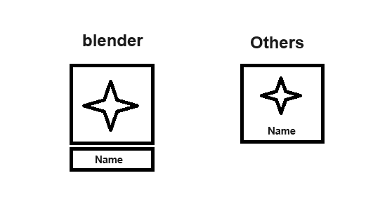
Also, I notice that in both programs, the name and the icon are in the same bounding box, as opposed to Blender, where the icon is in one bounding box and
the name is in another (like in the image below). I think that’s how they save space.
Shortcut for cycling through brushes (through tag, or list of brushes in operator, …)~ (decided not to add)
Does this mean that there will be no way to assign shortcuts to brushes? If so then what’s the reason behind such decision?
I would say that ability to quickly select brushes using keyboard shortcuts is a must-have feature for any serious sculpting app.
First impressions for me are rather wonky.
Brushes could show tooltips about their name instead of “Activate Brush Asset”
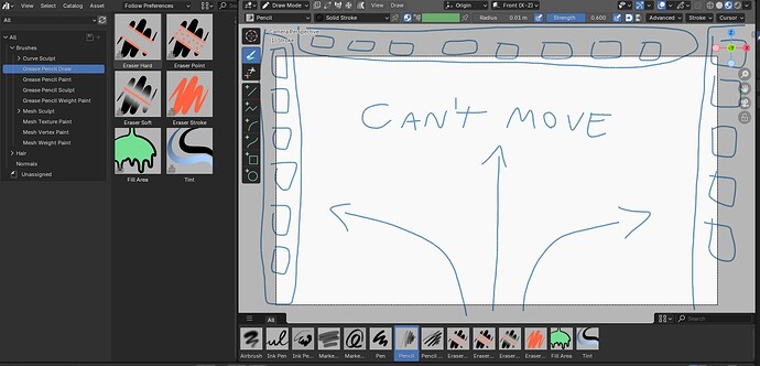
Other big thing is that you cannot move the asset browser tab anywhere fluently and you are stuck having it down.
If you create a new window and select asset browser, it doesn’t display the same brushes.
Also it would be cool to be able to quick favorite brushes
That’s all I could think right now, cheers!
In some cases it’s going to be hard to distinguish based on just thumbnails, for example smooth/strong smooth/directional smooth. Tooltips is better than nothing but not always ideal, depending on ones preference I guess.
Then again, I don’t think most people will have 100s of brushes active. The 3 mentioned on the above example would be quite common for a lot of people though.
First - congrats for finally landing the project.
My first impression is quite positive. Being able to quickly create a custom brush version, change it, save it or remove it is fantastic. Thew decision of ditching ‘draft’ step was in my opinion a good one too for the scope of the current Brush Asset feature. This could be revised with Node Brushes if they were ever planned or developed.
The two points after very quick and brief test:
-
As was already said - brush names in the tooltips, in my opinion this is essential for learning each brush, especially for the people that are starting to learn how to use Blender.
-
Don’t know if this is an omission or made on purpose -
Mesh Sculptcategory in my opinion should not include Utilities and Paint tools like it is in the screenshot:
It would be good to visually align the positions of the balls on the pictures, where possible.
Including as already posted here the ability to star and add the brushes you want to favorite.
I join the comment about horizontal scrolling.
Thank you!
If anyone wants to help with this, the file for the thumbnails is in blender-assets/essentials_brushes.blend at main - blender-assets - Blender Projects
Then I need more psd file, icon sources, and I’ll fix everything! It’s gonna be awesome!
I hope the horizontal layout at the bottom will not be permanent. This is similar to Mudbox, but even when I used Mudbox for about a year, I used it by switching to a vertical layout. It is worth considering why most tools with many brush icons predominantly use a vertical layout. I sincerely hope that vertical layout support will be provided in the future.
Can you make a proper image of the new design?
This is very messy, and I can’t really understand your full vision.
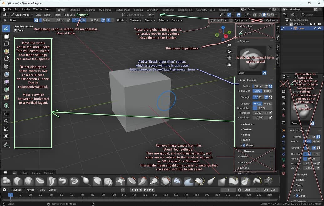
What about the brush setting panel that you suggested moving to the left?
Where is it in the new design?
(Replying to @Kate and to @pablovazquez):
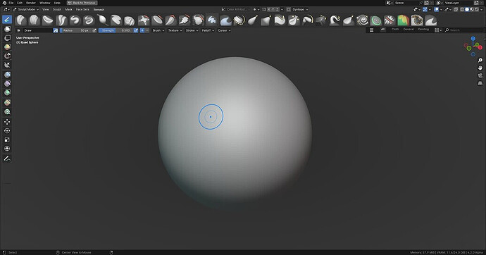
Maybe it should be considered to always show as the brush-thumbnail a centered whole sphere with the effect of the brush applied to it. (zBrush does it this way – this seems to work best, as it is easier to perceive the effect of something (the brush) on something else (the sphere) when looking at the form as a whole. (I would also propose to leave out anything explainatory like arrows, coloring, etc., as this only seems to be distracting for the user.)
In that image, they are moved to the left, just that they are displayed horizontally.
If these brush settings are displayed horizontally, it is redundant to also show them vertically and visa-versa.
Right click on this panel, and you can switch between horizontal or vertical display.
Here’s how it would look like displayed vertically (Sorry for the low quality image, copy of a copy from the forum)
not sure about this one since it is inconsistent with the rest of the interface!
