Brother, if it’s inconvenient for you to use the keyboard shortcuts, it wouldn’t be bad for a method more convenient for you to appear. BUT! it is important that this method does not supplant the method that is less convenient for you, which is less obvious, but more convenient for other users (who, apparently, are in the absolute minority and tend to zero), who do not want to spend time on excess for them operations.
Nobody have talked about that, we were talking about tabs and you, I don’t know why, speak about switch areas with shorcuts.
I think that you must to reconsider how you talk, because you dirt the converstion easily. Use a translator like deepl if you have doubts.
2 Likes
Yes. I’m sorry, you’re right, my English is too bad to conduct such conversations.
Try to use deepl.com translator, it’s really good to avoid this type of problems that cause arguments.
But anyway I recommend you try not to “overwhelm” the conversations. Do not try to answer all the messages one by one and when you do try to be concise and clear.
It is a forum, and conversations should tend to be comfortable, especially to read, even if they think differently. If not, people tend to ignore the messages and get “bored”.
1 Like
Am I misunderstanding how the tool is supposed to be used or are dropdown menues not scrollable without a mousewheel?
I am trying to scroll through my materials list for example and I always have to either reach for the keyboard or the mouse wheel. The arrows on top and bottom should scroll the list when the cursor gets close, I think.
3 Likes
A couple of months someone asked for two Tool Shelfes mockup. I tried hard. You just press “t” once to appear old good toolshelf, second t pressing make appear the new Tool Shelf, third “t” pressing makes the old good tool shelf disappear, fourth “t” pressing makes the new Troll Shelf disappear too.
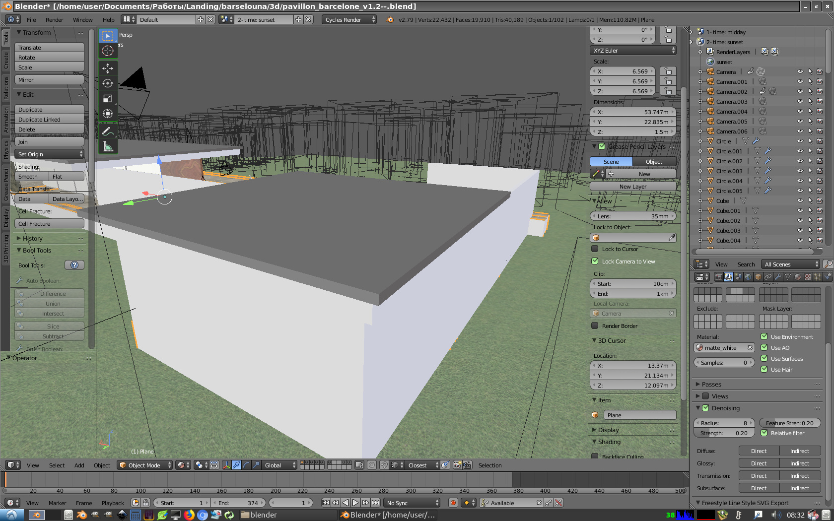
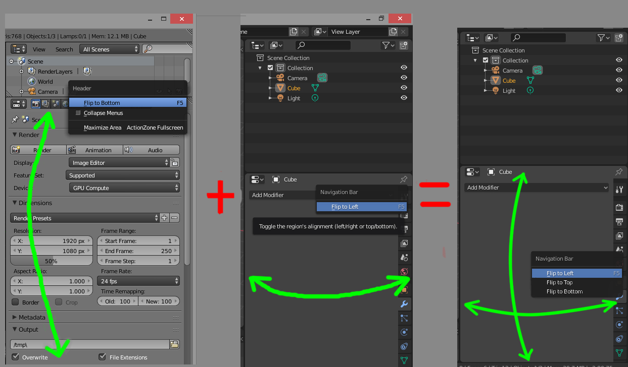
In blender 2.79 Header can Flip to Bottom/Top, blender 2.8 - Flip to Left/Right. Why not combine options? Users have different workspace settings and monitor aspect ratio. Therefore, all these options are needed.
10 Likes
A suggestion:
I’d love it if a newly created collection would automatically contain objects that are selected when creating the collection. This would skip the now necessary extra actions of moving the objects to the new collection.
Thanks!
6 Likes
Fixed the file dialog (mockup). It’s more convenient to have the filename and the buttons in the upper part. That way there will be much less mouse dragging. The search bar next to the filename is very logical as well. And bring back “…” (double dot) - this is the fastest way to go up the directory and you feel that there is a place you can back off ![]()
9 Likes
if you structure this code as optional in the preferences and submit a patch to be reviewed … i think you would do a great favor for legacy users …
personally, used to having everything at hand at the top, looking for a file, renaming it east and then saving it or uploading it …
it’s not serious, but I find a feeling of annoyance about having to look down to name a file and save it …
This is not a code unfortunately. It’s just a mockup for the devs.
ok, I thought you made some code changes …
I really do not like this design because it goes against expected conventions. The file name should be at the bottom, not the top, otherwise it becomes confusing about what that second bar is for. The flow goes “where am I? what do I want to pick? this is what I picked” when reading from top to bottom (directory path bar, file listings, selected file name). Having both the directory path and selected file name bars at the top is very weird and it breaks the logical flow and contention.
Also, search bars are always integrated with URL or directory path bars, never with a file name bar. That adds further confusion because it is very unexpected.
It also just looks ugly having two misaligned bar stacks right on top of each other.
2 Likes
If the name line is at the bottom, it takes too much effort to percept the full file name + path.
That’s /why /all /those /conventions /was
inconvenient.
9 Likes
I dig that ! I do miss the double dot as well, and having the address field at the top and the file name field at the bottom is completely weird…
Hello,
I know that the devs have decided to make the toolbar part of the current editor’s view (e.g. 3D viewport, UV editor, image editor). In the early versions of Blender 2.8 (alpha), the toolbar was on top of all the opened editors’ views and unique (i.e. displayed once).
I understand that it must have been a difficult decision to make; however, I wanted to give my piece of feedback as a user: I wish I could have a toolbar as in the alpha versions.
Here is an example of annoyance caused by the current toolbar being in the editors’ view; that is in the Texture paint layout:
I can’t see all the options of my tool at once, I need to use the middle click to slide and navigate in the toolbar. Plus as it is displayed twice; I sometimes use the one on the right and sometimes the one of the left (not really a problem, but that’s a bit silly ^^).
You may tell me that I could use the N panel. Which is nice! but in the N panel, I do not find the color eyedropper to take a color from the screen ![]() So at the end of the day, I am working with two toolbars and the tool tab of the N panel opened. That makes the UI a bit redundant and maybe not really elegant…
So at the end of the day, I am working with two toolbars and the tool tab of the N panel opened. That makes the UI a bit redundant and maybe not really elegant…
Here is my suggestion
First, if not already, the tool tab of the N panel and the toolbar could be unified so that they are simply two different views of the same data/object. The first view displays the data as a top horizontal bar, and the second view displays the data as a side vertical bar.
Second, the toolbar whatever in horizontal or vertical view would be outside the editors’ views, it would be displayed only once on the top or on the side. It would be global and unique…
More flexible suggestion
So now, maybe some users like the fact that they can have their toolbar displayed several times on screen. The reason being the distance of travel of the mouse and/or multi monitor set-up.
We can satisfy the users who want one toolbar, vertical or horizontal, and the users who want several toolbars by making the toolbar an editor as much as the 3D viewport or Image Editor are. We could name it the Tool Editor! You would be able to split your Blender UI as usual and put your Tool Editor on top or on the right or on the left, have it shown once or 2 or 3 times!
![]() Sounds good to me!
Sounds good to me! ![]()
EDIT: There is already a tool tab in the “property editor”, so we could get a “tool editor” in vertical view by simply extracting that tool tab into its own “tool editor”. Then we would need to implement a horizontal view for it.
2 Likes
It does if you use the M key to make the new collection.
I am sorry if this is a duplicate, but I would like to mention two things that bug me about Blender´s general window design.
I use two monitors and therefore drag an outliner, a properties window and a shader conmpositor window onto my second one, to have a fullscreen viewport on the legt monitor.
This has two major problems though:
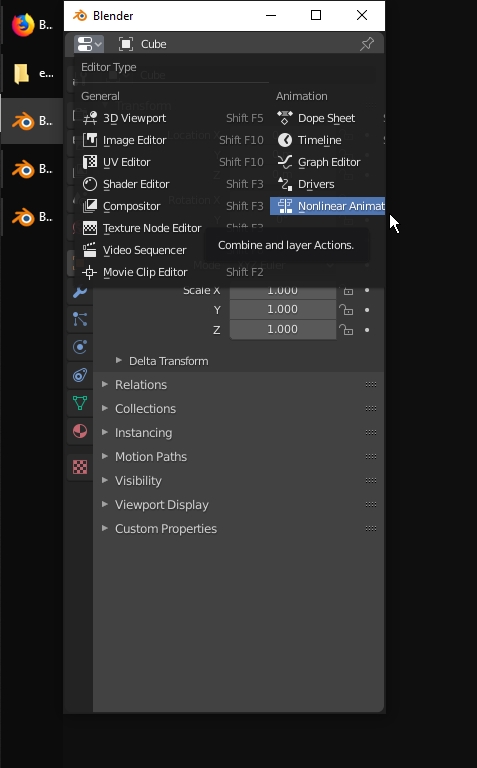
1.) I can not click on every item in the drop down list when changing the window´s type
2.) Every windows behaves on its own. Recently with the new file browser, there has been introduced another behaviour, where the file browser minimizes with the main window, doesnt have it`s own taskbar icon and stays on the same z index as the parent. This would be great to have on these other types of windows, too!
Thanks for reading! ![]()
3 Likes
Yes, but I mean in the Outliner (button or ‘C’ key in there). It’s idiosyncratic that the organizing convenience only exists when you press ‘M’ in a 3D view, while a lot of people (including me) logically like to do their object organizing in the Outliner.
Alt + click (button), and Alt + C would be perfect for this…