Speak for yourself. I personally find very tedious pointing the mouse in that tiny square on my 1920x1200 monitor, clicking and then visually searching the icon among the dozens. Since i usually need to switch to just 2 or 3 areatype, i find easier to press Shift+F3 F5 F6. For other cases I go the mouse way
1 Like
Also, the use of proper workflow (tabs on top of app window) should moderate the need of switching editors (old name: workarea). It’s a nice move but man! Please bring back Ctrl+arrows to switch the workflows! That was so fast! Now everytime I press Ctrl+left/right arrow and then realize I have to travel my mouse all the way up, read what is the workflow that I need, and click… meh!
2 Likes
You understand some things well, but in other topics you take a counterposition to my opinion. Subjectively and not rational.
Here the respected Alberto does not use hotkeys to switch between window types, and believes that no one needs it, and that it is wrong. While if he would apply a little teaching, and overcome his aversion to this method, he would discover that it is much faster than any tabs, and extra body movements. Objectively. It is faster and more convenient. And such solutions (tabs) kill the uniqueness of the blender from time to time.
In other topics, someone already offers to get rid of all unnecessary keyboard layouts except the “industry standard”, assuring that this is the only thing that people need.
And you just persist in other places, believing that the truth is exactly what seems to you to be true.
With a 2.8 blender, I stopped using workspaces because switching between them is now not so convenient, but changing the type of window has become so convenient that I quietly work in the single working space, and it has become even more convenient, although it was initially unpleasant and painful for the brain.
You write about the right workflow. But if the blender loses many “unnecessary and outdated things”, then it will simply be impossible to build such a process. Have you seen how most people work in 3D max? This is a constant climb on tabs and context menus. It is wretched and slow.
I wrote already in another place, I repeat,
the specialist should be able to play the blender! How to play the guitar or piano! All unnecessary - away. Let there be auxiliary tools for beginners and those who come to blender to work with one hand (mouse), but you can not deprive the pros of the opportunity to work quickly and hard. Moreover, just such a method of work should be a priority when developing an interface.
Any other approach is a mistake.
you have to explain to me the mental process that makes you associate contextual menu = slow workflow
in your words, don’t post a wikipedia link
the new blender context menu is also predictive
I’m still waiting for your kindly explanation of why the context menus are not very efficient in your opinion
Using a key is 1 to 2 actions. Using the mouse and the menu are 2 to 3 actions.
Key:
- click
- click, click
Menu / only: - press + hold, movement (paymenu)
- click, hover, click (context menu)
- hover, tap, hover, tap (OSD)
Mmm… to my ears that sounds like “You are right when you say what I say, but wrong when you disagree with me”.
Coming in peace, I think you’re making what I consider a mistake: believing you hold the Truth. That happens when using absolute terms like “Any other approach is a mistake.” Or “The specialist should be able to play the blender! How to play the guitar or piano! All unnecessary - away.”
We are all different, some of us fast with the keyboard, some with the mouse; some love icons some love reading labels; one has a great muscle memory, one is weak on that side but remembers where to find each single command in any menu; and the list goes on…
What I love about the new UI is that it didn’t throw away too much of what was in Blender before, and at the same time it made giant steps toward a more streamlined UX. Just something miss here and there, and for example I pointed out that Ctrl+arrow that was delightful, and now -afaik- just unassigned.
1 Like
if you haven’t noticed, you have the shortcuts for the most used operations, look better
You’re wrong. It seems to you again.
))) this is ridiculous. )))
I use such expressions to shorten my speech. English is not my native language, and it is difficult for me to communicate in it. Moreover, describe complex ideas.
You perfectly defend your point of view, and “it seems to me” that you don’t look at yourself to think about whether you are right. ))) sorry.
I don’t think that context menus are bad. It’s unavoidable.
Moreover, I think that there should be less key combinations.
You read only words in my words.
The interface should be minimal. Not otherwise. Can anyone argue with that?
Do you use a blender to poke your mouse over beautiful buttons, or to get some kind of product?
Have you heard about Ockham?
Please, do a well descriptive mokup and let’s discuss it, otherwise it’s just pumping and poorly understood.
Maybe I should quit my job and devote my life to creating blender layouts?
)))))
not! it was bad! we need more tabs! speak for yourself!
)))))
Sorry. )))
Seriously, guys, you respond to my comments as if you just want to write no without reading. ))))
don’t worry about this, we are getting tired of answering … soon we will stop, it is right to understand what kind of person you are.
2 Likes
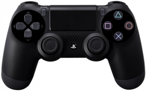
Look at this picture and think about your own words.
please note:
I’m sorry if I upset someone with my annoying messages
I have a 2560x1440 monitor.
But I find hard that normally people use it when in the program we didn’t have any shortcut indication to switch areas in 2.79.
Ok that new menu is bad, but it’s other story.
1 Like