there are a lot of options, one proposal of one is the property search bar
Thank you
Sorry for the inconvenience.
there are a lot of options, one proposal of one is the property search bar
Thank you
Sorry for the inconvenience.
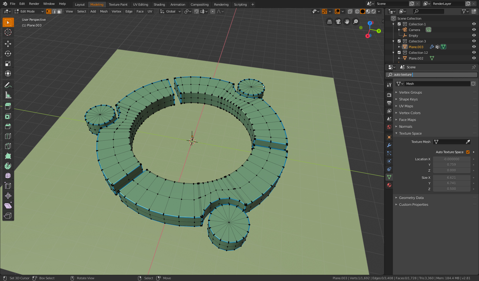
The real solution will probably be a more predictive and context property panels … in the sense that if you select an object in edit mode … you will have many more properties regarding the semantic connection with the object in edit mode … and all other properties will be less relevant … and so on … more contextuality for all other objects and other modes: painting, texturing, sculpting, rigghing etc … etc …
Thus you will have much easier panels to view and navigate.
Ideologically, I’ve already said, when between 10-20 years blender will have a “servant-aide artificial intelligence” … the property panels will have to become “jarvis” 
Hi Billrey,
This is exactly what I wanted to talk about 
I’ve only been using 2.8 for a few days but have found this to be inconsistent at times, if I use the knife tool then the tool settings appear along the bottom of the window(where the mouse control icons are by default), whereas most other tools seem to have this info along the top bar…
I think that for ease of use, for new and old users alike, it would be ideal to standardise this if possible?
Many thanks,
Mike
100% agree with this, I would love to see the return of this icon!
I had never noticed that you could “right click” on the borders to do this, thanks for the tip, I think it works great and can see why you considered dropping the corner splitting altogether.
It would be nice if this technique was more obvious, I’ve used Blender for years and would have no idea about this feature if you had not removed the corner icons leading me to post here and read this.
Not sure how you would do that easily though, any ideas anyone?
I also like the proximity icon idea for splitting via the corners.
Sorry I missed the context, but we’re talking about splitting viewports by dragging or right-clicking to split, correct? I would really like to advocate for that unintuitive approach to be removed and replaced with what Visual Studio Code does with its window management, where you can easily drag the top border of viewports around and they snap to the sides of existing viewports.
This works so much more fluidly and as expected by users of modern desktop software. Adobe products do something similar (however VS Code has had the best implementation that I have seen out of any software).
Yes would be nice. At one time we thought we could get this included in 2.8, see: https://developer.blender.org/T54951
@jacqueslucke even had a working demo, but there was some reason I forgot why it was not immediately workable. But his proof of concept proved how nice and useful it would be.
It’s indeed nice. To support it well, we’d also need to add tabbing.
We lose a little bit of vertical space for the tabs, but IMO I think that’s acceptable.
I should clarify that I did not intend to prescribe tab support as a feature to transfer over from the VS Code example. I probably didn’t do the best job illustrating that in the gif because I did feature the tabs unnecessarily. Without tabs, this would differ by not allowing the user to drag a viewport onto the title bar of another viewport (in VS Code this adds it as a tab, it would simply do nothing in Blender). Also in VS Code, dragging a viewport to the center of another viewport causes it to be added as a tab to that viewport region; this would also do nothing in Blender (there would be no colored highlight unless near the edge of a viewport, releasing the mouse when colored highlighting is absent would make the viewport open where dropped in a new window).
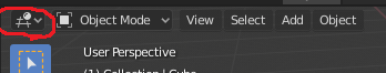
Also, when the tab bar is hidden, the user could drag around from the viewport type icon (this thing:)
And to create a new window, a user could drag any new viewport type out of one of these menus:
(Just open one of those panels and drag out any of the viewports, then it’s part of the mouse and can be placed anywhere in the program with the VS Code-style highlighted snapping).
I don’t think adding tabs is unreasonable actually.
We could get rid of silly hacks like this:
It would fix this issue, where users keep two views open, but make one of them impossibly small (look on the right-hand side of the viewport):
Splitting viewports would become infinitely easier. Many users have trouble with the way viewports are split in Blender.
We could in many instances end up saving screen space. Rather than keeping lots of small views open, in case they are needed later, users can tab them and only see a subset, giving them more room to work.
An old proposal that I made time ago with the tabs. I think that the main improvement of tabs is that devs could divide editor that have various behaviours in real editors (For example properties editor in objects and world properties) and allow user to switch between them. And allow user with one monitor to have all vertical editor in one column (switch between outliner and properties) to use all vertical space.
It with old interface because it’s really old.
Now that think it was the reason that I put workspace tabs from top, to diference the shape of the tabs.
I think that having several tabs in one window is superfluous. This is another UI overload. Window type are very simple and quickly change Shift + F*. At 2.8 it is greatly improved.
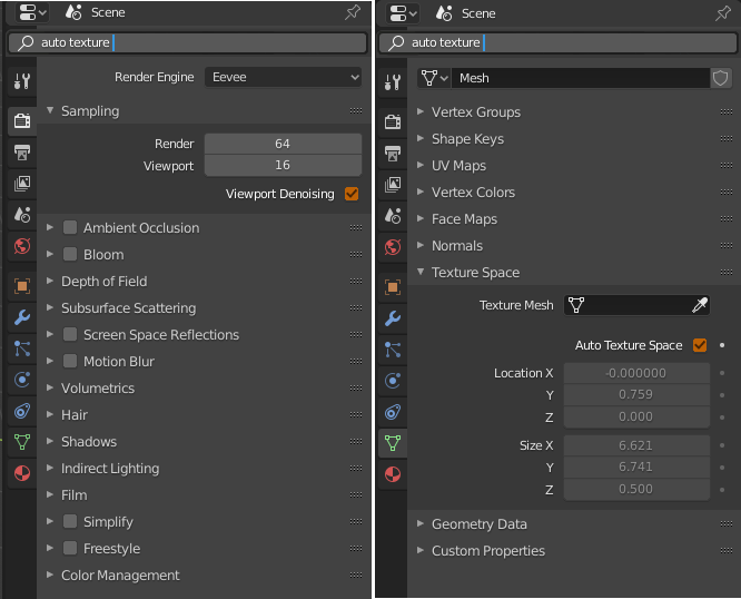
honestly, now that the property buttons are vertical,I would like having tabs instead of that useless “almost empty” horizontal space (ex property buttons space) which is now in blender 2.8 … and I would definitely prefer the tabs instead of that long long current scrolling …
I refer to tabs that sectorize the property panels (more tabs each property button that divides the panels), but that are not real tabs, but more than anything else, they are bookmarks that when you click on, you immediately arrive at a new piece of scrolling area.
in practice nothing would change from what it is now, only having these “extra bookmarks tabs”
Nobody use that… Shift+Function are hotkeys that needs two hands, is more easy to use the mouse, also taht it allow to order the interface. And it doesn’t work for laptops.
I don’t understand you, maybe I’m sleep, could you explain in other way?
what did you not understand exactly?
edit:
I modified the comment making it clearer
Strange, I have no difficulty using these combinations with one left hand.
Very comfortably. Well, you need to move the mouse in vain and waste time.
Maybe I didn’t understand the essence of the tabbed proposal very well. Surely this is some very wise offer.
Hi,
I was wondering if custom transforms could be added to the new “Orientation” pie menu?
I’ve done a quick mock up of how this could work below.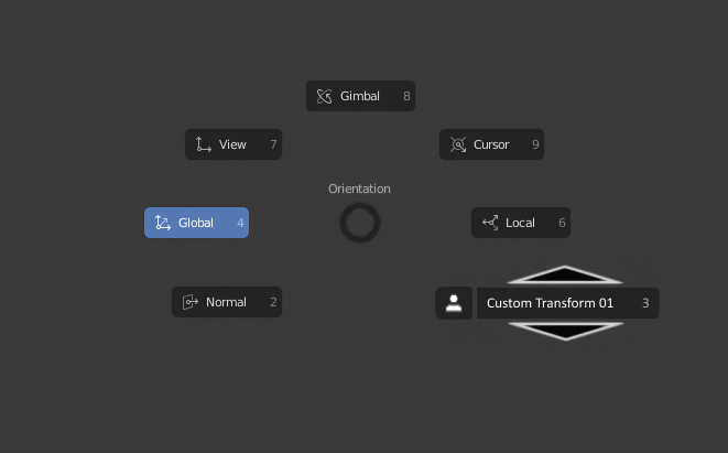
When it is selected via gesturing the mouse wheel could be used to scroll up/down to select different custom transforms. Or if a user prefers the up/down arrows could also be used for this.
It could auto default to the last custom transform used enabling quick selection via gesturing or a press of “3”(for example) on the keyboard.
When creating a custom transform you could have an “Add to Pie List” check box in the “Create Orientation” properties window to customise which are added to this menu and which are not, sometimes you only use a particular transform once where as others can be used frequently.
Cheers ![]()
I don’t know your size, but I only can reach Shift+F6 easily and F8 forcing
Your hand, a normal hand
Oh, you will be surprised, but since 2006 I have been using an over-tech keyboard, and on it, ATTENTION!, Two shifts! )))