@dan2 this might be useful
Thank you @ThinkingPolygons,
I’ll definitely check it out. The main reason I was refraining from using floating windows is that it can complicate things when using several instances of the same software at the same time.
This is exactly what I proposed before! (read below)
After my post jendrzych the designer of the new icons mentioned that he created a mock-up with the same idea.
Then William Reynish, Blender’s UI designer joined the convo with this:
“Only issue with that, is that then addons need to always supply an icon if they want to add their own category. Technically I would think it should be simple enough”
I’d consider this absolutely OK - especially with jendrzych’s idea that the first two letters of addon’s name could be there if no icon was provided.
But the discussion died at this point - I haven’t heard about this since then but I really-really hope they get back to this idea after 2.8
It’d make so much more sense (especially if they implement my drag and drop idea with it) and would be so much more professional as you said.
@kynu Thank you for getting me up to speed on the subject. There could be a pre-defined set of icons as well for the addon developer/user to choose from, depending on how descriptive the icon should be.
I’d prefer icons instead of the first two letters, many addons are not very descriptive on their own. I might know what ice tools, machin3 or mira or grasswald stands for, but in a big production there would be hundreds of juniors and atd-s who don’t.
I’m glad to see that these changes wouldn’t be overly difficult from a technical point of view.
2 Likes
I’m curious if we can get a dev’s updated response to all these proposals
@billrey could you please tell us if this UI adjustment is something considered for a future release?
1 Like
Yes, I think this, as well as having the ability to enable whole sets of addons would be crucial in production.
Let’s say I’m doing FX, I’d want to be able to quicky enable/disable not just the FX toolset, but also Layout, Character animation, and Bakes. Having a core set of addons, preferably with icons, color coded in the N panel would be a good start.
The amount of custom tools is just way to overwhelming. As it stands now even a simple publishing and QC toolset would fill up the N panel.
If designed correctly, the floating windows need not actually be real windows in the eyes of the operating system that add them to the task bar. I would also like to mention that we should get rid of the horribly unintuitive window splitting system that Blender currently has and implement the window system that VS Code uses, which is fantastic.
@Keavon I see what you mean. It might come down to individual needs and personal preference. I can definitely see the need for using floating windows, this might be a different discussion though. I listened to an interview and can vaguely remember Ton being against them, and I fully respect that.
During my day job I’m using Maya a lot which is a perfect example on how not to do it - having 6 instances of maya open, with 3 outliners, 4 graph editors and 5 hypergraphs can quicky become a nightmare if they’re added to the taskbar. Do we have floating windows in houdini? For the life of me I can’t remember, if we do I’m never using them.
I’d need to see a good example, but at the moment I definitely see the upsides of not having floating windows, as well as the limitations. The UI space can be filled up fast. Maybe a slightly different duplicate of the N panel would solve it, specifically dedicated to custom work environments. Same way I’m using different addons when sculpting, doing lookdev, layout etc. there could be a way to populate the N panel based on the workspace. (I know, we can do anything in any workspace at the moment, and it’s good to have it like this, just thinking of ways to manage things for large scale projects)
Like I told you in RCS, that feature was asked a lot of times, the first mockup was mine, for 2.79 and have… two years I think. And we have asked a lot about the same, like you see here the UX developer is aware about it.
Same for floating windows… we have asked for that about ¿thousand times? But blender GUI api don’t allow that. Dev had no time to make a simple new menu control. So I don’t think that floating and draggable windwos is easy.
Don’t burn yourself asking for things because the changes, as you can see, are not so simple.
@Alberto I read and replied to your response on RCS. If I’m getting it right what you’re saying is that you made a proposal 2 years ago, hence that shoud’nt be brought up again in form of a conversation.
As I said before, many new users are converting to Blender, conversations regarding subjects that have been discussed before will come up again.
If you have constructive proposals on how to handle production scenarios with 600-800 people working on 2000+ shots I’m open to listen to them, and I’m sure so are the developers - but please don’t tell me what to do, and what dialogues to start. I don’t think it’s a realistic expectation of going through every thread and proposal ever made, and I’m sure I don’t need your permission to ask a question.
1 Like
I didn’t say that, I said that I said it and others said it, two years ago, nine months ago, eight months ago, seven months ago. six months ago, five and a half months ago, five months ago, four and a half months ago, four months ago, three and a half months ago, three months ago… that it already has a dozen mockups and we have talked this directly with the UX developer, with the UI developer and with the icon creator.
Nobody is converting anything, we still have the same number of developers, they are the same as we know and at most there will be 4 more who surely already come with their plans well defined.
But if it bothers you so much to be told that it is a subject more than treated and you want to come to open our eyes, well hey, yourself. I’m sure that adding the “two weeks ago” to the list will fix everything and will implement everything we’ve been asking for hundreds of people for months.
And if you don’t need permission from anyone, I don’t need yours to tell you what I consider.
Look, there’s no need to get aggravated. I just asked a question, you pointed out that it came up before, let’s just leave it at that.
If there are no resources to address all the important issues at once, that’d be perfectly understandable.
The worst thing that can happen when asking questions is to be ignored or simply told that’s it’s not going to happen any time soon, but that’s just the nature of things.
acordin on what Ton said to the last Blender Today stream, some parts of the Ui is composed of layers on layers that have been added over the years … the buttons part dates back to the 80s, this makes me speculate that maybe soon there will be a reorganization at the level of core windowmanagement / ui … or at least that’s what I hope … in order to have an easier and more efficient, modern and effective management of ui elements … (the video is positioned at the time where it talks about these topics.)
The toolbar of the shader editor is almost empty. What if it was populated with nodes list (so called palette). Yes, nodes are not tools, but…
- The toolbar is empty anyway.
- A list of nodes may help to think more creative. It helps when you observe all the stuff in your posession, rather than just an empty canvas.
Also it would be nice to display them as drag’n’drop thumbnails.
2 Likes
Hello.
I have a suggestion for the 3D View Sidebar (N).
Since we can move the header stuff with all the display settings (gizmos, wireframe to rendered mode etc) to the bottom, dont you think it would make sense to allow this for the sidebar box as well?
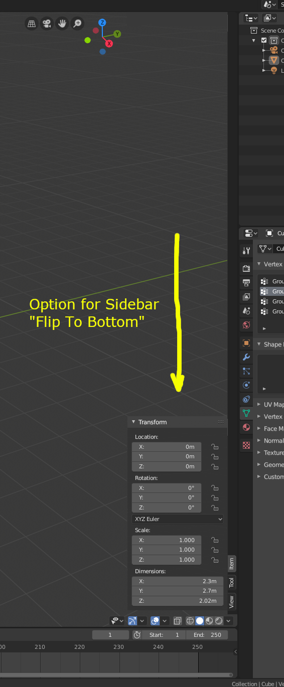
Meaning the sidebar will build up from the bottom.
It becomes easier to use if other important controls were placed consistent on the lower side (including adjacent window areas).
Ok, I understand that this was always this way. But, why when you add a new primitive in Object mode and immediately you change to Edit Mode, then Operator with options is not available anymore? By default Edit mode is the most convenient mode for best viewing of what you can change in the Operator panel.
To address your specific request:
As for parametric primitives in general, this should be integrated with the modifiers system which should get an overhault with the Everything Nodes project.
2 Likes
Oh, thanks.
I think it would be convenient if the Operator panel does not disappear while you “Tab” between Object mode and Edit mode until you want to finish the configuration, this only for visual purposes while you configure the primitive.
It would be convenient to have there also the name of the data associated with the object (mesh / lamp /, etc.).
When you first open 2.81 version and you load settings from 2.80 in splash screen, it does not load the settings (at least the RMB for select) in that session/instance. You must close Blender and reopen it. I am not sure if this is so because of some limitation. It happened to me on Linux, using RMB to select.