Blender user interface design

I like how blender ui looks, the only thing is tool panel seems to be underused sometimes, especially in object mode. I think devs could add more stuff there, despite new buttons may not be “actual tools”, for example adding primitives (in object mode). It would be a nice addition since it looks that target audience of tool panel are people new to 3d modelling.

Personally, I would like to have customizable hotbar, like quick favorites, but actual panel with buttons, maybe as a new type of editor.

Only downside of GRS (not toolbar) is you have to guess which Local Axis object has in a direction you want to move, rotate, scale.

I like the idea of click for select and click + drag for move in TimeLine

By pressing MMB, there are 3 colored lines representing 3 local axes popping up.
By hovering one, while releasing MMB, you can choose the desired axis. There is no guessing.
That’s equivalent to a gizmo.

Its not fast enough (must double press one of axis to be in local mode)
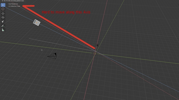
Another issue is viewport angle. Its uncomfortable to use sometimes.

I don’t like gizmos. Its in a way but user needs to know where to move selection. There could be an indicator somewhere in UI?

You need to double press only if you keep default orientation to global.
If you change current orientation to local, you don’t need to double press anymore.

There is an indicator. The little white dashed line. Chosen axis is the closest to it and it is brighter than the others.

No. It is not different than with a gizmo. Axis are starting at object’s origin like a gizmo.
Object starts movement at same position and ends it at same position than with a gizmo.
If view angle is not adapted to reach desired goal with this method, same view angle would not be adapted to reach same goal with a gizmo.

Ok, thank you

I noticed it just now. What I imagined was more like this
axis2
Small Arrows (local) in Big ones (Global). Shows when object or element is selected.
(There could be different colors for local axis. Its just an idea)

Correct. But with gizmo you don’t have to go through any process. You can just change angle and not think about it.

It looks unreadable to me.
Sincerely, I prefer to use a gizmo.

Most of times, I don’t need an indicator for local axes.
Most of time height of my model corresponds to its Z axis.
I can recognize front, back, top or bottom side by what detail model shows.
I added them into one of standard view. So, they are pointing into one direction and indicating local axes before I start to think to move object to a different location than scene origin.

OK, this is not the case for default cube. But if I need a face of a cube pointing into one direction, generally, I don’t care if it is front,back,left,right, bottom or top one if they all look the same.

It may not be case for characters, but hills, rackets and anything with similar shape.

The biggest issue is probably with sphere like objects.

Hi, I don’t know if I’m at the right place to talk about this: The volumetric toggle ON/OFF button.

It was removed in last blender versions. If a volume is detected, volumetrics are ON automatically.

I think there are some cases where it can be interesting to have the option to disable it.

For example, if you are working in Mr Elephant scene, volumetrics are now enabled by default, and if you are running a middle range computer, the scene will be slow. I think it can be interesting to have the possibility to continue to work on Mr Elephant scene disabling volumetrics (in the occurence you can simply remove volume scatter shader in world node shader editor but it is not really handy and you can loose your settings). Then you can enable volumetrics again just before doing your render/anim…

It can also be interesting to render with/without volumetrics enabled to compare.

I don’t know if there’s a simple way to enable volumetrics automatically when you add the 1st volume to the scene, but keep the possibility to disable all volumetrics when you want.

2 Likes

For the world, you are not forced to remove the volume shader node. You can simply mute the node.
For volume objects, they can be hidden.
It can be easy if creator of blend files grouped them into a collection.

It can be complicated if it is not the case and user did not give an explicit name to them.
So, you are right.

There might be an option into Simplify panel to disable all kinds of volumetrics.

Indeed, mute node and/or using collections are good ways. It was just a remark but it is not that important. Thanks for your answer.

Personally I liked the change of Volumetrics enabled by default, but I had not thought about people with low end GPUs.
Anyway in your case if the scene becomes too heavy, you can set the highest value of “Tile Size” and low values of Samples in Volumetric item. Probably so that it does not become annoying to constantly change the configurations for Rendered view and Final render, perhaps it would be convenient to have different configurations of mentioned settings separately for Render and Viewport under Simplify item.
If the volumetrics comes from World, you remember that in LookDev you could enable Scene lights without enabling Scene World for fast navigation.

Flip Region F5 keyboard shortcut on panels is only available for 2.79 keymap. Why is it almost hidden for 2.8 keymap? Is it problematic in any way? I believe that Flip Region’s ability is a very powerful customization option for users. This should have keyboard shortcuts for other Key Maps, even it should appear as an option in a menu when you right click on a panel.

1 Like

I kind of agree here… Sometimes there are situations where you really want to disable all volumetrics. Maybe it would be sensible to put that volume toggle button/ticker into the simplify-tab, since it is basically a simplification that would most likely be wanted in the viewport, but also still be rendered.

1 Like

But Cycles also does not have a checkbox to disable Volumetrics globally, and volumetrics in Cycles is even heavier than Eevee in rendered view (if you use same GPU to display and render). In the message above I have given options so that it is not heavy, even you can configure Samples = 1 in Volumetric and it would work in the same way as it being disabled.
For me what would be more important, would be to have separate configurations for Viewport and final render.

Agreed, which is why I suggested putting it in the simplify-tab, which has exactly these settings to help optimize the workflow. :slight_smile:

1 Like

My god. That’s indeed a hidden feature. I had absolutely no idea you could flip regions like the N and T panels. I’ve been using blender full time for 5 years.

2 Likes

Hello.

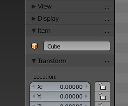
I have concerns about the removal of the sidebars item name box:
SidebarItemName

This wasnt only useful for renaming purposes. It enabled users to copy+paste the item via mouseover into a different name box, like modifier or constraint targets, on the fly.

In my experience its safer and faster to use copy+paste than searching or using the picker tool (which isnt available for bones). Personally I used the name box heavily.

The benefit is that the name source stays in place and you never have to switch context of the Properties editor to change or copy the name from the Object or Bone tab (bones have another tab).
Since switching happens globally for the window, it requires some back and forth while working in a specific area, bone constraints for example. In 2.7 you can rename, copy and organize your bones and constraints in a workspace of just 2 “static” windows. Very comfortable, no longer possible in 2.8.

So it turned out to be a bigger papercut for me because the name box assisted this workflow quite well. It made me more unreliant on other editor windows and I really wished you had not removed it from its place.

6 Likes

Hi Guys,

I realize there was a conversation regarding this subject before, but with many new users converting to Blender I guess it can be expected for this to come up periodically.

I made a rough conversation starter/proposal on rightclickselect as well, (https://blender.community/c/rightclickselect/dzdbbc/) (keep in mind, I’m not a UI designer. It’s a concept, nothing more) but figured I’d bring it up here where it might reach developers more directly.

The main point to be clear - in a production environment you’re going to use many in-house tools, scripts and plugins. I’ve been working at big VFX houses for quite some time now (currently involved in pipeline development) and one can be looking at twice as custom many tools as default maya would ship on a daily basis.

The ability to sort them in an efficient manner, so that it doesn’t clutter up the interface is crucial. (I’m not necessarily talking about the ability of drag and dropping scripts into a custom shelf, organizing them freely, assigning custom or built in icons).

I’m very open to look at it the Blender way, I’m a huge fan of not having floating panels, but I definitely feel that this needs some attention. By no means do I want to make it Maya-like, on the contrary. In many aspects I would want to make Maya Blender-like.

Organizing 10 addons in the workspace might be feasible for hobbyists but it’s not going to work on a daily basis across departments in a big scale production environment.

Forgive me if I’m not going through the whole thread, while if definitely looks interesting, it’d take a lot of time to read the 1280 entries (maybe for topics like this there could be a summary of some sorts).

Anyway, the question would be - is the N panel as it stands now set in stone? If so, what would the suggestions be for bigger production houses in terms of organizing their toolset so that it can be accessible across departments in a streamlined fashion? (keeping in mind that the user can be a seasoned professional with 20+ years of production experience, or a jr ATD, straight out of school)

Thank you for your time, and again, excuse me if this has been discussed and brought to a conclusion before.

Cheers,

Dan
3 Likes