Guidelines that organize the addon-dev, and maybe a video made by @pablovazquez that describes how to do it would be the best thing … here is a question of communication
1 Like
What people don’t want to understand is Blender’s own nature. Blender doesn’t work on the basis of popups, floating windows,… Which by the way are a piece of crap in almost all programs.
Blender works with a very clear, efficient, modular interface and each editor must work independently. And because the workflow is so optimized, the creators of addons want their addons, which are often personal tools they have published, to be well placed. And that can only be in the T-shelf or in the current Sidebar. Which are also the places where there is more space, especially now with the unique column.
Does anyone want the textols addon in the properties editor? No, of course not. We all want it inside the UV Editor which is where it works perfectly for us.
It doesn’t matter if some people want to put the addons in a place, the addons will go where they are useful and comfortable to use. And forcing addon developers to put the addons elsewhere will basically force them to make addons uncomfortable to use simply to please a minority and and annoy most users.
3 Likes
agree on almost everything except one thing …
the space in the side bars is too little for most of the more complex addons
Could be, but actually is the biggest space of the layout. The vertical space in the main editor.
I don’t know how it could be solved, but in a dimension like this, 3 columns could be inserted …
for some addons I would exclude the possibility of manually enlarge the sidebar as it has no real usefulness
Well, that already has to do with the problem of the single column, I’ve always been suporting of the old layout … I guess many addons are not designed for this one, or that is not available in the sidebar.
I expect that for 2.81 they take into consideration the columns proposals.
Don’t get me wrong, I find the N-panel very convenient and use it a lot. And I don’t have much of a solution, at this point…
But thinking about it more, it feels very incomplete and indicates some larger problems to me.
A couple examples:
- It’s got collections visibility controls. Is it really more convenient to use than moving the mouse to the outliner? If so, is that a problem for the N-panel to solve, or is it a problem that the outliner can solve?
- The N-panel also has a nice way to see and edit bevel weight and crease on selected edges. It’s a lot easier when I can see the value beforehand (though I think it should be a bar instead of just a number).
But again, is that a problem for the N-panel to solve? Would those controls be necessary if the “normal” way to edit bevel weight and crease was better?
I’m not really sure how to feel about it, but my thoughts right now are: Either the N-panel needs to be way more central in Blender’s UI, or the usability of everything else needs to improve to the point that the N panel is unnecessary, except for active tool settings and maybe some addons.
I’m not sure about your proposed changes, but I’d definitely be willing to try them.
1 Like
That was strange, in a first moment it was a popover, not really useful, in header, but when you have a lot of collections it wasn’t a good option and was moved by users petition to the N-panel.
That is a way to see the values and to change the values really good. I appreciate that in a lot of moments. I don’t work with commands always. For example, I was working with a laptop this afternoon and I used a lot because work with trackpad is a mess.
The sidebar sometimes duplicates controls because users want it to. Because we want to run fullscreen, because we like to hide it quickly, because it works with our workflow…
What about a dropdown for the categories in the n-panel?
I know its less accessable but migth solve the over populated vertical bar.
For me the layouts now have the same issue since i use more than fit the horizontal space and the old dropdown approach worked perfectly, i think anyone who sets them up will use keybindings to step through, and that could also be done for the n-panel.
So if one would ctrl-scroll the n-panel would still cycle through like its done now but we pack away all the tabs in a dropdown so its still accassible and readable if theres a lot of tabs.
Wait, why do tabs shrink when there’s not enough space? They should remain the size with fully visible text, and be scrollable as in the Properties editor. No?
9 Likes
Another possible solution for users with a ton of addons, is if they could expand the tab area sideways slightly and have two rows of tabs. Same space as using icons, but with the benefit of understanding from text.
My proposal to Add-on tabs:
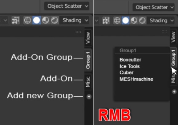
"
- Add new group(s) / Delete group(s)
- Rename group(s) ( HardSurcafes/HSurfaces/HS… for example )
- Change group-color ( in the Preferences )
- Add Add-on for a group in the Preferences ( and maybe with drag )
- Change succession of tabs ( with drag )
- Right Click on the group: Select Add-on
- Left Click on the group: Last selected Add-on "
But…
And “Filter Add-ons” is not working very well.
Filter Add-ons is enabled:
Everthing is fine. Oh, wait, no:
Filter Add-ons is disabled:
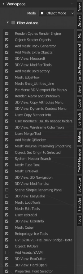
Add import/export options to Filter Add-ons or I don’t know, just fix it. ![]()
4 Likes
In Grease Pencil I was expecting to see the Guides available in line/circle/arc modes of drawing before the UI freeze. Would be nice to draw line with specific curve for thickness with the guides or being able to apply the curves to strokes.
Really like the final solution with the Blender Icon Menu for Blender-related stuff and the Preferences back under Edit. Good job! 
3 Likes
in the end reasonableness and common sense prevailed … justice was done by the knight brothers 
2 Likes
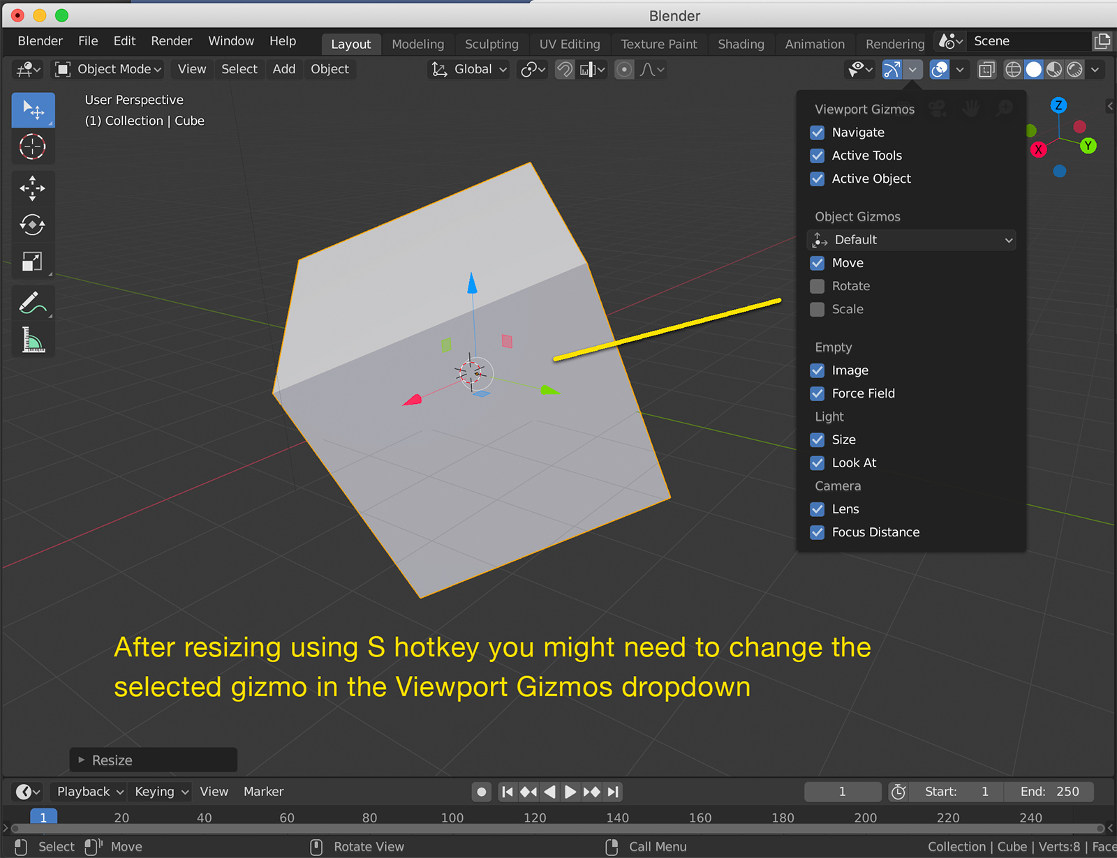
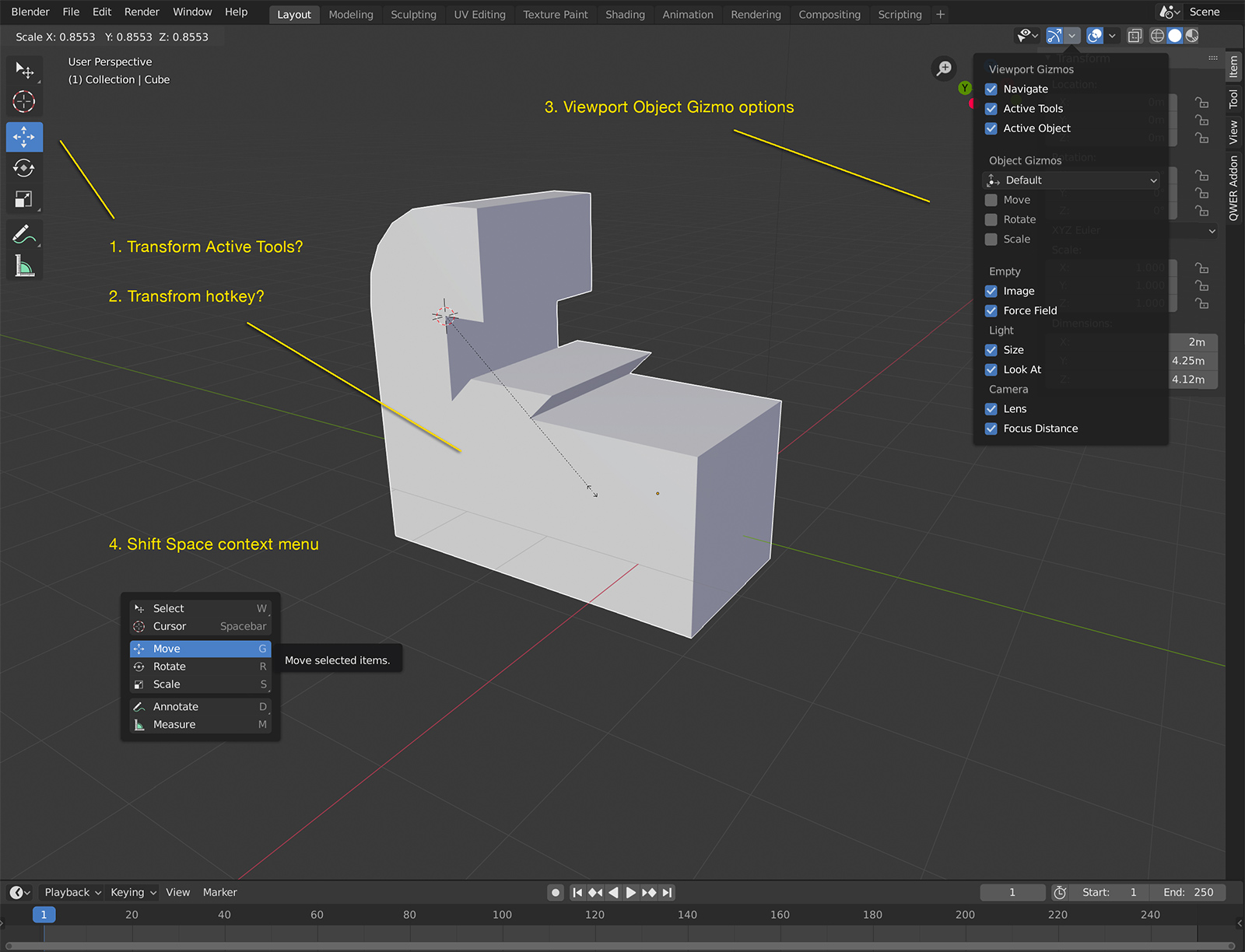
In my most recent try of Blender 2.8 I got really confused over the types and options for the move, rotate and scale tools.
I don’t know if this was the case for 2.79 but in 2.8 I realised that:
- the G, S and R tools are not the Transform Active tools in the Tool bar
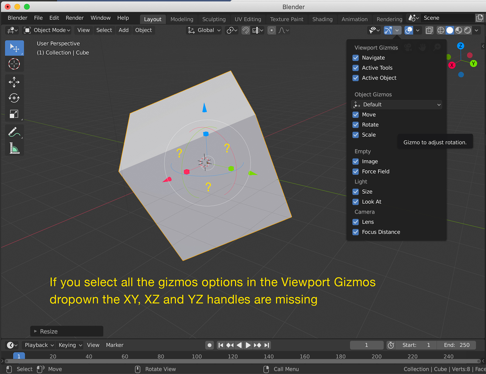
- the gizmos for the G, S, and R tools are in the Viewport Gizmos dropdown to the left and might not be consistent with the tool you are using
- generally these options are spread out and it takes a while to understand which tool you are using and how the gizmos are relevant and activated
Daniel Pool explains the confusion in this YouTube video and why he developed his QWER add-on to help.
2 Likes
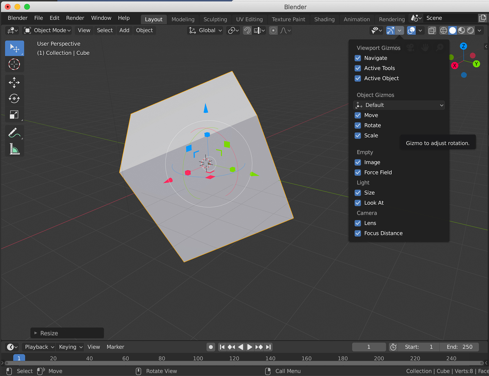
the first image , i think it’s planned to bring back the Trasform tool in the tool bar which solves the problem, the second one, lock on two axes is not possible when you have both move and scale, which one takes the action?
The d.b.o thread about the transform gizmos is chock-full of mockups that solve this issue one way or another but they’ve not been implemented so far. I hope they get another chance.
https://developer.blender.org/T47032
Yeah you’re right. Didn’t think about that. I guess if you wanted this functionality you’d need two intermediate two-axis widgets - one for transform, one for scale. (pic below)
This is offtopic, but I unified the two transform modes (one is reactive from toolshelf, the other is active from keypress) to the same hotkey. So when you press GRS (or WER) then it will activate the widget (new transform) of that mode. If you drag on the same keypress, then it will immediately move (traditional transform). The visual feedback of the transform mode that you are in is intuitive, and you aren’t stuck to “activate + then move” workflows. You can do this in the keymap.
4 Likes