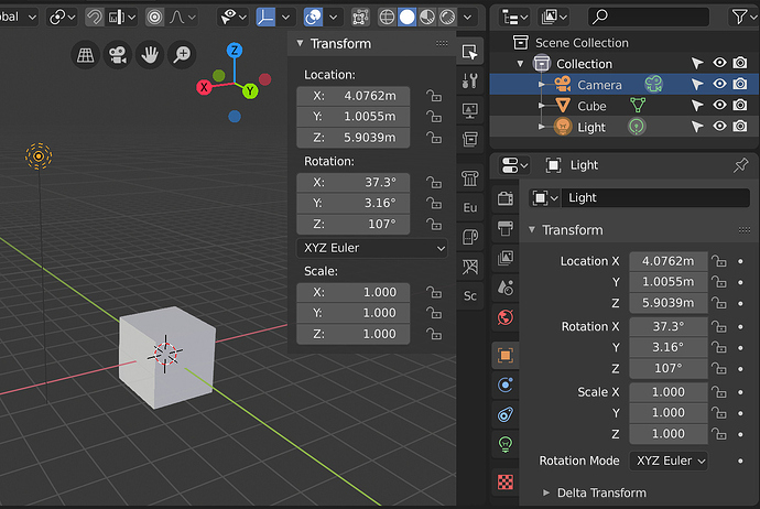
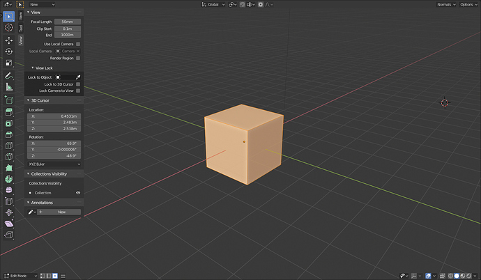
Most of that menu could easily be moved inside of the preferences itself. Only exceptions being Splash Screen(should be named About Blender and located at the end of Help menu), preferences itself(should have stayed at the end of Edit menu) and Quit.
I like the Blender logo directly opening the splash screen. File and Edit are sufficient to hold the other things, those are the places you would expect to find those preferences in any other software application. I would even advocate moving Preferences to File instead of Edit, though.
It’s “kind of” the standard for Mac OS applications. On Mac apps, the QUIT is under the application menu – but is not under the application ICON.
It’s not the standard for Windows applications. The application ICON usually has the Maximize and Minimize.
I live in both worlds – so, I can get used to it. Although, it really doesn’t feel like it lives in either world.
oh! welcome back!
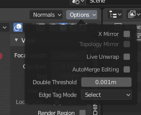
I agree, the Factory Settings Buttons should be in the Preferences and the Preferences should be back to Edit. Using the Blender icon seems to be nifty at first, but IMHO it’s an awful idea as it goes against any convention or user expectation.
Even knowing that Preferences are now under the Blender Icon I still regularly click “Edit” when it want to open the Preferences. Please revert this!
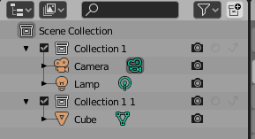
Making the restriction icons greyed out until you click and remove the mouse imho makes them look quite off and, as a first impression, gives the idea that they are disabled and that you couldn’t click on them.
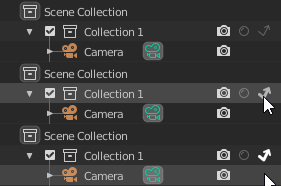
This is especially true with light themes, in which they’re almost invisible.
this is the current situation of my sidebar with addons, practically I don’t understand a shit anymore,
there are no tooltips, there is no order, the texts fail to read, and after a few days I forget some features of the addons and in my mind they become meaningless shadows, mysteries to be discovered but they are a dense and dark wood, a dense Labyrinth without escape in which it is better not to penetrate
![]()
![]()
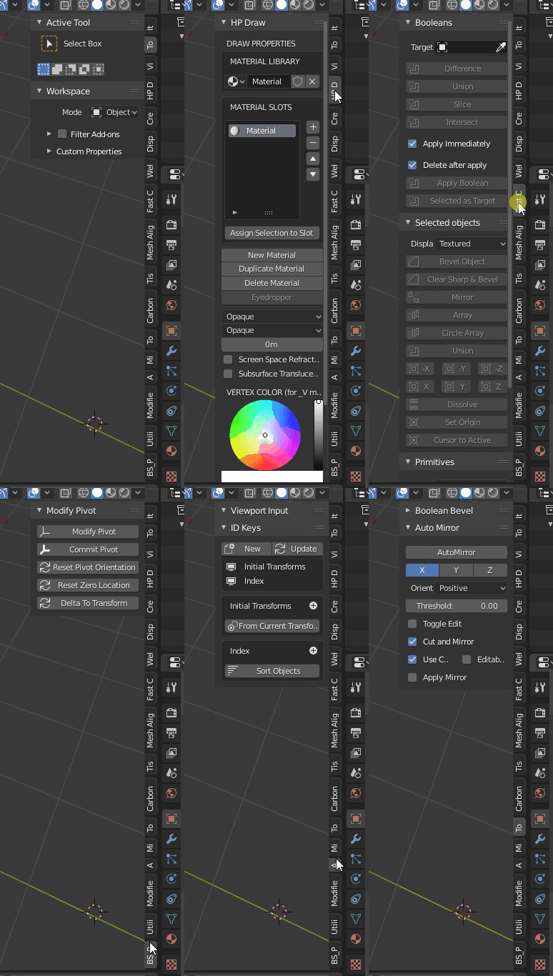
Good moment to remember that we warned about that 10 months ago…
I’m trying to make explicit things that I think is a priority to solve before blender 2.80 come out
honestly the problem of crowding and space for addons was also present in blender 2.79, it has only been moved …
it would be a shame if they don’t take this situation head-on and get it out once and for all
by monday the UI improvements will freeze and we are in the weekend,i don’t think they even have time to wrap it up unless they push for more few days.
Yeah, but the problem was worst in the moment that we lost the T-shelf, all addons go to N-shelf and you put in a gigant button soup with the Topbar, outliner, properties editor in same place.
Will be really bad that some things that will left blender in a good place won’t be change before final 2.8
- Some keymap changes
- Custom Normals interface
- Blender App Menu
- Tabs from N-shelf
- Show toolbar settings by default
no was also present in the T-shelf,
in fact it has been moved from one place to another …
obviously accumulating everything in N-shelf
however, apart from the complaints:
my proposal is:
-
icons for compartments instead of vertical texts
(in practice we would have a sort of “second property pannels design” for addons) -
tooltips describing the compartment
(and tooltips in the sidebar for each single addons)
obviously it is the duty of the addons devs to add these tooltips, but it would be good if guidelines were given by the blender developers -
use of volatile windows for addons with many options,
the ideal base would be: the main functions in the sidebar,
optional and additional functions, in “floating windows-popups”
In addition to that, it might be helpful to be able to show/hide single tabs with the ability to save the visibility in workspaces.
the compartments could be more local and contextual
the addons, appear only in their area …
if you are in edit mode, only the addons for edit mode will appear.
if you are in object mode, only the add-ons for edit mode will appear
so…
“mesh editing tools” “animation tools” “objects tools” “rigghing tools” “texturing tools” etc … etc …
so quickly all the addons would dilute and the chaos would become more orderly …
It’s already possible to show different add-ons depending on workspace (Filter Add-ons), that may help a little with this problem.
Icons instead of vertical texts, it’s not an option. Since add-ons make different people, you will get a bunch of similar icons that can not be distinguished from each other.
Tooltips. Each add-on already has a description that can be shown as a hint.
I don’t see the logic in that…
Addons icons can be so different like addons names, and I don’t remember that all addons have the same name.
is already possible but not automated …
it should be possible from the addon devs to directly give the predefined directives on where the addon works best … and then in case the users decide to customize and sort the addons in the various workspaces
Blender should have the various general compartments, and the addon-devs should then decide in which compartments to put their addons …
I assume it is also a work of adjustment-updating the API … it’s a matter of rearranging everything
my mistake due to a too brief summary.
I was referring to the “titles of the addons” … it would be wise for them to show a brief description as a reminder of what the addon is for and how it works (popups similar to “Z-brush, possibly to ambuger menu with detailed descriptions”)
this work should be done by addon devs updating their projects …
but blender developers should facilitate this process and give guidelines to addon-devs
(to facilitate the reorganization)
@billrey @ideasman42 you can please split this discussion into a new topic, I think there are the bases for a good reasoning about it, thanks
What exactly decides the N-panel’s contents? Are there rules to it?
It seems kind of random and disjointed to me. Viewport-specific view controls, transform controls including unique object dimensions controls, bevel weight and crease controls, some addons, 3D cursor location and rotation, active tool settings (which are in 2 other places except this one is editor-specific), collections visibility and annotations.
Is there no better solution for most of these controls than to throw them all in the hidden side panel?
The use of the sidebar is easy to understand. Settings and parameters of the object, tools and addons that you use inside that editor.
Few people are against sidebar, the same guys that never give any solution except “put all in editor properties” that will be worst. The problem of the sidebar is that we need a lot of tabs for dozens of addons and the vertical text is a problem, also that we cannot change the order of the tabs.
But with a few improvements all that could be solved easily without change the sidebar.
And a little change in tabs concept and change with buttons and transparent BG
I think part of the problem is, that many Addon developers just dump their Addons in the N-Panel even if there would be better places for their UI to go. For example the Theme Editor uses it, although it is easy to create a panel in the Preferences Editor - no offense to the creator.
