This is the opposite of my experience. I’ve thought only a few people all come from max. None liked the t shelf because it was so unorganized and absolutely nothing like the max interface (also incredibly disorganized these days).
2 Likes
I aint upset, it is deception.
No one cares about what’s standard, its not the main point. the point is how hard is to learn something again. and changing blender that way, well some parts of my brain are hardcoded after a while and is easier to learn if I could keep a reference point.
Wasn’t meant for you.
Guys, this post is not for debate about personnal experience or preferences/options or personnalk attaks, post ideas or mockup, but stop the chatter.
Go on BA for that 
I have a 3-step idea.
1 - Remove topbat, its useless
2 - make toolbar customizable like Quick menu
3 - Revert a few shortcuts that should never be messed.
It’s true that T-shelf could have better organization. But the way to show the info is better than actually.
Topbar is not useless, it’s just cumbersome to have settings there. But it can become really useful with the right items there, refer to c4d/maya ![]()
I say enough.
But few words about Industry Standard
“Industry Standard " means nothing. Industry standard 3Ds Max has ugly interface. Non enough customizable UI, non efficient workspace using. It’s interface was so sad so this is one of the reasons why I want finally swap to Blender. Industry standard…
When discussing this Top Bar/Tool Shelf I specifically didn’t address to other software. Because here it matters how it feels in 2.8 versus 2.79, and not some kind of " pop mod”.
4 Likes
1 - Remove topbat, its useless
Do not hurry to just remove something. Someone may like it and someone may needs it. The better way to give people with different wishes be able to customize interface as they want.
1 Like
say it to the developers so they dont remove shortcuts.
To each their own, no probs. ![]()
But man, to me and many other people that use several 3d apps at the same time everyday, it means everything. Having some standard between them is very important, as it makes speed things up a lot.
So for me it’s not about 2.8 vs 2.79, it’s about 2.8 vs the world, that’s the point and focus, and we can’t risk lose that… If we get stuck in 2.8 vs 2.79, Blender will go nowhere.
2.8 is the new Blender, so yeah, 2.8 vs the world. This is it. ![]()
thats why they are making an separate standard keymap, but messing with the factory keymap is unfair.
I just want to clarify that:
- that was only a brainstorm, trying to look at the viability of the N-panel as something really necessary, as nowadays it’s a mishmash of different stuff (selected object properties, grease pencil layer options, 3d cursor location, etc) not a declaration of a better option for everyone.
- I questioned that maybe object properties was redundant, but in fact I think it’s essential to have it on the viewport, just maybe not on the N-panel. I was against the Tool properties going to the Properties Editor Tab because that is now part of a separate editor that eats viewport space, cannot be quickly hidden, is farther than the T-panel to be accessed, etc. The same reason I’m not actually in favor of only having the Object transforms only on the Properties panel as you appear to believe I am. Again, I’m just thinking that maybe the N-panel is not the better place for those now that everything is becoming buttons. If those remain there, maybe other object-relevant stuff could be moved to the N-panel as well? Again, only brainstorming…
The fourth example is definitely the best IMO, but one thing that sticks out to me is that the settings/gear icon for Cavity could perhaps be located on the (sub-) header.
Image
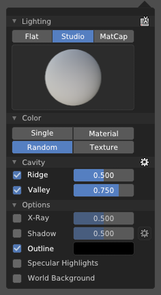
Now what’s bothering me is the shadow at the options.
I think I’d rather just see a settings button/toggle per sub-section
I have been trying to keep up with all of the rapid changes in the blender interface over the codequest and now afterward.
I will say that 99% of the time, they have gotten things right, or they have changed something that I didn’t even know was there, or never used. I enjoy the new viewport shading modes and options for hiding/showing content. I am in love with eevee so far (though there are some bugs). Collections are probably an improvement but right now they don’t work like anything I’ve seen in any other software (Are they like photoshop layers? Are they groups of objects? NO…both? What?) and I really need some help understanding them. I wish that someone would adequately explain them…
But the main things I haven’t liked (As with many users) Have been the changes to the keymap. I could complain, but what good would that do? Instead I have a few suggestions:
1. Keymap information - Maybe it exists and I just don’t know where to find it, but I would like to see an ongoing-updated list of keys that have been changed. I am tired of working with 2.8 Alpha and finding that a hotkey has been changed, and not even knowing where to look for information about that change. A simple table stating: Here’s what’s been changed, what it used to be, what it is now.
2. Keymap Tutorial - Upon nearing the release of blender 2.8, is there possibility for some kind of UI Tutorial to be included with 2.8, to update users of 2.79 of the major changes to the keymap? Such as ‘A’ no longer being a toggle, ‘Alt+A’ is no longer ‘play animation’, etc?
If not, I may have to look into creating my first ever tutorial video about this…because people are going to NEED it.
3. Pie Menues - ‘Ctrl-Tab’ is a very poor selection for opening a pie menu. It is unnecessarily cumbersome for a feature that is supposed to be all about speeding up workflow. Is there an actual behind-the-scenes/coding reason that ‘Tab’ cannot be a 2-function key?
My Proposal for the pie menus is the following, please someone tell me why this is impossible:
Tap to swap modes - If you simply tap the ‘Tab’ key, it swaps between either your last two used modes, or Object/Edit modes.
Hold for Pie - If you hold the Tab key, the menu appears. move your mouse to select and either hover or click to confirm. If you hold the key and release it, but nothing is selected in the menu, it performs it’s default function, or does nothing.
4. Space Search - At one point it looked like the spacebar would no longer be used for search. This has been changed again, but not completely. Now the Spacebar opens up a selection of the available tools. This is ok, I could get used to it, but the ‘Search’ has an unnatural hotkey in the menu. F3 is very ‘out of the way’ on the keyboard. Since all the tools that are displayed are already available in the sidebar, I would suggest that search should have a much more accessible hotkey, or be under the mouse by default.
Perhaps pressing space twice would work to activate search? In the shader editor it is ‘Ctrl+A, S’ but I know that won’t work since ‘S’ is ‘Scale’ in the spacebar menu.
5. Snap Camera to View - I use this functionality quite often when posing a character and wanting to move the camera. Unfortunately it has been removed from the (~) Camera pie menu (Because evidently the developers don’t like having two-level pie menus?). Could it be added back to the pie menu? or else perhaps another button is added to the camera widgets in the corner:
6. Create Camera from View - I haven’t seen this suggested, and it’s not in blender by default, but I can’t imagine it is that hard. Could we have a way to ‘Create camera’ and ‘Snap to view’ all at once?
Last, I have some quick questions:
Where is the best place to get questions answered regarding features that are already in 2.8, or I am unsure if are available? For instance, I was testing and trying to use the ‘Mesh Deform’ modifier yesterday and it was not working. It gave me an error I have never experienced before, but I wasn’t sure if it was because I had done something wrong, or the modifier isn’t fully supported yet. Where can I ask about this?
Where can I ask questions about eevee? It seems like the development of that rendering engine is either nearing completion or is going on in the background and no one is talking about it any more. I have a few questions about glitch-like things that have happened that I may like to mention and see if it is known about.
3 Likes
This may be what you’re searching for.
This used to be the case actually, and I saw a lot of positive feedback. Not sure why it was changed to [Ctrl] + [Tab].
Thanks, that’s something like what I was looking for. But it has caused some further confusion for me…
Reading down the page that you linked above, it states that they have implemented the very feature I was asking for on the Tab menus (Single tap to switch, hold+drag for pie), but I am almost 100% certain this is not the case in the latest builds. And further,This Page contradicts the other one and lists the current changes in 2.8 stating that they have made the pie menus into the ‘Ctrl+Tab’ option.
What I don’t understand is why this is acceptable. The original document that you linked actually says exactly what I did:
Switch Modes: Tab + Pie menu
We want to keep using the Tab key for mode switching, but make it more consistent and better suited to switch quickly to any mode. We do this by keeping the old tab-to-editmode behaviour, but also making it so you can hold Tab and drag to spawn a pie menu with all the modes available. Pie menus can be very quick to use, because you can simply flick using a gesture while holding Tab.
So I don’t understand why they would decide to do away with this…
Also, who thinks that F3 is an acceptable key to search? I do not know why double-tap space is unacceptable, or even ‘Ctrl+Space’… I honestly believe that as much as I hate the idea of moving search to Tilde, I would prefer that far more than F3, because it is very close to ‘Tab’ which I hit often.
Yeah, that’s what I mean. The behavior you suggested is what it used to be, but it’s my understanding it’s no longer the case. I’m also a little confused as well because holding [Tab] to trigger the mode change Pie Menu seemed to be well received, but I don’t remember seeing an explanation as to why it suddenly became [Ctrl]+[Tab] instead. Maybe somebody else can chime in here.
Tab + drag was a really good idea, but after a couple weeks of testing and feedback from the Spring open movie team it was discarded in favor of Ctrl + Tab.
The reasons are that it was really easy to actvate the pie menu by accident while trying to switch to edit mode, and that that system introduced some lag in switching to edit mode, caused by blender reading the release of the key.
The task linked above I think have a chaotic description 'cause changes happened really fast, and also 'cause other tasks, like the “minimal keymap” one were opened, you can still keep track of everything that changed reading the comments though, Campbell linked every commit he did there.
This is quite off topic here anyway, there are a couple of dedicated threads for keymap changes.
2 Likes
Thank you for giving some of the reasoning behind the changes. At least I know now why the changes were made. It does bring up some question of prioritizing the wants/likes of a small group of users over a consensus of the larger community though. I really don’t see why it would be a problem opening the pie menu by accident… the edit mode is literally a mouse flick away in the pie menu, only milliseconds slower than a keypress. Seems a heck of a lot like nitpicking, with the result being detrimental to many other users.
The one thing I want to know is this: Will we as users be able to change this functionality? It seems like something that is being changed at a fundamental level, rather than a customization that can be performed. I don’t mind it if I can restore the tab functionality myself
In any case, my apologies if this was the wrong thread to put this in… the top post did reference getting feedback for:
Hotkey changes to make mode switching faster and more consistent
So I thought this was the right thread to speak of them in.