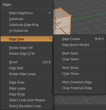
Hi, I’m wondering about the change in the Edge menu. Why were the Sharp, Seam etc. moved into the Edge Data dropdown? It adds unnecessary complexity to the menu and slows down the workflow. I understand that the menu was quite long but for all I know it never caused any problems. You have an amazing feature that aligns the menu to the last used option if you open it repeatedly and I absolutely love that. But moving those options to a dropdown effectively removes that speed increase. You want to avoid nesting pie menus because it’s slow but nesting dropdowns is slow as well. I’m just wondering what was the reason for this change.
1 Like
I’ve been using “Toggle Window Fullscreen” mode now (mostly since it stops the maddening flickering of the viewport window background between different shades of grey as I move the mouse around) and I note that in true fullscreen mode the “Remove the selected View Layer” [X] button is exactly in the upper right corner of the screen where you would expect the Windows “Close window” [X] to be.
Removing a View Layer does not seem to be an un-doable action at the moment, so this strikes me as being ripe for disaster for new users or those who are distracted etc.
Yes, you wouldn’t normally be trying to close the window without saving first, but you might have multiple Main windows or be thinking there aren’t changes and relying on the exit warning to save you, and end up losing your current view layer if you’re not paying close enough attention. You’ve gotten yourself into fullscreen mode and are now casting about for how to close the window, and your eyes focus on that tempting looking [X] right where you’d expect it to be.
What if the right-most element on the Header was a new button to toggle in and out of “Window Fullscreen” mode? I’d appreciate and easier mouse-based way to pop in and out of fullscreen mode than having to go to the Window menu for it too.
Maybe I’m just worrying too much 
Yea, what if those configure/flip icons were inside endiro/matcap ball?

I think that it would be pretty obvious that those are buttons, and it wouldn’t screw up alignment and consistency of other elements.
3 Likes
Put Top Bar inside 3D Viewport don’t work because content inside it have minimum necessary size, 3D Viewport - no.
The only way i see for this false concept to replace Toll Shelf by buttons is to give users options to turn it back…
Some kind of idiotic situation when at first somebody ( no one knows why ) does some not the best changes and then everyone is sitting and thinking how to proceed from the results of this to make it not be so bad …
I do not believe that these changes ( replace Tool Shelf by just buttons put settings inside Top Bar ) in the interface were developed by a person who has been modeling in Blender for many years, doing a serious job, working on a few monitors, known tons of hotkeys & use it all, generally an " expert ". No one " expert " doesn’t change so convenient in access, placement and form Tool Shelf for some buttons that he does not need at all.
Looks like it’s just made by someone because something new had to be done. Work for the sake of work. In 2.8 there is a lot new that I really like. But this one causes a lot of questions.
These settings compressed into this Top Bar for me feels like workflow efficiency & speed downgrade. It need to do lot of mouse extra moves to look or access to some settings. Instead just press " T ". Most of time in Edit mode Top Bar hold nothing and just stole workspace. And put it into Properties window it’s not the same as " T " Tool Shelf…
People repeatedly write about it but developers are indifferent.They replaced something that everyone use & need by something that most users not needs + something less efficient and pretend that nothing happened.
It is not the same! Properties - not a part of viewport so it can’t have transparent background and it can’ be
hide/unhide by " T " key.
If I want to have settings on my screens left in 2.79 I already have it as a part of 3D viewport. So what a reasonable reason to broke this? And why it can’t be turned back for those who need it just exactly as it was before?
3 Likes
I understand that some users don’t want it to change, fine, but those changes are making blender better/less complicated/more user friendly, trust me…
Fun fact: Did you know that the main reason people find blender really weird is because of the T and N panels? But why, you may ask… Simple, scattered information, tools, properties and settings everywhere… and 2.8 is killing some of those long time issues, which is great… so I guess we are in the right path… 
I was going to say the exact same thing. The configure icon being on the side makes for an awkward layout. The only difference I had in my mind from yours is having the icon(s) be lower-right aligned.
I have taught dozens of people, professionals, amateurs, and no one has even said a single word to me about T-Shelf and N-Shelf. At the end the old T-Shelf is not different of max sidebar, modo sidebar… In reality only maya do something similar to yout proposal and it’s the worst thing of maya for new people.
2 Likes
The issue with tool settings in properties is when you work in full screen, you don"t have acces to it.
So you need to work with the top bar, but it’s bad since everything is in popover.
That’s why a.monti’s idea is IMO the best idea.
Of course, we can keep tool settings in properties too.
2 Likes
Just to make things clear, there are many things I’m not a fan in 2.8, like:
I’m against the topbar as a place for tool settings, as it will never be able to handle it efficiently. That’s why I upvote proposals like this. In fact, once the tool settings is done I’ll probably never use the topbar.
I’m against the T and N panels because of the unnecessary confusion and scattering of information they add to the interface and the general workflow.
I’m against workspaces that exists as tabs on top of the interface, eating precious space.
And many more stuff…
See? This is what it is, there are many things I don’t like in 2.8, BUT I think overall 2.8 is STILL a big improvement over 2.7… 
3 Likes
T panel contained all tools of the program in one place, similar in all areas, with actual system the program divide the tools between different panels and made necessary to have other area in the screen to see the same information, also break coherence between areas.
1 Like
In fact, once the tool settings is done I’ll probably never use the Top Bar.
I’m against the T and N panels because of the unnecessary confusion and scattering of information they add to the interface and the general workflow.
Wait here… Casual modeler detected? He set up setting once and don’t change it newer again. Probably.
I already wrote this to one else who wants to " remove transforms from N panel " and write it to you. The fact that YOU don’t use something does not mean that nobody needs it. This only means that YOU don’t use it. Nothing more.
Did you try Vertex Paint mode workflow? All the time go up, point & click, go down to click on what u need… God damn. Who test it before implementation and say it is better, faster, more convenient then in 2.79. I want to look into the eyes of this man. Because if he say it - he lie!!!
Did you try Sculpt workflow? Each brush has it own settings. And same story. Go up, click go down click. Switch to different brush and don’t remember what’s in it’s settings, want to check it? HA HA HA!!! Go up click go down change. And like a cherry on top of this cake - popover show only one type of settings. It can’t show all at once as Tool Shelf.
Of course it all better then just press T and see all u need? Of course big scalable transparent area of Tool Shelf worse than this popovers in stripe what most of time show nothing and just give 90 - 50 % no effective workspace usage?
It looks like this Top Bar was introduced by some " expert " modeler like you and for such one " experts " as you. If you need this stripe - use it. As much as you want.
I just ask to give me and others the opportunity to turn back ON Tool Shelf settings panel as we use right now in 2.79 !!!
1 Like
You don’t get my point. It just means that there are better ways of organize things, that’s all.
But I’ll stop here, let’s not clutter this thread with this.
Cheers.
Bye.
1 Like
Calm down a little
I think everyone is agree to tell that the top bar is a bad idea like it is now, but we have to wait, test it and we will see if that must be changed.
We also can have different background and opinions, for example, I like T and N panels, it’s perfect to work in full screen and have access to what we want and the addons.
The tool settings in the properties don’t allow that, that’s why the idea of a.monty is perfect.
Right now, devs listen to us, it’s a good thing, so if we want it to continue we need to be calm and make better proposals.
But don’t force your ideas on other guys, it’s not because you think it fit your workflow that it will be the case for everyone.
The key is customisation.
2 Likes
Whoa.
Man, sorry about that, but if you can’t see/understand the interface improvements, that’s your fault and yours only.
My advice is to look at other softwares a bit, then things will become clear to you. 
Sure. You’re right. Enough of this.
It is not problem of UI areas such as T and N panels but rather problem of poorly organized information inside those areas (and this problem still exists in N panel, because for example Dimension is property but of an Object not a Tool or Viewport so it must belong to Properties Editor → Object Tab → Transform; or 3D Cursor location sliders for another example is property of a Tool not Viewport and so on).
I think this mixture of not related properties and options only possible because there is no clear description what exact Properties to put in there (and as a result there is all in one place mixed and shuffled).
1 Like
I work on full screen so anything that I can’t hide, I dont like, it includes the topbar.
Cuz you seem so upset with the changes. And the way I see it, Blender is just starting to behave more like the industry standard apps, which is great imo. So your complaints are pointless to me. 2.8 is better in every way than 2.7 imho.
Working in fullscreen is a very personal way of work, it shouldn’t be the primary point of discussion in UI design.