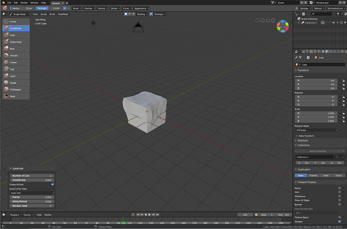
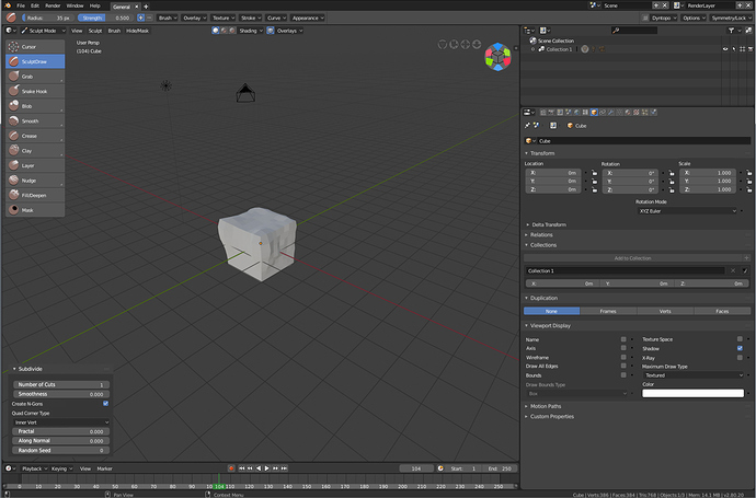
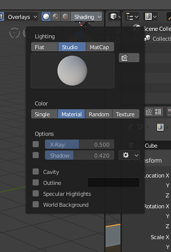
I like the one on the right, but maybe to keep consistency with some other parts of the UI, both cavity and shadows could be in “subpanels” and have the advanced settings and the toggle in the header (or may put all the settings in the subpanels) ?
I still defending the proposal from @lsscpp to improve the layout.
Yes I think we should have something like that, a check boxe to activate it, that shows the cavity options and there is a subpanel down bellow to have more options.
@Alberto Picture too small.
But the proposal from JonDoe is about two columns and two rows.
It’s possible with some manual layout if we want it:
if shading.light == 'MATCAP':
    layout.row().prop(shading, "color_type", expand=True)
else:
    col = layout.column(align=True)
    row = col.row(align=True)
    row.prop_enum(shading, "color_type", 'SINGLE')
    row.prop_enum(shading, "color_type", 'MATERIAL')
    row = col.row(align=True)
    row.prop_enum(shading, "color_type", 'RANDOM')
    row.prop_enum(shading, "color_type", 'TEXTURE')
That’s what I said:
Unfortunately with the current width of the popover we can’t fit all 4 options horizontally (Mater… Rand… get trimmed)
Nice trick! Didn’t know we could do that.
Just tested it. In practice it feels a bit awkward to have a 4 way selection turn into a row of 3
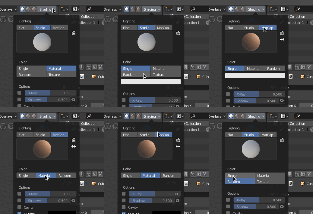
We could gray out the non-available ones but still feels awkward, since it’s the only place where we use this layout in Blender and also in case there is a 5th option in the future.
Imo, those options could stay in one row.
@Alberto Hey thanks man. Glad you like it.  Like Pablo said somethings might be a bit limited by code at the moment, but I hope I’ve helped in getting some ideas rolling.
@Wazou Thanks so much for the kind words Wazou. You’ve inspired me A Lot when it comes to Blender.  Love Your Add-ons and Thanks for all your contributions to Blender.
Not sure about the post being flagged. Maybe it’s because I linked to my post on BA forums? As a new user I was limited to 1 image per post, so didn’t want to spam this thread with single images, thought it would be easier to link to BA since we are all discussing this there too. 
@pablovazquez It’s looking goooood Pablo. You’ve made short work out of it. So Fast!  Man I’m glad I’ve got your Blendinis Rolling!
  Love how you guys at the institute get when you’ve got an idea charged up!
Wow. An hour ago we were thinking the 4 button thing was impossible. And then Brecht Happened!  Yeah it suddenly popping from a a 4-way to a single row of 3 buttons feels a bit weird. Especially speed watching it on the gif. How awkward is it for normal use if you don’t mind me asking?
Also I completely ignored the color picker for Single Color. I guess that’s what happens when you use an image editor instead of a python console. 
the problem is the different length between the 3 columns and 2 columns.
Yeah, in the mock-up I made it so everything looks like they are expanded. But I do agree, certain settings can be kept hidden behind sub-panels until you’re ready to use them. Can save screen space not having too many big things pop-up also.  Since we know sub-panels for pop-overs are coming, just thought I’d design it showcasing how it ‘could’ look like expanded/activated.
Oops, I missed that.
By the way, the hdris that once were available in lookdev mode are missing in the latest builds, in fact, the entire “world” folder is missing from the directory \datafiles\studiolights.
Hope you guys can fix that.
Thx.
Also, Pablo, do you think something like this is possible?
https://blender.community/c/rightclickselect/zMbbbc/how-about-unify-the-animation-editors
Another proof that mockup images don’t always work.
The gear icon doesn’t fit in the same space as just the icon
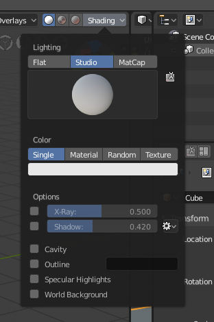
Tried removing the emboss from the icon, the popover function doesn’t seem to like it.
The gear popover looks better when it’s a bit wider, but the buttons above look empty without emboss.
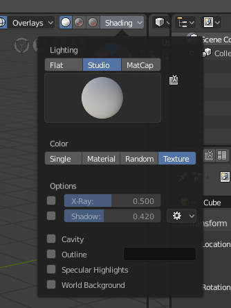
Add emboss… but the text is not centered and all is misaligned
Anyway, just trying make a point that UI takes lots of time to get it right, alignment, everything. Hope to get back to this when I have more time but for the time being, if anybody wants to have a look please be my guest! This is not rocket science, it’s just shuffling some python lines around.
Thanks for the feedback!
Where is the python code for this?
It’s not possible put the tool icon inside the matcap thumbnail?
Regnas, one important thing is that NLA editor currently is not supported for FBX export. You have to bake the entire thing to a new action. While Maya, and other softwares, work with proper animation layers, which mean that I can create an action and another action that works on top of the previous one, without the need to bake anything, and the whole group of interconnected layers exports perfectly to fbx as a new action (to then import on Unity/Unreal)… which doesn’t happen with NLA and makes you lose flexibility when it forces you to bake the whole thing, since then it becomes a jumbled mess of keyframes everywhere.
To add two action layers you have to be shuffling between NLA and dopesheet/timeline for fine tuning and moving keyframes around. One should be working only on NLA, or only on the dopesheet, just as now we are working only on the timeline instead of dopesheet/timeline.
So I propose that the merge should also consider the idea of NLA working as Animation Layers, not as something that requires you work on a different window, losing keyframe control, and forcing to bake everything to a new action for export (which is kinda destructive behavior).
Agreed and you are just amazing pablo.
