Could we have an option change the roundness of the outline?
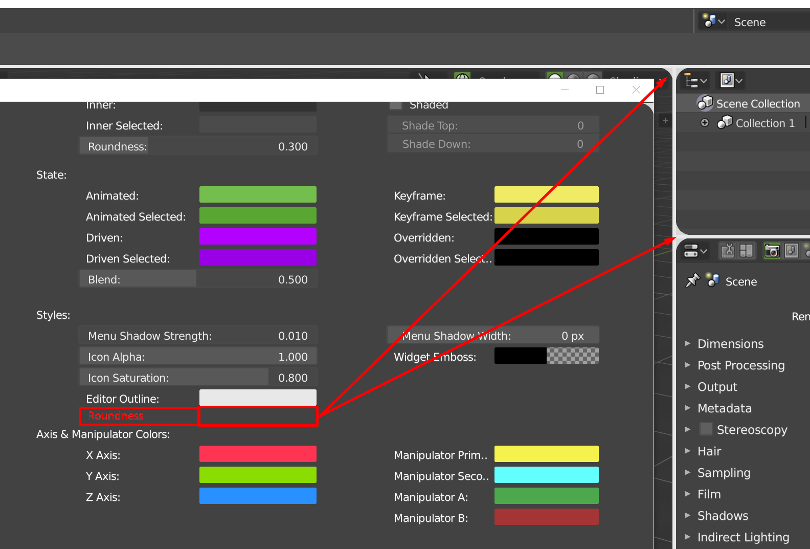
This is the only one we cannot change right now and if we use thick options, we have that full unwanted rounded corner.
Could we have an option change the roundness of the outline?
This is the only one we cannot change right now and if we use thick options, we have that full unwanted rounded corner.
Man I love you ! 
In fact I can imaging putting the outliner in it, like that we can work in full screen and call the outline with T and maybe with something like shift + Tab we could switch editor.
I really like this idea ! @pablovazquez what do you think about that?
Really cool solution!
And I can think about another solution, which is to use the N-panel (Sidebar) to house the Tool properties. The sidebar has a lot of options that could easily be rearranged without hindering the workflow. Those options were rarely used anyways. Tools settings though are used all the time.
This is the rearrangement that I can think of:
And this would be the interface with the Tools Properties on the sidebar (and the rest rearranged):
If this idea is of anyone’s interest, please leave a  so that the devs take into consideration
Agree but not with the idea of turning the “propertie region” directly into the “tools shelf” as is, it has potencial to be more practical than that.
The idea of @a.monti (with the selection menu ) was also aligned with some ideas that where mentioned previously usable by add ons and had a lot of potencial.
Not sure about:
Green: That could easily be with view types on the header, at the beginning of the week where together and the eye icon or camera can represent both, camera view properties and view by type, saves an icon space and that would put also all view, filters, overlays, rendering and shading close together with navigation tools, really nice pack.
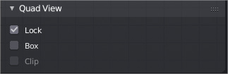
one thing missing from this idea its the quad view menu, ¿would that go in the same popover of the camera?
Red: always though that, but also its shown to be practical to have that data there or at least in a easy to view area. In practice works fine.
However this idea looks good from a user point of view, as long as some interesting is think about the Properties region.
This is killing me too… Hit me if the solution arrives… 
Hi Guys, Inspired by some unexpected insomnia, thought I’ll try work on a mock-up for the Shading Panel Pop-up menu.  Not sure if it’s a worthy effort but thought I’d give it a try. Let me know what you guys think. And if it’s good then I can try do the same for the Overlays Menu also.
Here’s a small sample. Original on Right, Mockup on Left. (Original: 240px Wide, Mockup: 203px)
@pablovazquez Hope it’s worth you guy’s time. Please let me know what ya’ll think about it. And if you need a PSD for reference I can send it over. Sorry if this is a Big F’ing Mess to Look At.
Gonna take a small nap and then hoping to tweak the width a little bit. About 15px more so buttons & sliders will scale a bit better with bigger screens. Thanks to @TheRedWaxPolice for the insight,
Since I’m a new user here it won’t allow me to post more than 1 image. Didn’t wanna spam this thread image posts. So here’s my discussion about same on BlenderArtist’s Forum. 
Hi to all, I want to show you a review of blender2.8 interface that I made. The video is in spanish, sorry, but I wanted to make a review in my native language. Anyway you can put captions in your language.
I’d also prefer this kind of layout, the new one seems quite chaotic to me, especially when Cavity is active.
There would be a loss in width for the sliders, but those are not properties for which you need that much precision (and one can always press shift to be more accurate).
It will be great if in datablock selector, blocks that are linked to a selected object would be allocated to a separate group, so that they can be quickly found. For example like this:
Hey Monti. Glad you liked the mock-up.  Yeah, the overlays could use some organizing. But I’m sure the devs will get to it in time. But in the meantime, wanted to see if I could do anything to help.
The sub-panels are already done actually! (UI-code wise they are sub-panels). Once the devs finish the implementation to support collapsing of sub-panels in popovers it will work out of the box. Same with the Overlay popover, it’s all nicely split into sub-panels, they just can’t be collapsed yet (needs real work from the actual developers, not something I can do unfortunately).
Unfortunately the double-line radio button is not possible to do. They have to be either all horizontal or vertically aligned, the layout engine can’t break radio buttons into two lines like that.
Agreed this should be a setting, since we have roundness for the whole UI. Looked at the code, unfortunately this is super complex. The whole editor is not just a big widget with rounded corners like a button, it’s actual geometry on top of the corners. It would take some work to get that done at least for a mere mortal like me. As for the real devs I’d rather have them fix crashes and bugs at the moment.
I brought this up in a meeting last week, it will be worked on.
That’s great news Pablo.  You guys have done a mighty awesome job with the 2.8 UI so far. It’s easily understandable that some things are not possible with coding alone. I could figure that much out for sure. It’s easy to make mock-ups in an image editor but end of the day, if the code doesn’t allow it. There isn’t much we could do yeah.
Really looking forward to the new sub-panels for pop-overs. Would definitely help clean-up the clutter.
Also I do apologize if my mock-ups were looking a bit too ambitious. It was never one of those ‘I Want THIS’ kinda things. Just wanted to share with you guys some ideas that was running in my head.
I just finished my last edit on this mock-up. I know not all of it can be implemented at the same level, but hope it gives you guys some ideas. — Can’t seem to link to my post on the BA forum anymore. 
Thanks again for all your hard work on the UI & Theme Pablo. Appreciate it Big-Time! <3
PS: While editing I noticed, the blue selection color of the Lighting/Color Buttons on the shading menu are a bit duller compared to the blue color for the Ridge/Valley Slider.
I’m really surprise that this message have been flagged by somebody.
Rally cool your popover proposal JonDoe
People are stupid!
Well done JonDoe, it’s great
Maybe that could be like this to follow other parts of blender.
It’s good to see mockups that push the limits of the current layout system. It’s actually good to see both, work within the limits for a quick implementation, and push the limits.
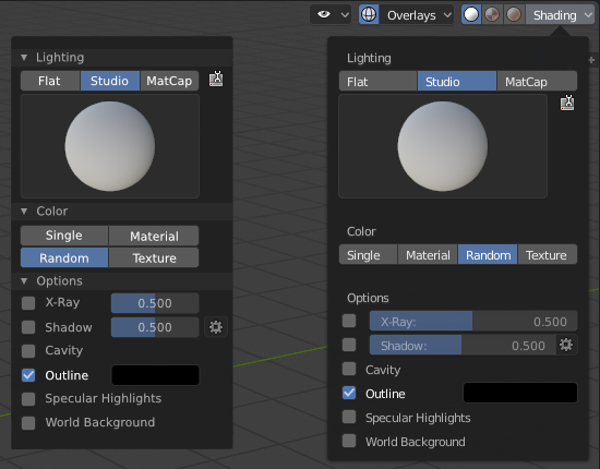
Unfortunately with the current width of the popover we can’t fit all 4 options horizontally (Mater… Rand… get trimmed):
^ Ignore the Options panel, only did the top column split (which looks very nice btw!).
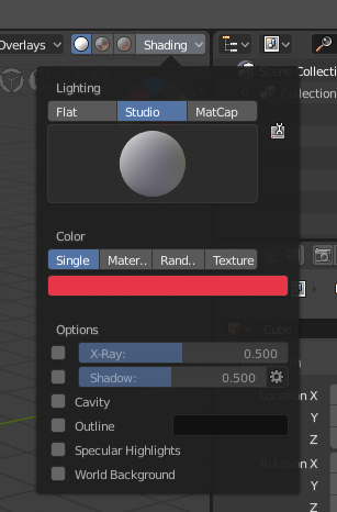
I’m a bit busy at the moment with other stuff, but tested quickly having all 4 color options vertically and maybe we can brainstorm some layout like that, the color option looks good because it’s right next to ‘Single’, but then some of the other options won’t work well (like Outline checkbox + color picker).
^ Again, ignore the Options panel layout
Yeah, strange. I just unhid/unflag it.
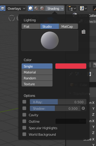
I still prefer those option in one row 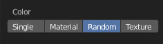
Also @pablovazquez please don’t make the buttons too short to the point that we can’t read the entire words there.