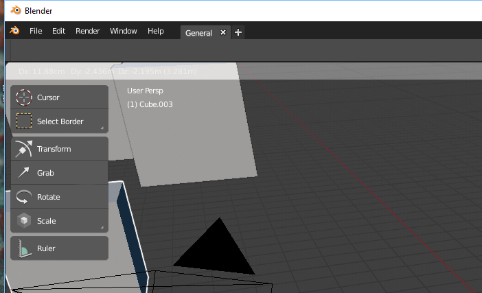
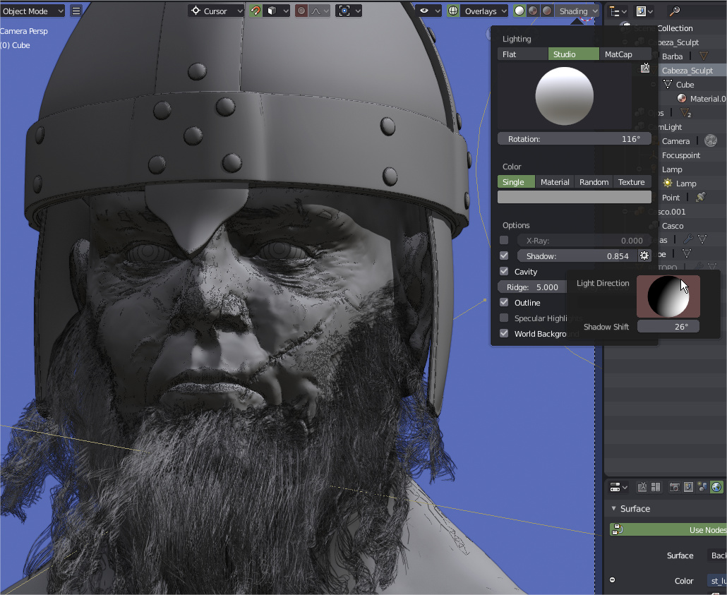
+1 on this, the idea behind having all the shading options in the center was good, but after twenty to twenty five hours sculpting and modeling in 2.8 it started to become annoying, its not going to be consistent trough editors and may jump when switching modes but its better to have one more thing poping than having popovers over the model that we want to configure to see properly
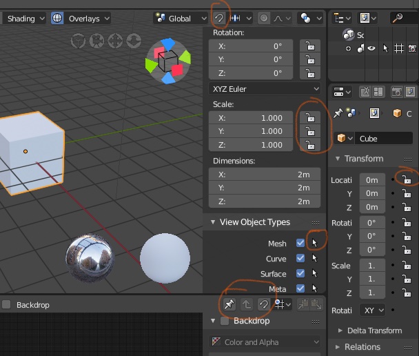
totally agree with this, also next to “view object types” in the header inside the same menu could be also “View” properties, that way we have full control of the viewport, shading, camera, display etc. in the same place and leave Properties shelf for object properties, custom properties and some other add ons goodies.
So-so agree with this, as long as those options are globals the position its not wrong, however if a popwindow its added to the workflow like in the drivers that could be convenient to use also here, solve two problems without need to change how viewports work or change too many thing in the interface, just a little button or even an option hidden in the contextual menu to bring a child window with Viewport Display and SSAO high lighted
+1 in this too, also solves the potencial space problem in the status bar.
NOTE: reading the forums and watching videos its interesting to see how people call that shelf “The N Panel” and not the properties shelf or properties region
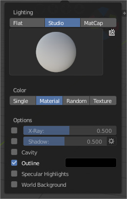
Downloaded latest june 11th build and they changed shading pop over a bit , yesterday i posted about how big is shading pop over and this happened , is this coincidence or are they listening to every Blender User and every post what we made , so nice of you guys (Blender Devs) , you all.
maybe one could try to change the popovers into a landscape format, I did a quick photoshop mockup, not entirely happy with everything - but just to get an idea how it would look like.
One could argue that some of the elements could also be removed, so for instance I dont think the matcap/hdr preview needs to be that large or does even need the ball preview - its fine if its shown while changeing the images. the titles Lighting/Color/Options could eventually also be leftout if there is no room for it.
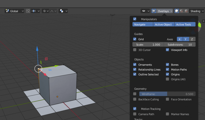
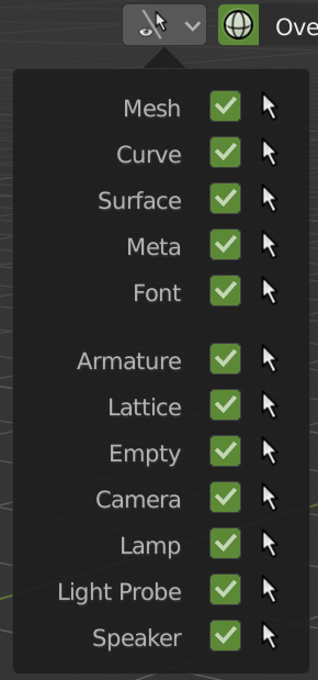
The Shading & Overlays Pop-Over menus have been moved back to the Top-Right side of the viewport as it was before. And the View Object Type menu also has been added back and grouped with those two menus. All 3 View Menus together again. Like a Happy Little Family!
Like all the users have been suggesting, the Shading & Overlays menus made more sense being in the Top-Right corner. Mainly so it doesn’t block what’s being worked on in the center of the viewport, while changing different settings in those menus.
And the View Object Type menu fits perfectly in with those two menus. Mainly because it will be easily accessible for new & experienced users alike. Quick Access while working & Easy Discoverability for new users.
Also it’s good to see the new layout of popovers with left aligned text and text INSIDE slider instead of the new column style with text out of sliders and aligned to the right.
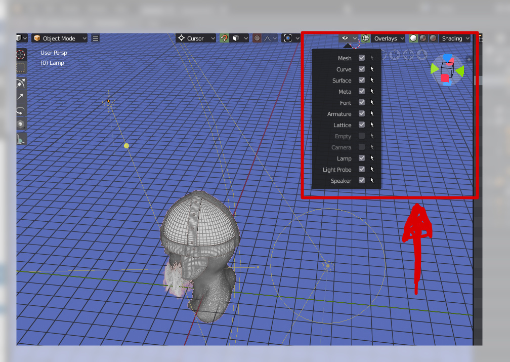
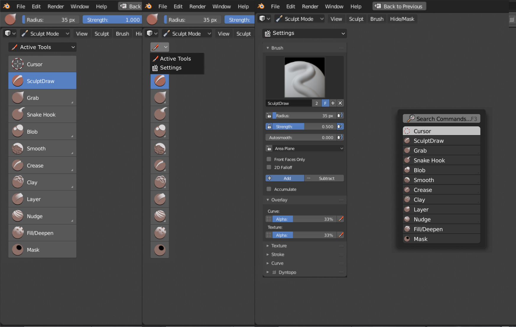
About the View Object Type Menu, I donb’t know if it’s possible or not, but when you make “Select All” the program select all objects, also objects hidden by this feature. COuld be good if when you make a selec all and you only see the lights the operator only affect to lights, for example. Instead to affect to mesh, empties,… that you don’t see in that moment.
that its also happening with the “non-select” icon (the little arrow) in the collections, unselectable with right click but “A” select the objects any way, ¿may be a bug?
Anyway, I think this could be a compromise for toolbar and tool settings, that probably are still the most controversial things in 2.8.
While keeping everything quite simple, without tons of tabs in the toolbar, it would allow to access the tool settings tab in any situation, also when the 3d view editor is maximised or in full screen mode.
I know that there’s a logic fallacy in this for, if the topbar is hidden, you would theoretically need to first select a tool and then switch to the settings, but active tools are always available pressing space.
So, basically this would define two completely different workflows, a default one with active tools in the T panel + topbar, the other “more professional” so to say, with active tools if needed selected with space, and tool settings in the T panel.