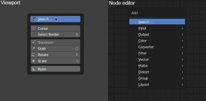
Like my partner Alberto I have created a small mockup where you can see
that the concept is similar to adding nodes popup.
Currently the mouse appears right on the active tool. If it is modified so that the mouse always appears above Search then you only have to press spacebar and then click to start searching. In this way, the spacebar hot keys would not be lost, as the search would be activated with a click.
I think that would be intuitive and easy for everyone.
That wouldn’t work, 'cause S is assigned to the Scale tool, I think that the best solution tried so far for the search function is still that design but with double space.
Ah, sorry, I saw the S underlined and I thought you meant that
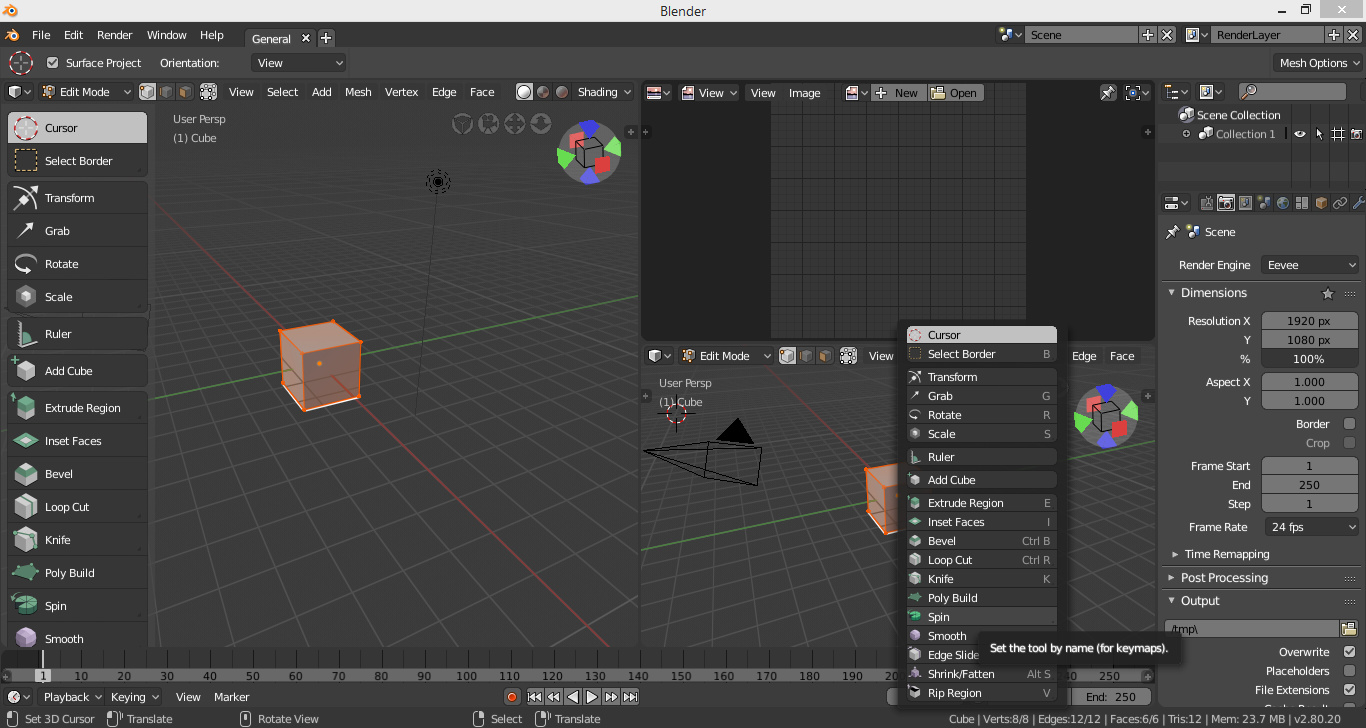
Anyway it’s not always true that the mouse appears on the active tool, in a situation like this one for example there wouldn’t be enough space for the pop-up and so it starts from the bottom of the screen, in result the mouse it’s on a pretty random place (it’s on the spin tool, but Greenshot doesn’t capture the cursor).
Also, I’m personally used to leave the mouse before actually pressing space for search, obviously I’m not sure, but I think that’s quite a common habit.
With your left hand you give the space with your thumb and with your right hand you already have it in your mouse and click, I think that’s the most common thing.
Yeah but as I said the mouse can’t always be on top, if you press space while the cursor is on the bottom part of the screen then the active tool pop-up (at the current state) will end where the status bar begins and so the mouse will be on a random place.
There would be a couple of solutions to this: having the popup going over the end of the screen, with a scroll bar, or having Blender to take control over the cursor position.
I think I would hate both of them, and I don’t know if the second one is even possible.
The auto-merge vertices option is missing from the snap area in the 3d view. This is an EXTREMELY important part of my modelling workflow, so I just wanted to make sure you guys were aware. Is that option available somewhere else in the interface?
I’d like to thank @pablovazquez and @brecht for addressing some of my concerns… I understood the clear reference of them on the last video, for example the concise window mode for the second monitor.
Even if there are things that me, or others, still don’t think were for the best, I guess time and general use will indicate clearly what needs to still be improved. Everyone sees the world from their own perspective so there’s a tough choice on what would be the best for the majority.
I know this is just the “first” step on a lot of changes going forward, everything can change if not until release, on further versions. Keep doing the good work @devs.
I just started 2.8 alpha, it looks good. but i have 2 ux issues that i think are making things more complicated
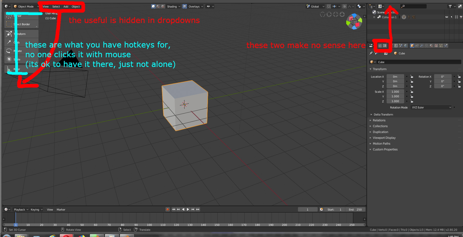
tool shelf changes (T) - the useless stuff you have hotkeys for (move. scale…) is in the toolshelf, and the useful stuff is hidden in the dropdown menu. IE. I never scaled anything by clicking Scale in the toolshelf, but many times i change shading flat to smooth there.
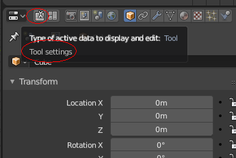
The first three tabs in the properties panel are extra, they feel like they are ought to be somewhere else in the UX
Please think carefully… Those tabs will contain properties and settings of things, obviously they need to be in the properties editor… But you want them in the outliner, seriously?
Properties editor contain properties of scene and world, not tool settings, are different things. In the same way taht properties editor don’t have preferences of the program, or viewport properties, or UV editor properties, or UV editor tool settings,…
Hi, thanks a lot for improving Blender. I like it a lot. This is my feedback / suggestions:
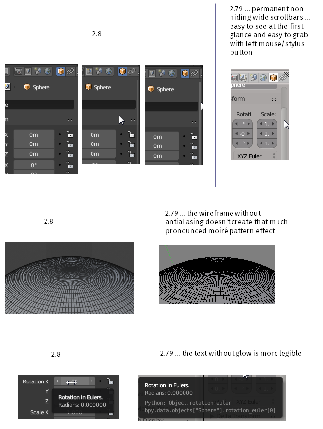
Scrollbars:
Please give users an option to switch to the classic non-hiding fixed-width (wide) scrolbars. The thin hiding toolbars are very hard to grab and you have to wait for them to appear. I work with a stylus and sometimes after hours of work my thumb gets quite sore (the middle button on my Wacom Intuos 2 stylus is a bit chiseled), then I start using the left button (pressing the tip of the stylus down on the surface) as much as possible - this means grabbing the scrollbar with the left button instead of scrolling with middle button.
The great thing would even be the user-configurable width of the scrollbars.
Wireframe antialiasing/smoothing:
It would be great to have an option to disable the wireframe antialiasing.
When the antialiased wireframe is dense it is giving me more pronounced moiré effect which is not pleasant for the eyes.
Tooltip text glow effect:
There is some kind of white glow around the white text in the tooltips. The glow makes the text fuzzy = hard to read, unpleasant for the eyes. Please consider removing the glow effect.
Classic wireframe:
Maybe I have missed something but is there a way to display a mesh as a classic wireframe (like in Blender 2.79 and probably every other 3D app)? I know you can get really close to that - I have seen the Pablo’s video “Wireframe is back” (or something like that) but the wireframe mode still had a slight shading. I would like to have a classic solid wireframe lines without any change in thickness or opacity. Sometimes it is more useful than any other shaded mode or pseudo-wireframe mode. Please add the proper wireframe mode (like in 2.79) back if it’s not already there.
Yeah, that’s exactly what we’re criticizing. Why else would we be talking about it? And by the way I have given you other examples that would be just as ridiculous as putting the tool settings there.
It would be very clever to criticize something that has not been made (“This phrase is sarcasm, so you don’t get confused”).
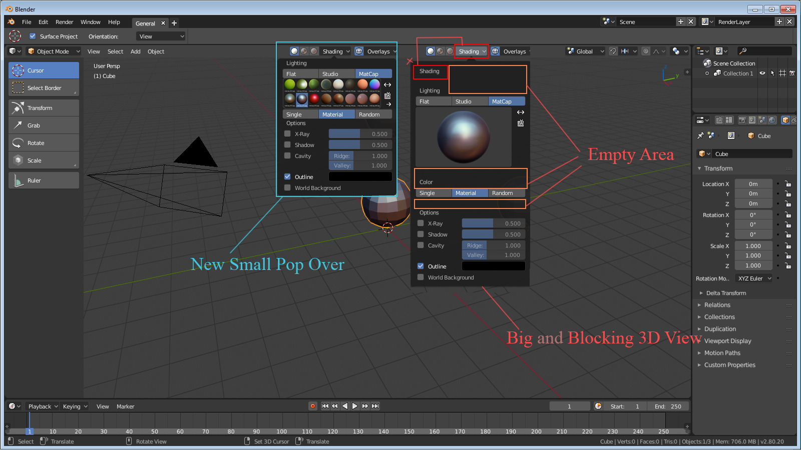
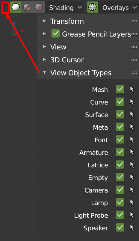
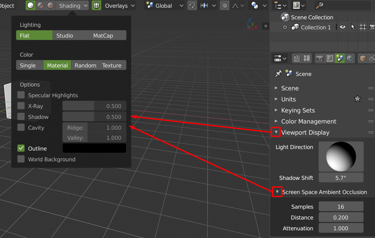
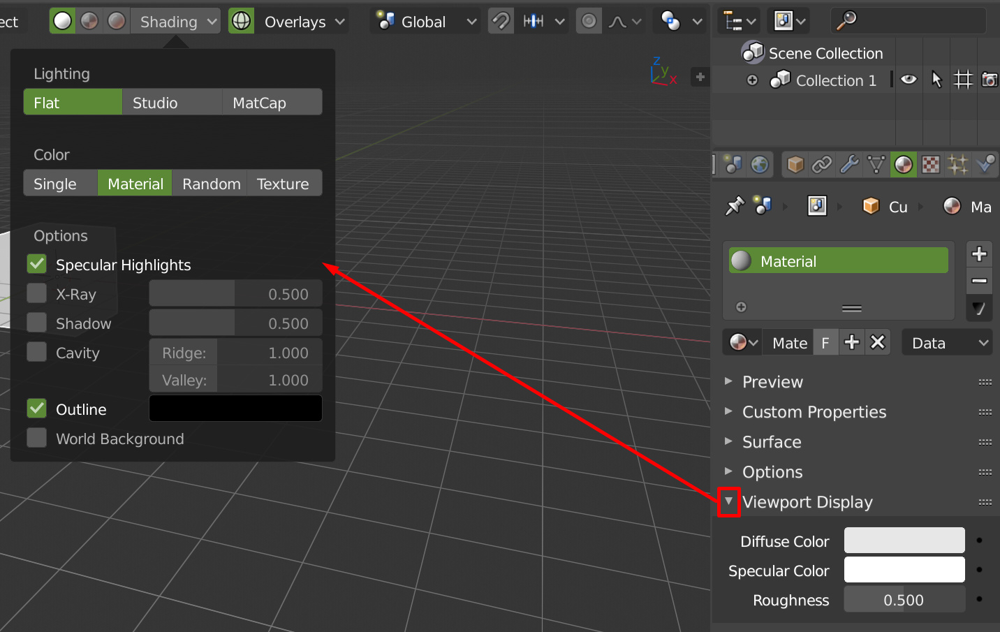
Specular Hightlights needs options in the popover for the entire scene, it’s bad to have to add shader to change it. Same as for cavity, put the options in the popover.
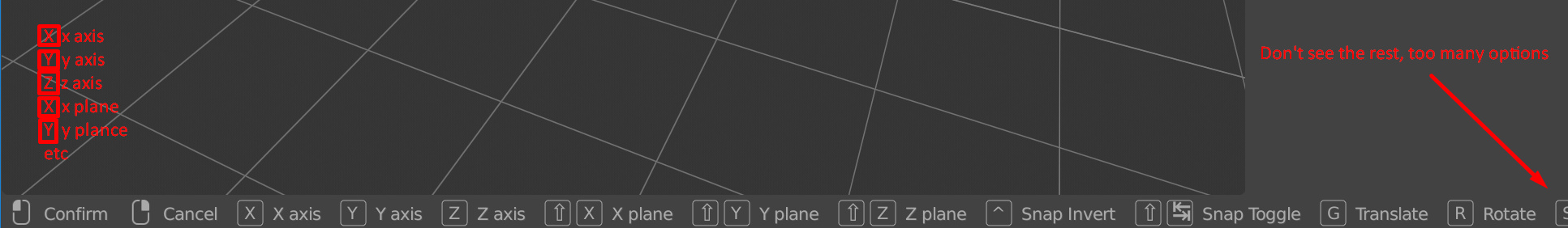
Status bar is nice, but not to place modal keys in it, if people hide it, they will never see the options. And having it at the bottom of the screen is also bad, the information must be in the 3dview.
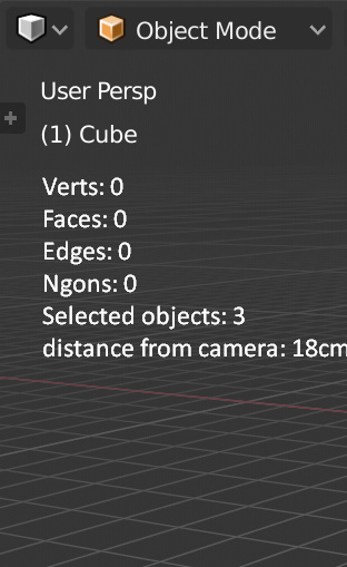
Same for the vertex/edge/faces count, in the 3dview with an option in the overlay popover to hide hor show it. That also need more work, to see ngons, to work on selection and not on the visible objects etc.
Hello, welcome to the group! I agree with your feedback! Except moving stuff to the outliner.
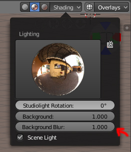
Also, can anyone tell me if there is some way of controlling the Background Blur? I know that some months ago the background didn’t have blur, then they added what appears to be a 80% Blur more or less, but I never saw a controller for it. Does it exist?
If it doesn’t would it be tough to add it to the Lighting popup?
Here’s an example:
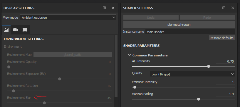
Blender can be an excellent tool to paint (PBR) maps and sometimes a greater control over the BG blur can be beneficial. So much so that Substance Painter has this option very accessible: