It could work like the snap button… one button to turn on off (and that stays highlighted when on as per theme setting) and the arrow to have its setting in the dropdown as you illustrate.
What i like about this, and i was going to propose myself, is to do away with the text ‘overlays’ and ‘shading’ for the related button groups and just have the dropdown arrow. These don’t give any context, and the only reason these seem to be there is that they are new sections. Compare this to the dropdowns for mode and transform orientation that have text since these texts change on context choosen. Will also give less clutter too with the header going past the n panel.
Those menus are important, the text not only serves to make the menus stand out, but to increase their size make them easier to click on.
It also makes them easy to find if you have an idea what you’re looking for but have never used 2.8 before, whether you’re entirely new to 3d, came from another app, or came from 2.7. Most of the other menus either have super clear icons, or are fine being a little less discoverable, because their use is much more niche.
Imagine trying to find the shading options for the viewport, or the overlays, only to discover they’re under a small icon in the corner, that looks similar to a bunch of other icons around them - their appearance in that instance belies their function & importance or impact on the workspace.
As for the proportional editing, you still need to show what kind of falloff you’re using, and whether it is enabled (and what enabled setting it’s on) regardless, so you’d only shrink it by the space of an arrow. Having the enable setting in their own dropdown keeps things more organised in my opinion, it keeps the menus shorter and options closer to the mouse too.
paper cutting myself with this:
current right of 3dview header:
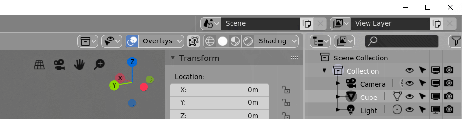
Drop the text from the shading and overlay dropdowns, these don’t give any usefull contextual info, in contrast to transform orientation or mode dropdown :
Even then, i find this overlap of the header and the n-panel too much clutter, so give option to let content of header align to wherever the n-panel expands to:
3 Likes
Still, the proportional editing icon should show it’s enabled/disbled status per theme colour. It does so in object mode, but not in edit mode.
So the button group should have three parts in edit mode then, one on/off that highlights, then an icon + arrow for regular / projected / connected type, then an icon + arrow for the fallof type
It would need an additional icon too for the three types, enabled and regular type is now the same.
1 Like
When that text is removed (just add text=“” to space_view3d.py line 302), the resulting space for the dropdown menu is exactly the same size as all the buttons immediately beside it. So if hitting that is difficult then so it would be with all our small buttons. If that is indeed an issue, them maybe that should addressed separately. The minimum element width could be increased for example if we needed to.
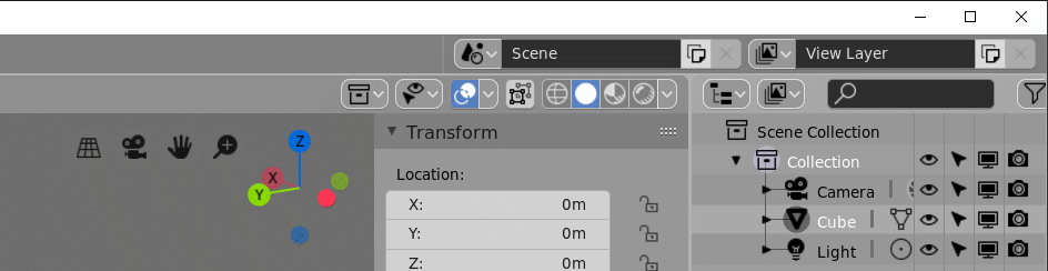
Following is what it looks like now if you remove “shading” and “overlay” text from those widgets by just editing the python file:
1 Like
Their size and how easy they are to click on are proportionate to their importance, relative frequency of use, and number of options they hold.
It’s got nothing to do with being difficult to hit the button, it’s got to do with UI/UX hierarchies.
1 Like
i like to have the empty area of a panel visible, be it with a lower opacity.
right and left click already pass trough, middle mouse button not.
But it does seem quite coincidental that all the other buttons are fine but that particular one is made just the right size when you add the word “shading”? So then in Chinese it would be too small? Should the edit mode component selection buttons be made much larger?
You’d need not only an opacity tresshold, but a contrast tresshold between the pixels on either side (given theme colors can make it the same opacity or not, but then the contrast of colors could also come from a model…
You’re nitpicking, the size isn’t the only factor, and the particular size is irrelevent, the main point being it is different, larger by any amount would theoretically do. The fact it’s text and not an icon also sets it apart, these things all combine and play a part.
Also given chinese characters are typically larger than english ones, and the translation would I believe use two characters, the button would still be larger anyway.
the 2 main themes (light and dark) could use some tweaking indeed.
I did some for myself, but since there are many inconsistencies and no global / override setting yet i’m waiting a bit to go further with it.
Sorry. I am a bit anal with these things so it can sometimes seem like I am being a dick. But really not nitpicking; more trying to get a more detailed explanation from you about how you see it. We all look at things a little differently and sometimes it can be difficult to explain exactly why we see things as better or worse. And in this case it does appear that your better description is much different from your initial statement where you included “increase their size make them easier to click on”
It doesn’t show text of selected type for snapping and pivot point right? which i think it should, those are contextual and the icons take time getting used too.
Are these also editable in the python file?
What would make this easier to edit for each users’ preferences, would be to have a 'right’click menu on the button widget, now it passes trough and shows the header options. Then you could set it to show text or icon or both per widget.
Still, to have more discoverability and context awareness, for new and experienced users alike, show text too for snapping and pivot, just like transform orientation…
I think the menu items should come first after the editor type, aligned left.
then the mode / type dropdown together with it’s relevant icons and whatever centered or aligned from some fixed position at maximum of all menu’s of all editors. Some editors even have both a mode and a type dropdown. So the menu’s jump all over the place now, while they all have at least view.
then all display and shading stuff aligned right.
or maybe the mode all the way on the left… not sure every editor even has a mode or type.
was there ever a consideration to have both a header and a footer ?
To be a bit more clear, it should be taken into account the visual hierarchies and content-linked styles of elements that exist consistently in the ui currently. To do that, let’s look at the edit mode header.
In this header alone their is a general hierarchy of ui elements and consistency in what elements, menus specifically, cover.
In a generalised order of top to bottom (you could swap some I’m sure):
Icon + Text + Arrow
- Important list, typically a mode change which alters the entire editor.
- Orientation gets one I think because the icons don’t really display the current setting well, of all the editor types I briefly checked, it seems to stand out as being an exception.
- Object interaction mode menu, orientation menu
Text + Arrow
- Large panels of various loosely related settings.
- Overlays, Shading
Icon + Arrow
- Small, typically ‘pick one’, list of related items, maybe one setting.
Pivot point, Snapping menu, proportional editing setting, falloff setting, collections, object types visibility - The editor type list whilst long, still fits the theme of the icon+arrow, and gets a pass for being consistent in every editor
Text
- Generic single column menu everyone understands, bread & butter items inside.
- view, select, add, mesh, vertex, edge, face, uv
Button-Bar
- Toggle-able quick-list
- Shading type, selection-mode
Toggle Button
- When you want a checkbox accessible on the header, but don’t want to use the text space that comes with it.
- X-ray view
Arrow
- Missing
The particular order is up to interpretation, but generally you could consider that a descending order of visual distinctiveness.
So, my point in general would be that swapping the text + arrow with just the arrow would lower the distinctiveness of these large setting-filled panels to either the bottom or near-bottom, and relying on nearby buttons for context, too. It would also bring them closer in design and look to the icon+arrow group, when they don’t really hold the same types of pick-one menus or tightly-linked settings behind them.
3 Likes
But would you not agree that, at the very least, the “shading” and “overlays” text is still out of place with the rest? For the Shading menu to be like “Edit Mode” or “Global” it should instead say “Solid Display”, “Wireframe Display”, or similar as the mode changes. We don’t have anything else that just shows the type of input only.
The one input says “Object Mode” or “Edit Mode”, not always just “Interaction Mode”. Similarly we show the word “Global” or “Local” rather than always showing only “Transform Orientation”.
“Overlays” and “Shading” are the only ones I can see that are like this. “Scene” and “View Layer” shown at top-right might seem like it, but only because our default scene is called “Scene” and default layer is called “View Layer”. LOL
Edit: I do see something similar in the Timeline, where we have “Playback” and “Keying” bring up popovers. So there are a few things like them.
I also want to point out (as with my earlier post) that the same “visual distinctiveness” can be achieved with a more distinguished spacing (between and around) each element/button.
Its general layout (and organization) can help with this visual distinctiveness too.
I personally like the icon+arrow (not icon + black-dropdown-button arrow though) for something like the overlay options, but due to its importance, it also must stand on its own (and therefore must be spaced/separated accordingly.)
Just my two-cents.
I’m not sure what you mean. Are you suggesting to make it like pivot or collection visibility, where it is one element with both icon and arrow enclosed in the same box? That doesn’t give us the on/off toggle we have now. Or are you proposing something else or new?