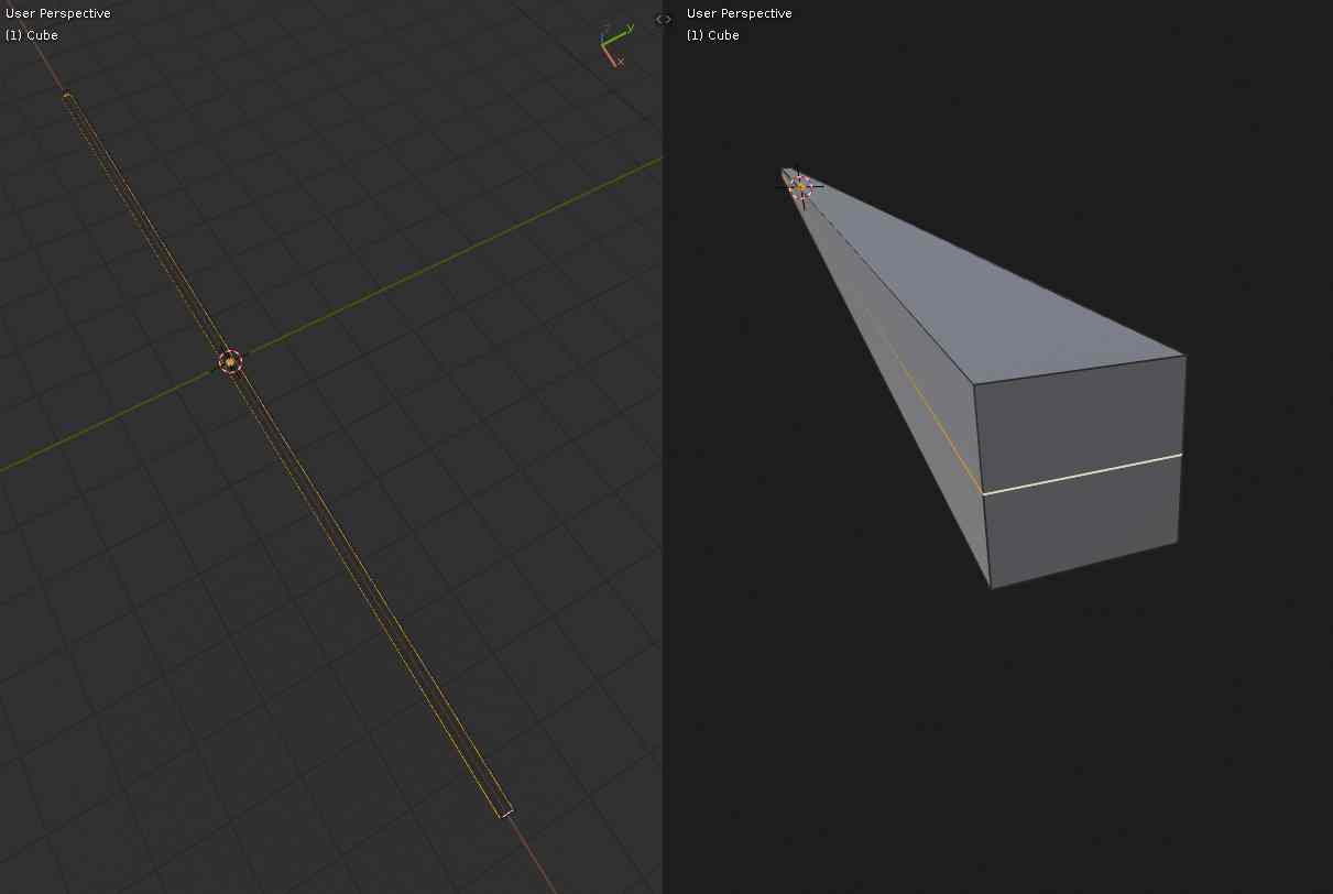
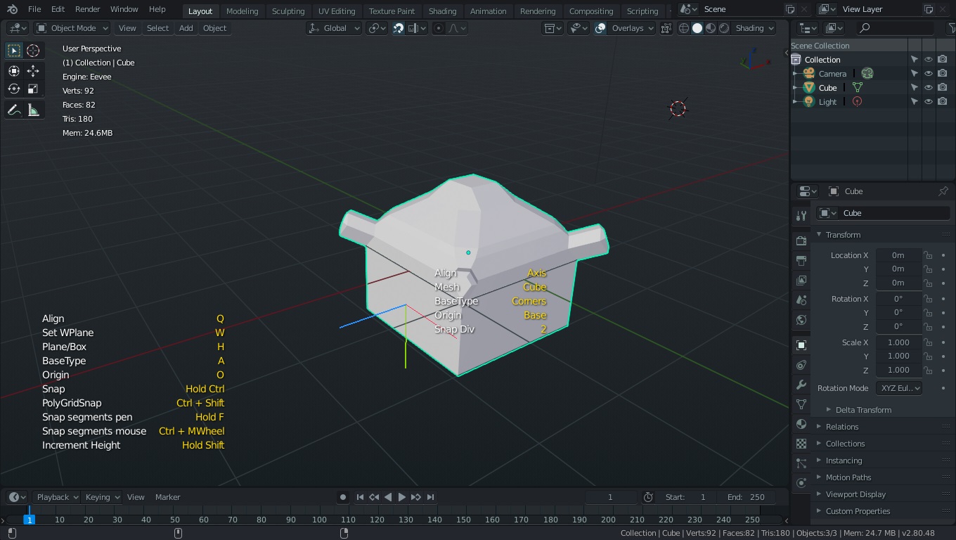
The image above would be a simplified example of the problem, but many times, doing a complex selection on a large model I would like to rotate around the active element (like rotate around last dab on texture paint mode) because it might be a complex part on a corner occluded by other geometry, but the view obviously rotates around the whole selection and I loose the focus, forcing me to zoom out, rotate the view, then zoom in again…
So the less intrusive way I can think of would be to have: “CTRL+ALT+MMB” to rotate around the active element.
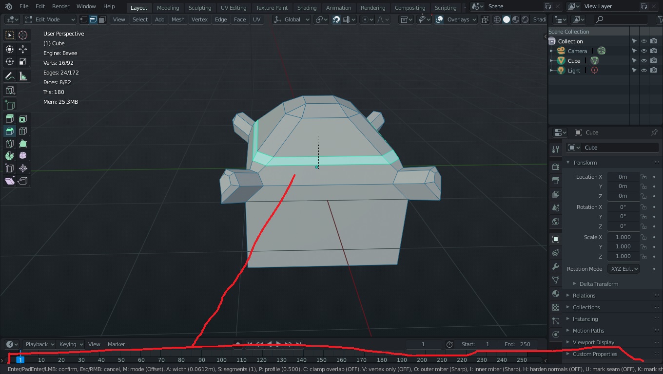
The Subdivide tool is really good for creating edge loops along the paths that do not form an edge ring (hence the loop cut won’t work there), but unfortunately, performing subdivide will result into selection of additional surrounding faces. Since Subdivide tool only creates edges, once it’s confirmed, it should result into selection of only those newly created edges, not surrounding faces too:
That is awesome, originally I was thinking it would be slick to have it aware of whether things are selected and offering what was relevant. It would be nice to save UI space and objects could be added in one click (their 2D counterparts would be in the drop down.) But having UI change based on selection might be tricky to code, it might visually be jarring having it change every time someone clicks away, and some shapes can’t be organized that easily without an odd shape one… also might make add-ons like extra objects difficult. So I after all that I see why the linked version is more applicable, thanks again for letting me know they are pending.
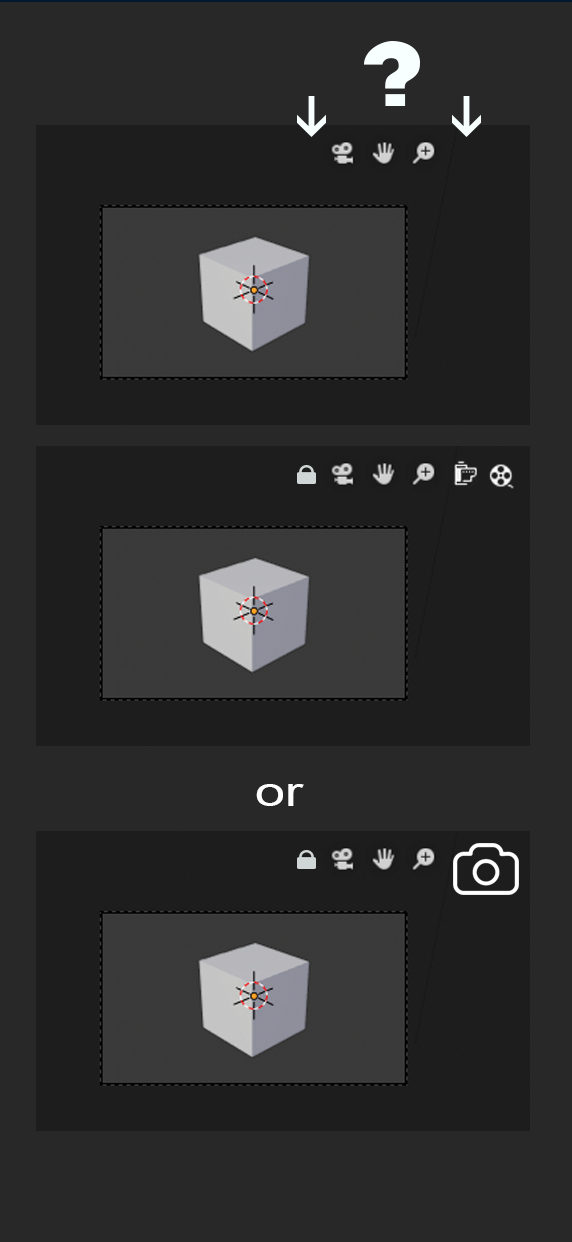
There not being a Render Button has always bothered me (i believe there is a thread on this somewhere if anyone wants to link it for me). So I just realized that when clicking on the camera icon in the viewport that the Perspective and directional Gizmo disappear, which makes room for the very relevant render button. Something else I really could make use of is the camera locking to viewport option (I never remember how to do that).
Edit:
the top is current, the next two are my possible proposals.
the use of the bottom line that lists the possible shortcut combinations is very inconvenient for more complex tools …
therefore, since it is becoming common use in the community, especially for the most popular blender addons, to use a clear and readable help list of shortcut combinations for the various tools, why not adopt this mode officially?
I’m not sure I like that as a permanent solution. Then you have a keymap info box and an adjust operation panel coming up whenever you use tools? Not very elegant.
I think a good compromise would be making that bottom status bar more legible for more complicated tools. The use of icons like in the new 2.8 tools would make it a lot more readable.
I was looking in to how to do this in the code, but I didn’t find anything yet. It seems like it should be an easy thing for a newer contributor to do.
Obviously I also don’t find it convenient that every single combination of shortcuts is listed … Especially for the most common ones that are now memorized … so the bottom bar doesn’t even look at it …
But for the more complex tools, I would prefer that the shortcuts are quick legible and clear, at that point, I want to take a quick look to find the shortcut I need, I don’t care about “aesthetics” … while I work, not I want to spend precious time because I can’t read what I need
and this for me would be one of the most useful aids, because obviously I don’t remember all the possible shortcuts for every single tool.
So my opinion is that the various addons developers do very well to write these on-screen helpers
and then … in the end, there has always been flexibility …
who doesn’t like them, a click and turn off or on again depending on the preference …
Please add “Single Scene” view in Outliner for less visual clutter when having several scenes in Blend file (Checkbox - show all or just active).
Add automatic unfolding/folding (showing active scene objects) when switching scenes (as checkbox option for each outliner instance).
Add option to show only objects that are visible in viewport (active collections) in outliner Scene View (This was possible in 2.7 as Visible Layers mode). This would help better to work with multiple collections - to minimize visual clutter when you want to work only on one specific collections (i.e. one asset).
Fix selection hilighting for multiple selected objects in outliner Scene View (Sync viewport selection with outliner and hilight all selected, not just last active object)
FYI, #4 would break the ‘selected’ filter view, and make it really hard to do anything with.
I’m not sure why the entire filter menu vanishes when switching the outliner to scene display mode, though, seems odd. In the view layer display mode it also highlights all selected, not just the active, so maybe those features just haven’t made it over to the scene display mode yet?
The only problem that i see with that is the constant pop that you have in the viewport. In 2.79 is better because the info is inside viewport, not in the bottom.
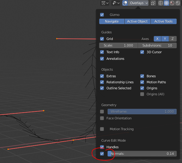
There should be an overlays toggle for the weird “fishbones” of bezier curves.
Converting a bezier curve to a nurbs curve doesn’t convert it as much as it completely destroys it.
Smooth isn’t a modal (or even a tool) that can be… smoothly… applied to control points, like scale for example. Rather it harshly just “jumps” to whatever it thinks is one step smoother.
A nurbs curve doesn’t automatically begin from its first control point, but rather weirdly behaves like a subdivided surface with no sharp edges. That’s not how nurbs curves behave in other software (like Autodesk Alias). I also see no easy way to make it behave that way.
There should be a “symmetric” bezier handle type that doesn’t allow one side to be longer than the other. (How do you even symmetrize handle lengths?)
Ok, wow, so the contents of the overlays drop down actually changes depending on where you are? It’s not a context menu, so that wasn’t apparent at all.
Also, “normals”? Fishbones aren’t normals to me, so I wouldn’t even think it applied to them. Plus, switching off all overlays while editing the curve didn’t remove them either, so it was pretty confusing overall.
But thank you for the information! I still hope some developer looks over this.
Normal is a pretty apt description, since they represent the current rotation of any point along the curve, you can see the effect if you have something follow the curve or transform along it, it uses the normal to determine ‘up’.