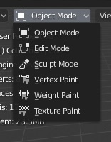
They saved within User Preferences. It actually written in tooltip.
They saved within User Preferences. It actually written in tooltip.
Ah… thanks. This is pretty confusing though. No new user will ever figure that out  Even with the tooltip, which just indicated it is saved as an user preference, not that the user preferences need to be manually saved on top
It makes sense to me that quick favorites would be a preferences-level thing - I don’t think what you store there would be specific enough to a particular scene to justify it being saved with the file. On the other hand, adding stuff to it is so fast that I wouldn’t mind having to save them all over again when starting a new scene…
Quick Favorites should be saved and loaded with the preferences, but also saved each time that you make any change on it.
Well, I would
I also think it should be saved with preferences, not scene. I was just not sure, because I thought it doesn’t save at all. It should really be saved anytime something is added to it, not requiring you to open preferences and click “Save Preferences” button every time you add new entry to it.
I think they should be saved immediately. We could also do that for preferences in general - most apps don’t require a separate confirmation to save user preferences.
Autosaving preferences without explicitly pressing a button has been requested many times already, but since it’s still not done, I assume it’s not that easy.
I’d love to see the save preferences button finally gone and preferences being saved immediately.
Blender prefs is way too complex to have that…
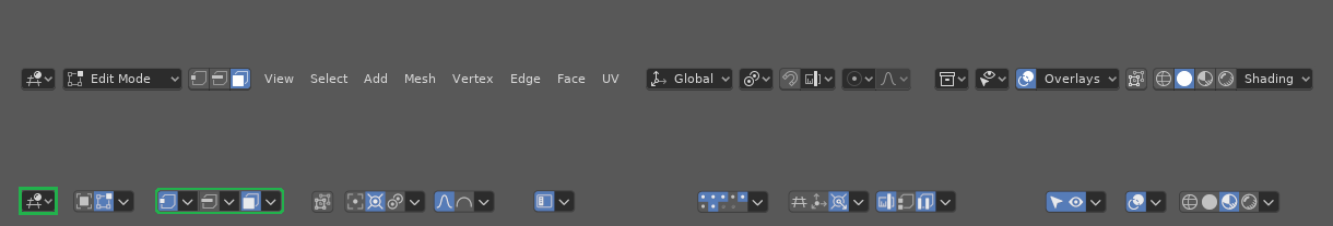
After some tweaking/reorganizing, I got something really usable out of your setup:
The concept is simple –
Left – (Global) Editing Options / (Local) Tool Manipulation Options / (Local) Scene/Viewport/Edit Menus
Middle – (Global) Scene & Positioning / Snapping Options,
Right – (Global) Screen/Overlay/Display Options.
Arranged with most-used concentrated toward the left-middle, with minimally-used options on the far right, using spacing to distinguish each visually, with no more than 3 groups at a time before space is necessary.
What changed:
I removed the vertical dividers from between the groups for less visual clutter, added a highlight on the leftmost button (to visually separate it from the edit mode functions). Most importantly, I added more sensible spacing and organization based on (related) global or local aims – This was key.
I also compressed the menu dropdown (near proportional editing) to manage the View/Select/Add/UV popups.
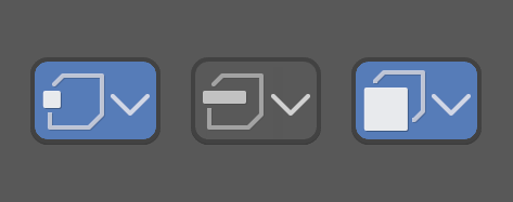
I’m not satisfied with the edit mode dropdowns highlighted in green. I feel like those should be “long-press each button for its respective dropdown menu” – otherwise, toggle the face/vert/edge mode on/off upon simple left-click. A super-tiny arrow/dot in the bottom right-hand corner of the button would indicate the “more options” concept.
Basically, it’s somewhere between a straight-up dropdown and a button-click (depending on how long you click the button) – since RMB in the header is already taken, this is a great alternative.)
That’s cool. I find it fun to play with this stuff.
Personally I don’t like current (2.8) alignment where we put some things to the left, some in the middle, and others on the right. It seems to work well at some theoretically-perfect program width, but loses any advantages when narrower and puts options in the far-off hinterland when very wide.
With that exercise I had tried hard to make every part look and behave as close to identically as I could. But if you relax that it can get a bit nicer. Click on the left of the button to quickly toggle, otherwise the menu itself also has an “enable” option as the first item…
maybe it’s a matter of habit, but at the moment I do not understand anything…
the part that troubles me the most is the lack of text menus
is not an opposition to them, is that at the moment with the only icons I do not understand anything
would it be too wasteful of space if instead of the arrows down there would be the texts in the most important cases ??
I would also need the abbreviations, for example:
view slct vrtx edge face mesh uv obj ..... ovrly
flanked by icons … obviously
here too … the text “mode” and paint "is not so essential …
and you save space …
and finally, thinking about it … I think it’s convenient to have a little more area where to click instead of an arrow down, I find it too meticulous … especially with high resolution monitors …
That example takes the header, and turns it into a row of seemingly randomly spaced buttons and highlights, diminishing the visual distinction between any of them, and of the highlight selected state itself. It’d make using the header into a matter of memorizing glyphs and searching between icons that don’t stand out from eachother.
Now that’s how you create button soup, by throwing a ton of buttons onto the header that all look very similar.
What–?? You don’t like my work of art!?
How cruel!
I guess it’s true – Haters gonna hate. Hate. Hate. Hate. Hate. Hate.
__
lol
In all seriousness though – Agreed. – So what buttons do you think “look very similar” exactly?
Also, keep in mind I didn’t pick the icons/forms. I simply rearranged the existing ones from @Harleya’s experiment as a personal experiment of my own. I only tried to make it more usable and clear by using nothing but the button form factors defined by @Harleya’s experiment. This was nothing more than an attempt to show how a simple rearrangement of those same elements proves to “tidy” up the interface in a very similar way a shirt laying on one’s bed can be folded and still “tidy” up a room. My example image wasn’t meant to “tidy” anything up itself – it was meant mainly as a way to show how things can be “tidied” this way.
Remember, this is an experiment – not an answer.
@nokipaike’s concern about the “no text” form factor of the buttons arises from this same (experimental) limitation of the buttons’ form factors, and the limitation of my edits being based solely around arrangement. This can’t be fixed without edits to the actual icons though.
@Harleya actually alludes to the solution to the visual “similarity” of the buttons you brought up in his reply above (i.e. just use a different way of visually representing the button – like in @nokipaike’s case, with the black BG and text, or a different style of dropdown.)
Essentially, the visual similarity creating the need for “randomly spaced buttons” can be solved quite easily with different visual form factors – and thankfully, Blender is quite adept at this.
However some organic (i.e. your “random”) spacing is still necessary despite the button form-factor.
Why?
The eye needs a place to rest during long journeys across the interface – and the wider the interface is, the more interesting and visually-distinct its landscape needs to appear (with more frequent and spacious places for the eye to rest – i.e. positive and negative space) across the whole journey.
There is another drawback to the horizontal layout:
But I’d go on to say that adding an extra dimension of vertical space (i.e. another row of icons, perhaps let a button/dropdown occasionally take up both rows of the header) reduces the necessity for extra “random” spacing to keep up with the eye’s need for horizontal variety across increasingly wider screens. This variety is necessary as it stands because, again, it gives the eye a place to rest between visual information, which reduces the overwhelming strain effect that visual clutter has on the eyes and brain.
Expanding on the above “dual row” header concept, each panel should be starting on the leftmost panel (or screen border), organically spaced for grouping horizontally. No panel or group should be fully right- or middle- justified either.
With each additional element or change I described above, the rest of these design/visual issues could quickly be alleviated.
Not sure if this can be considered a papercut or getting your finger chopped off in a blender, but would it be possible to add middle mouse button functionality while dragging noodles, like in substance designer?
Select one of sockets while pressing Shift, navigate to the other, then select it too with Shift, then press Fkey (as in Fill, same than when modelling meshes and you want to “fill”).
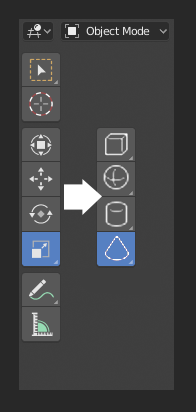
When nothing is selected, the transform tools can’t be used so it is better to put in there place an option to add something those tools can work on. This also gives a chance for better organization, the little down arrows would allow the cube to drop down into a flat plane, sphere to circle, you get the picture. Most other software has ‘add mesh’ UI immediately available which I always thought was missing from Blender.
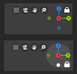
Also, I always wanted a way to lock the view at an axis, I imagine a lock symbol is mostly transparent until you hover over it. These two quick concepts may not be the best example, but I would still find the function very useful.
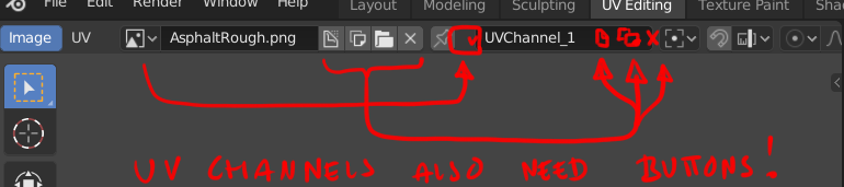
Having never edited multiple UV channels in Blender before, I’m at a complete loss.
There’s a very rudimentary channel input box in the UV Editing workspace, that actually has a drop down list, but doesn’t look anything like the drop down lists found in the rest of Blender’s interface. Also, I see no way of deleting a channel.
When I do select the channel I want to edit, unwrapping from the main viewport still affects the original channel, not the one I chose from the drop down list. 
In new ui need little bit longer time for swap mesh material to world material