And why can’t the collections show parents as it does when filtering out collections? To me it would make the most sense. I mean whats negative about it?
1 Like
Because those children may not be inside that Collection. To view the scene hierarchy, change the Outliner from View Layer to Scenes view.
This is just a suggestion, but I was thinking that maybe “Lock Camera to View” should be more visible. New users can have difficulties in spotting that option… Maybe it could be moved on the top, where you already have navigation icons. Or maybe in a corner of the camera frame.
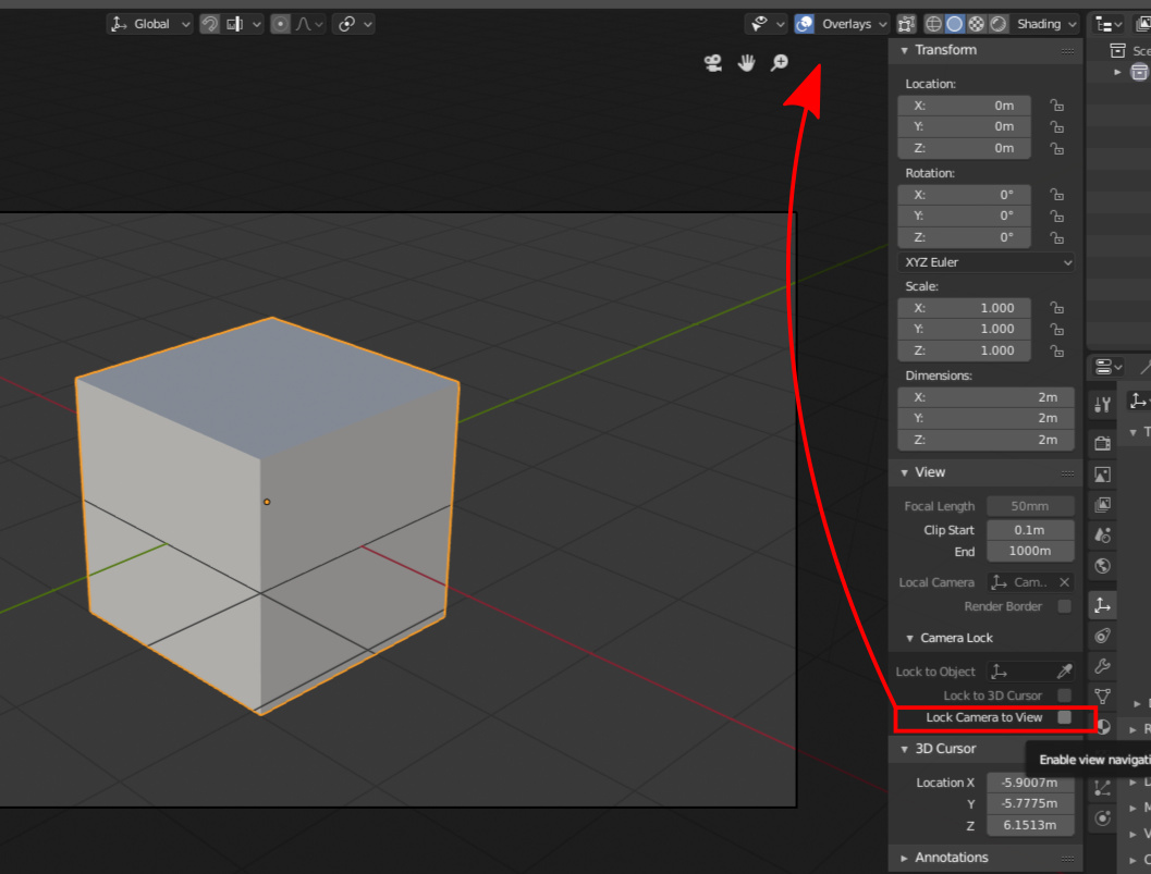
I think that it could be usefull for old users as well, because people uses it a lot.
Btw thank you guys for all your work!
16 Likes
yes that would be great and will be totally consistent to how you do it in the viewport too, mmb and drag in a direction should constrain to the desired axis!, i had envisioned this a couple of days ago!
1 Like
I understand now thanks for pointing that out. I see it could be more versatile being this way.
I actually opened a proposal on RCS about this exactly. If this gets approved I can take it down there.
Thanks for all the suggestions folks!
Over the next few days, @pablovazquez and I will go over them and add some of them as tasks on our developer portal here:
https://developer.blender.org/T56950
The criteria for picking papercuts are:
- Feasibility (has to be a small isolated issue, not a huge feature request)
- Good fit (The issue or suggestion must fit with the overall design of Blender)
- Papercuts only (No bugs, glitches or full feature requests)
You are still welcome to keep posting more in the meantime.
7 Likes

the resize time range buttons are interfering with window splitting so often because now it’s possible to split from all 4 positions, this wasn’t an issue in 2.79 since it was from the opposite side…maybe making them bit bigger or change the shape to arrows, whatever u guys find it appropriate, thanks.
4 Likes
Is this a one time possibility to improve blender or it will stay alive on all the developement time of Blender.
If we can keep this and continue to improve the software indefinitively, it’s a good thing IMO.
5 Likes
moved my thoughts to a different thread ![]()
1 Like
Flashing icons really annoying, please add the way to disable this icons.
I think they not so useful even for newbies.
Not constant info position some tools here another one there.

2 Likes
I posted about the very same problem just a few min before you, here:
(because the header of Properties seems like a bigger deal than a Papercut annoyance)
2 Likes
you are right. I moved my post 
1 Like
It’s not a one time thing. It’s meant to be an approved list of todos that are (hopefully) small in scope so that any developer can pick these up.
There’s no promise when these will be done - it’s really up to developer interest. But, one of the problems we had in the past was that many developers wouldn’t bother with any UI tasks to avoid lengthy discussions and heated debates. If we can make a nice list of small todos that are pre-approved, I hope that more developers might be interested in helping out fixing these kinds of small niggles.
7 Likes
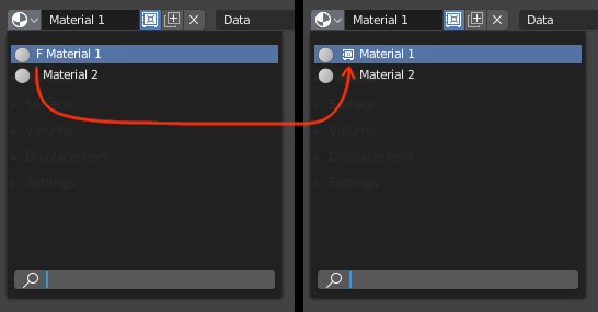
The F for “Fake User” in has recently been changed to a save icon. But in the name, the F is still displayed. It should be replaced by a small save icon.
Maybe instead of a the 0 for unused datablocks, there could be an icon too?
15 Likes
You can hide that bar the only problem is that the project and objects information will be hidden too but I think those are planned to be moved inside the viewport? I think that would be a wise move as those won’t be related to many other areas of Blender. I also think is kind of hidden down there and it could also be added as an overlay on the viewport which could be turned off too if needed.
1 Like
If it’s just UI fixing, I think everybody knowing python can do it.
The thing is how to make a patch and present it?
Pablo should make videos for that kind of stuff IMO.
2 Likes
yeah, but what about tools info like Knife, and some other info like baking progress errors, etc
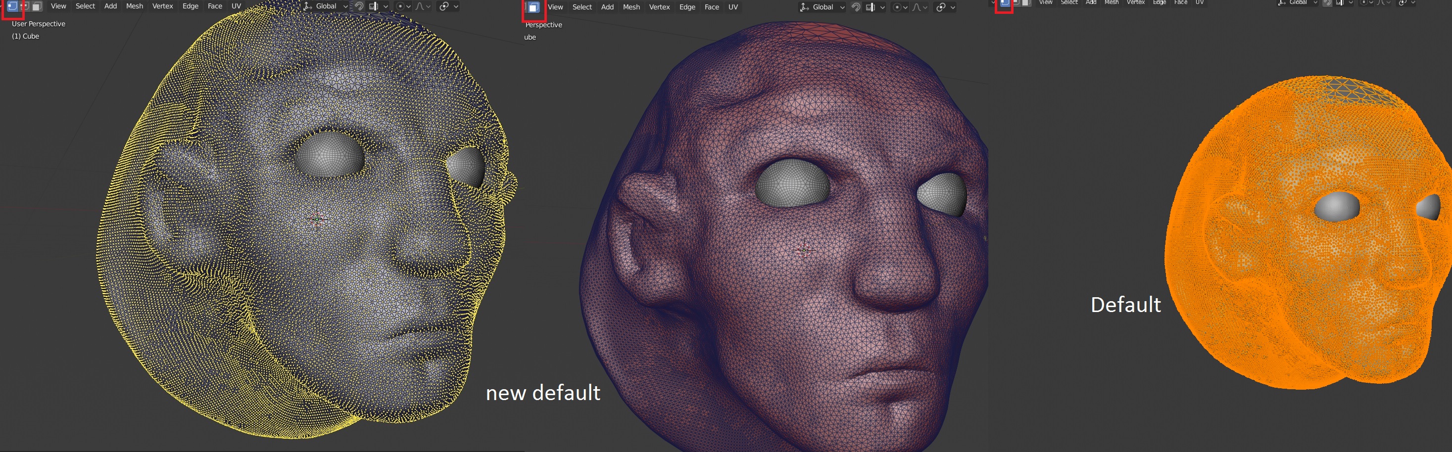
possibility to show only the appropriate display for selected component, right now it kind works because you have to toggle face shading on and off each time.
working on heavy meshes makes it not very readable by default settings.
I thought the knife info would be at the top like other tools, for instance, inset settings are within the viewport. Does anyone know why the Knife info is at the bottom instead of like the other tools?