Now that we can work on multiple objects a batch renamer is needed.
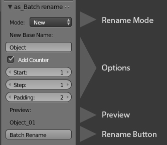
Came across this [Add-on] as Batch Rename - Released Scripts and Themes - Blender Artists Community
Now that we can work on multiple objects a batch renamer is needed.
Came across this [Add-on] as Batch Rename - Released Scripts and Themes - Blender Artists Community
Even simpler would be if Properties would always propagate to the selected objects. This way, if you rename with multiple objects selected, it would automatically propagate without needing a special batch renamer.
For sure cleaner… but . .whatever would be easier to implement .
I personally would not mind going to Object > Rename Objects .
Thanks William for the answer !
I unfortunately cannot implement the proposed improvement as I know nothing about coding… maybe some day. Do I add this proposal in the UI Paper Cuts (Parent Task) developer.blender.org or do you manage that ?
Hopefully this kind of improvements provide greater consistency 
EDIT: ok, thanks ! Have a good night 
I can add it. I was holding back on adding too many things there at a time, until we have more of the first batch done. Otherwise it could get overwhelming. I may add some more though.
This may be a little thing but surely useful for new people to blender.
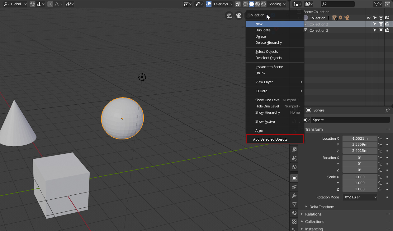
Add Salected Objects to Collection into a drop manu
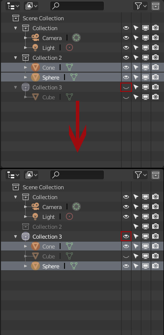
And this is probably a bug or my way of thinking but moving objects to hidden collection unhides collection. It should stay hidden.
Could it be possible to use DIFFERENCE as default for the boolean modifier?
And activate merge on the screw?
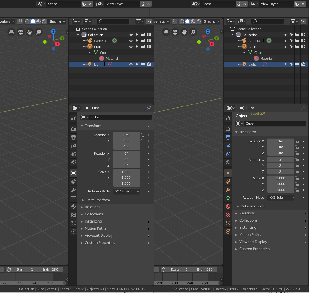
Properties Window > Coloured Tabs: to help muscle memory with a better categorization. Some kind of colouring, not exacly what I suggested. The example shows how easier it gets to remember and to find the wanted tab.
And fixed title, since there is only icon tabs and mouse over to check the title name is kind of counter productive.
Totally agree with this!!!
This color differentiation would help A LOT in general!
At least separate the three main zones, maybe not color for the icons, but for the background, or the other way around, I don´t care, but some color differentiation would help a lot there.
(Configurable via theme of course)
Cheers!
I like this one a LOT – Colored tabs (by object or tool association) will definitely differentiate the functionality and make things easier to find at a glance.
A separation gap (even a slight one) between the colors would be useful here too.
@billrey – I think a splash of color (on an otherwise grey interface) would work more practically here!
I think my biggest gripe with Blender has always been that I could never find what I needed at a glance, even if I already knew where to look. When you’re in the state of “flow”, it gets tedious to have to mentally note that the “mesh” functionality is on this tab, the “rendering and materials” are on these tabs, and the “bones and animation” are on these others. Oh, and then the “general scene and object settings” tabs.
Sure, I am working on a patch to do this, as part of the theme. It should be fairly easy to do with the current system.
No undo in the shader editor…
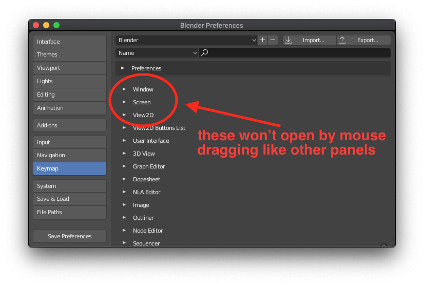
today I noticed that panels inside keymap settings won’t open and close by mouse dragging like those panels inside the properties editor
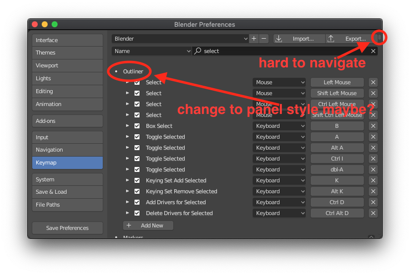
by remapping keybindings in keymap settings a searched keyword is resulted in a long list of editors with operation bindings that match a searched criteria. Long lists result in short scrollbars makes which makes vertical navigation challenging. Could bullet points be changed to panel headers instead (this would allow closing panels by mouse dragging)?
That would be nice. But currently, they aren’t actually panels, which is why they act a bit differently. One solution would be to turn them into real panels, which is possible now that we can do panel nesting.
Wow, I’m really liking how preferences is shaping up!. However, I just noticed a papercut due to the new default width of the window.
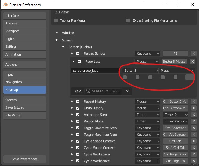
The keymap is even more squished and visually-broken by default now. Perhaps a new layout is needed here. Here’s a pic of 1 example (some sections are worse if there’s another level of indentation):
Thanks. This should be easy to solve simply by turning the checkboxes into toggles, and/or by giving them slightly more space.
it sure would be nice if those would be real panels. ctrl + click would allow us to open specific editor with its bindings and click + drag functionality would also improve usability