UI inconsistency:
Merge vertices isn’t a submenu (requiring two clicks), while Snap vertices is…
(Snap vertices is also missing its Shift-S shortcut hint.)
UI inconsistency:
Merge vertices isn’t a submenu (requiring two clicks), while Snap vertices is…
(Snap vertices is also missing its Shift-S shortcut hint.)
I swear I read somewhere (perhaps this very topic) that you could enter new transform coordinates for multiple objects instead of just the active with some keyboard shortcut. But there’s no evidence of this in the UI. I think there was a color indicator once you hit the correct shortcut, but I can only find the little dot which turns the input field yellow which indicates animation…
EDIT: Friendly irc person told me it’s alt-enter. It really should have a button as well!
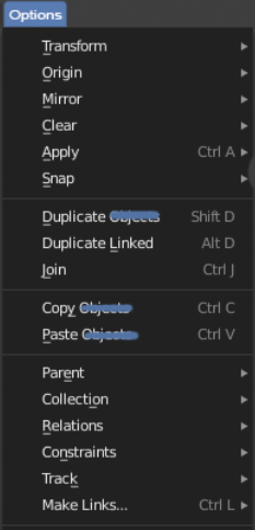
The name “Object” in the view port has always confused me, I always click it expecting to see objects. I have no clue why it is named that so I renamed it to “Options” because it also starts with O so it feels familiar. I wanted to call it Edit since they are all editing options but but that is already used. 
I scratched out the other Object word to clean things up since adding the word object makes it feel like the option is limited to solid objects… There is also the Obj format to add to the confusion, it generally isn’t the clearest word to use in my opinion.
Yes this I agree with a lot, one rarely uses the 3D cursors location thingy, and though the annotations is even more used, still I think it’s not necessary to have it so much in your face.
I also had these concerns, and made this quick mockup: Blender UI paper cuts a while ago
There are a couple of odd things about the Top Bar design that I wanted to share:
Topbar is divided by 2 vertical separators. These separate the left Tool specific options and the right general Mode options (as far as I can see).
Having 2 separators creates a 3rd space in between that is basically the designated “empty area” which doesn’t seem helpful.
I was confused when I noticed this if there is ever a set of buttons & options in this 3rd area. If there isn’t then maybe one of the separators should go.
The Topbar is visibly connected to the workspaces.
It looks like there is a direct connection between what workspace is selected and the content of the Topbar (similar to the tabs in the Properties Editor).
But there is none. Perhaps this is meant to mean that the set workspace is opening up to the content of everything below but the Topbar is visibly separated from the rest of the editors.
Maybe there should be a horizontal divide between the workspaces and the Topbar. The highlighted workspace still looks like the current one anyway.
In the render Dimensions panel,
the number of the pixel is called Resolution.
According to Wikipedia Image Resolution, that cite Guideline for Digital Camera Specifications, the notation “Number of pixel” should be used.
Normally image dimensions are expressed in pixel and resolution is expressed in dpi:
despite the fact that both can be used in speech (as evidenced by Wikipedia) it is good to be precise…
A quick confirmation can be obtained by creating a new image on Photoshop:
Size is used for the pixel count while resolution refers to a physical medium, and therefore the reference to dpi inches is used.
I propose to change the word Resolution in Size.
Thank you,
Rickyx
Not only that but on a small screen resolution such as my cintiq 12wx the right side gets completely cut off and there is no way to access what is in there, effectively making as of now half of the top bar completely useless in for an example sculpting and texture paining use cases.
These suggestions should be reversed.
1 & 2 should actually have those panels pop-out of the respective tool icon on the LEFT toolbar when right-clicked (to invoke their options panel, sort of how the images literally appear in your example - minus the red arrows, which should be pointing left…)
3D Cursor tool options should be where the 3D Cursor tool is (visually) to the user – not hidden-away down under some old-school Photoshop-style collapsable menus that force you to dig for the relevant settings/options – The same goes for Annotation tool.
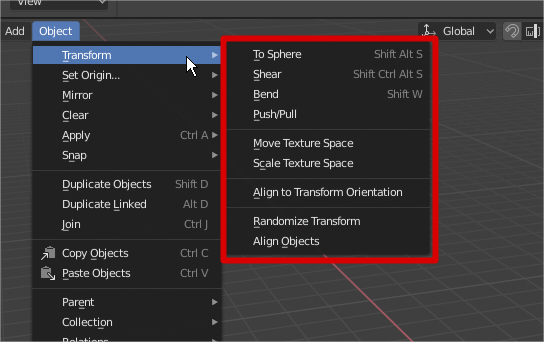
This operators are missing from the transform menu
Grab/trasnlate G
Rotate R
Scale S

Are these paper cuts being worked on still? I’ve seen so many good ideas but I have yet to see so many of them implemented in blender…
Why can’t I drag and drop objects to parent them in the scene view in the outliner, and why isn’t the scene view the standard view yet?
The layers view is FLAT, so it shouldn’t be the standard to view a hierarchy! (Also, why the heck is it called “layers” and not collections?)
So many inconsistentcies and non-industry standard Ux bullsh in the outliner still. 
Currently, this view does not allow you to see the objects inside the collections, so that would not be a good default choice as it stands.
They are called Collections.
I posted this elsewhere, but I’ll paste it here as well then:
Since many years back, the outliner is by far, the worst part of Blender for me. Blender is getting better, but the outliner is still so illogical and convoluted that I actively try to avoid using it (I actually switch to Max instead). ![]()
It’s super late so I sound extra cranky, but here’s another outliner video before bed:
Granted, these may not be paper cuts… more like a kick in the balls.
Ton Roosendaal said he wanted a beginner mode for Blender, and I really want one too where I hope the outliner is stripped of all it’s stupid stuff. An UI is not supposed to make you angry, is it? Well, the outliner is bloody succesful at it.
The core developers are focusing more on bugfixing at this moment in time. There should be time again before 2.80 release to do some additional UI-related fixes.
In the meantime, other developers are welcome to contribute patches!
i just realized in blender, somthing abit confusing vers 2.8
if i ned to edit materials i have to go into the Shader editor
But if i want to edit settings for the Shader editor in preferences
then in preferences. its called Node Editor, not Shader Editor
Abit confusing
This settings are not just for the Shader editor. The theme settings for the Shader, Compositing and Texture editors are all controlled there, so makes sense to have a more generic name, I guess. Maybe it should be in plural “Node Editors”, so we would know it affect all the “Node” editors…?