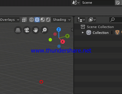
Area splitting is quite a pain.
I can’t be the only one, who has this trouble with splitting the area in Blender 2.8.
Sometimes, I need up to 20 attempts of dragging the corner of the area before a new area is finally created.
Area splitting is quite a pain.
I can’t be the only one, who has this trouble with splitting the area in Blender 2.8.
Sometimes, I need up to 20 attempts of dragging the corner of the area before a new area is finally created.
I know that pain, until I realized the area is bigger than what you visually think, just drag a little bit more far appart where the cursor icon changes for now, but the draggeable corners should be bigger and chamfered as in the original proposal mockup and for some reason I guess they still haven’t changed that.
The active area for splitting/joining has some issues right at the corners. I have a patch in that should make it easier, not yet reviewed.
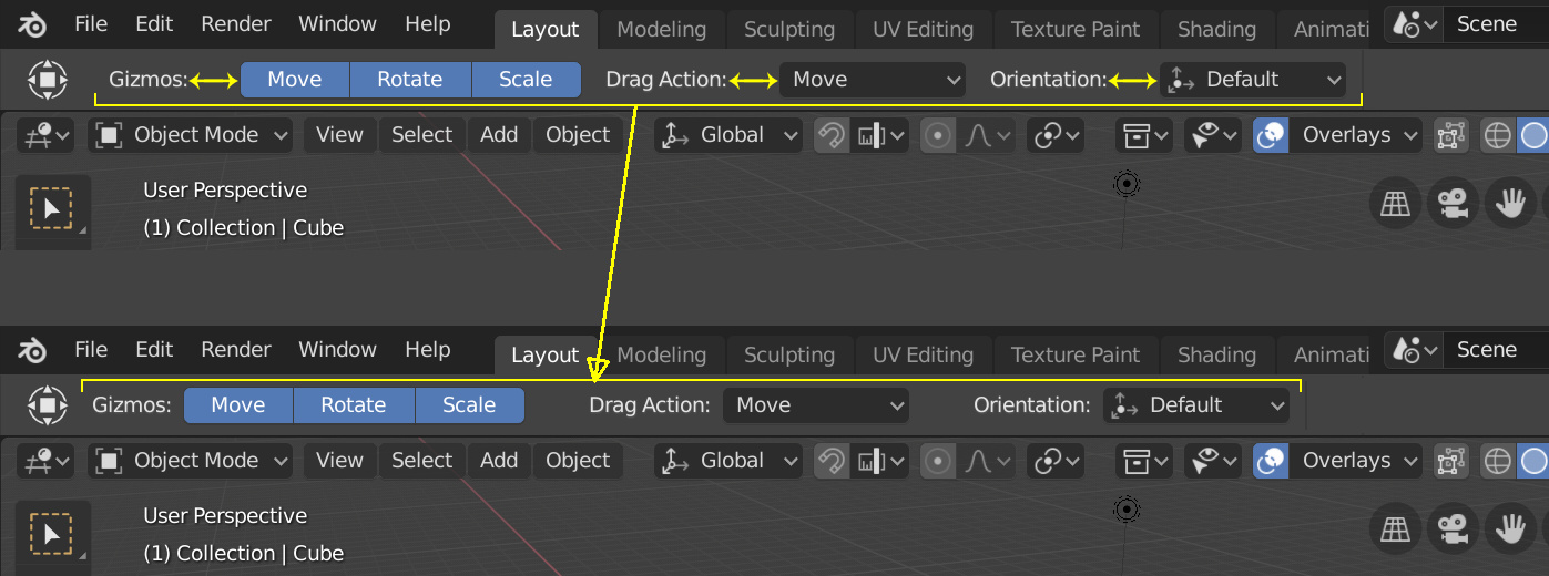
The labels in the topbar are too far to the left, leaving too much space on the right where they should be (more close to the controls) for better understanding/alignment. And also perhaps the all thing should be moved to the left a bit.
Quick example.
I am loving the new 2.80 UI however there is one thing that is bugging me and slowing me down. When in edit mode I now use the 1,2 & 3 keys to switch between vertex, edge & face selection modes. This is great. The problem is that when I am in object mode and I think I am in edit mode and press 1,2 or 3. I get a real sense of dread as now I have lost context as the Collection visibility has just completely changed and I have to spend time figuring out where I was! This happens A LOT! It is driving me crazy. It is easy to forget if you are not in edit mode.
I don’t see myself ever using the numbers to pick a collection as that is in my view the old way of thinking about layer selection. The new default should be these number keys don’t do anything unless you want the old behaviour?
Cheers,
Reece
In the gif you’re clearly trying to create a new area starting from the outliner so Blender expects a move to the right. When you finally put the cursor on the 3d view portion of the tiny split-area, moving to the left does the job.
That said I agree, that as of now, this feature requires a bit too much pixel-precision, and something better is needed.
N-panel “transform” pannel
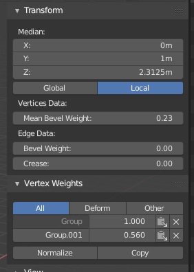
Its context sensetive pannel.
There is Edge Data section, if we select edge, but there is no ifnormation about edge markings (and nowhere else except overlay)
I think edge tags information should be accesable somewhere except overlays/selectby.

BTW is there way to make 3-state checkbox in blender with 3rd state as for multiple context mixed state?
Some functions have been added to View > Area and there is also the frame edge menu (the one that has Split and Merge). Probably both should have more controls (Swap & Duplicate at least, Demaximizations don’t apply in the frame case, but Maximizations could). The menu with text means user doesn’t have to remember what mod key each thing is, and doesn’t require drags but can alternate clicks and mouse motions if needed.
There was ages ago, called TOG3 (used for On, Off, Negative On in some texture channels, eg). (Removed for “non-standardness”? Different MS products seem to have something similar…).
Another minuscule papercut: the LookDevHDRIs sunrise.exr and sunset.exr display the sun in the same position (on the right of the “ball”). I’d love for one of them to be shifted (I know i can adjust the rotation, it’s just that I’d expect sunrise and sunset to be on different sides)
like this: https://drive.google.com/file/d/1Vn9axr-7CXZ7ZoUx5bnSuaH31Vs1qgeN/view (I couldn’t strip the thumbnail so it may be a bit heavier than before)
Wow! That’s neatpicking! 
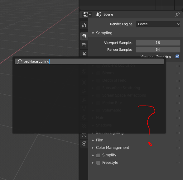
Since many menu items and settings were re-arranged in 2.8, it would be nice if you could search for them (kind of like the Help menu search in all native apps on OS X, which also has a really neat result highlight)…
I don’t think that it’s a papercut, but it’s a good idea to future projects allow to access any data by the search field
Should take most of the non-papercut Preferences feedback elsewhere - to the BA link above. However, here’s 1 paper cut in there that I also mentioned at BA.
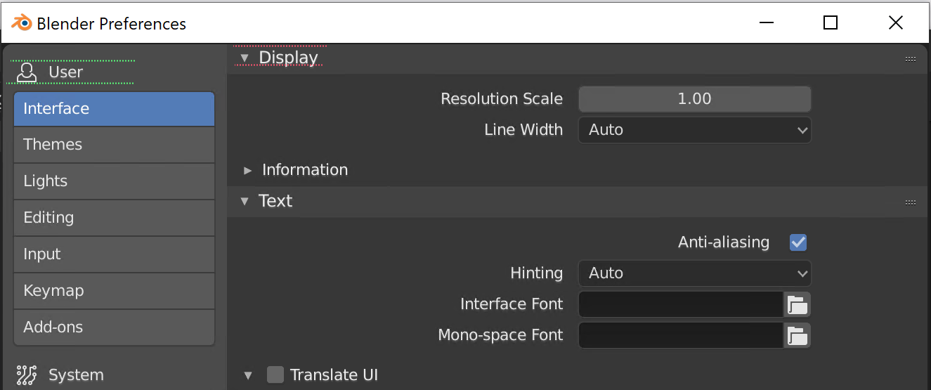
Panel-only sections need some breathing room – look at alignment of the text (1 is too close to the top edge and looks weird):
What if I try my first diff with this modification @billrey ?
Instead of “Add new material” write “Copy this material” in the tooltip (when a material already exist, and properties are copied to the new one).
Thank you,
Ricky
Opening a 2.7x .blend file on 2.80 sometimes causes errors, so I would like to have a warning: “This file is made in 2.7x. It may cause unintended changes in 2.80”.
Vice versa if possible.
BONE OVERLAYS – improvements!!:
Amazing job in 2.8 guys!!! – I want to deeply thank you all for your hard work in making this release something special!!! You guys all rock so hard! 
This would be neat - even if it were just the letters X, Y and Z. I’m not sure how we could do this in practice though.