I don’t know if this can be considered a real paper cut, so i posted in the UI thread, but a link here might be ok: Blender 2.8 user interface design
It’s on the todo to make Preferences nicer still, to sort out the header.
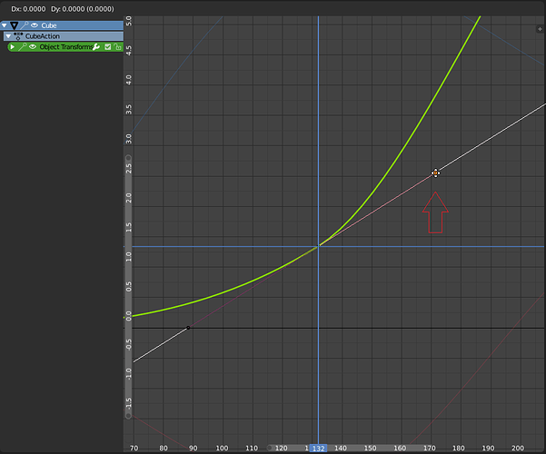
would be usefull if, when draging single handle of the Curve(any bezier curve,fcurve etc ), tapping GG would allow to move along normal(or tangent). Currently we need to place a cursor at a keyframe and then scale this handle with cursor set as pivot point.
Also why there are no Gizmos for Fcurve editor? In the 3Dviewport at least when we edit bezier curves, we can set gizmos to move along normals, and grab our handles along normals
Indicate “origins only” in the header bar.
I just spent more time than I am willing to admit trying to figure out why my objects would only move and not scale and rotate, when the transform properties weren’t locked. It turned out I have “origins only” selected in the “pivot point” popup. This is not communiated in any way when the popup is closed. I don’t want to jump to solutions, but some sort of color fadeout for the headerbar icon would help.
Closed: lots of space for the name, quickly hide/unhide (with dragging behaviour for multiple hide/unhide)
Open: more visibility toggles, move up/down, apply & copy (mockup to be better aligned)


When you change an animated value and change the time, the value will simply be lost. The dots next to the value could appear different for such cases.
Not sure if this is considered a UI paper cut, but it is something that has been around–at least for the Mac version. In Edit Mode, there are are some edges that extend further than the vertex points, almost like a normal (but not really). It gets longer/shorter when you increase/decrease the vertex size in Preferences.
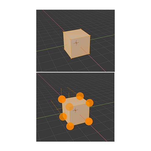
oh nice, didn’t know about it…thanks.
I think it’s some kind of bug but the keyframe dots for Object Location, Rotation and Scale does not appear on the N panel.
Since the Properties view has so many tabs, including global tabs like Render as well as tabs that are always there for a given item type but may be less often used, when you select a particular item like a Light, it can take a moment to hunt down the tab you want that has the primary parameters for that item type, especially as a new user.
What if we added a subtle highlight, like outlining with the selection color say, to the tab (or tabs) that would be most commonly used with the currently selected object?
Here’s a (not subtle) screenshot showing the idea, though the highlight here is probably too much and would be confusing in that it’s not actually the active tab. Perhaps increasing the highlight for the active tab and then color the outline of the “interesting” tabs. “Interesting” could be “most relevant to selected item” as above, or could even be something like “contains a non default setting” or “contains animated parameter or expression” depending on user preference.
In this example we’re looking at the Render properties, but have just selected a Light and are trying to draw attention to the Light Properties tab:
A lot of handy shortcuts in the node editor it seem they don’t work anymore (shift + click to select, ctrl drag to cut links, etc…)
How about to make Pie-menu toggle with one button? I mean if you press ‘Z’ to call pie-menu then it is very logical way to press ‘Z’ again to disappear it if you called it by mistake, instead of clicking mouse.
You just remembered me that it’s impossible to select two side handles of two different keyframes at the same time, e.g: if you want to perform the same transform operation on both sides of two different keyframes at the same time.
You can either select both keyframes entirely (which selects both side handles) or one single side handle of a single keyframe.
This is a very old papercut… but I guess it would be something for Alexander Gavrilov to check, since he is the one doing sort of an “animation revamp” on Blender right now.
Another related papercut is the impossibility of scrubbing the timeline on the graph editor (now with right click) without moving the “horizontal bar” (Cursor Y) as well, since you must click on the editor active window, which then repositions both bars at the click location. Would be good to be able to “Lock” the horizontal bar at a certain value, if one wishes to (sometimes we animators use the horizontal bar to do transforms on keyframes based on it)
It’s also really sad that we cannot add drivers (and keyframes?) to curve’s keyframes values and it’s modifiers options. For example, you cannot drive the left handle value of a keyframe curve, or the Scale factor of it’s noise modifier, or it’s Restrict Range start and end values. But this would be a proposal, not a papercut. Maybe this could be part of the Everything Nodes, since I guess driver relations will be part of this project…
Also I don’t know if this has been considered already, of if this is the place for this idea, but in regards to “Spacebar activates either Play, Tool or Search operators”, there could be an option for it to be a pie menu… so you could choose either of those three at the flick of the wrist.
You press spacebar and if you want to search something, you move your mouse up (for example), if you want to play animation, move left, if you want tools, move right. After all Pie menus is already a concept deeply integrated with 2.8.
I have posted this in left click Default Left click Default?
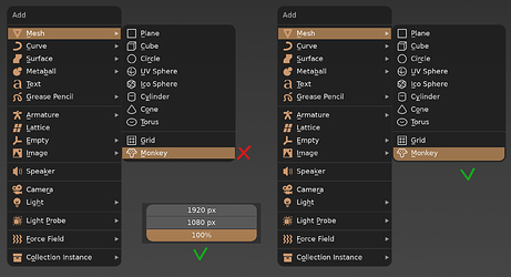
After setting edge rounding of UI elements to max value, the first / last item’s highlight shape in context menus, while preserving its rectangular form, starts to don’t behave as expected:
Would it be possible to include the Scale tool in the task description too? This tool would benefit from this as well. And it would also be good for consistency.
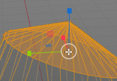
The Transform tool doesn’t need to have this though because the area is already used for free rotation.
Thanks.
Right now it is quite amusing to try to scale the interface with your mouse in User Preferences because of the change of design.
Open up User Preferences, go to the Interface tab, move your mouse to Display Scale and start dragging. As you do so the slider widget you are currently using is itself increasing in size (as before, so no issue), but is also now moving to the right (because of the menu beside it increasing in size). You can sometimes get it to work, but quite often it is just an unpredictable, jumpy, jittery mess.
Funny. If you make the preferences window wide enough, the jittery doesn’t happen.
