A lot of the View Layer Outliner magic turns out to be hidden in the FIlter options. If you toggle visibility of Collections then it goes back to an old style “all objects” view that shows the parenting hierarchy, but still with the rest of the new features. I think it might be nice to promote this back out of the Filter options popup to the header there so you can switch back and forth with a single click. You can parent things in either mode, it’s just that there’s no visible result of doing this when Collections are shown.
There’s still much that’s funky in the new Outliner and View Layer behavior, just because it’s so complex and interacts with everything, but the major issues I think are substantially education and discoverability rather than necessarily anything being wrong with the design.
Watching Pablo’s old video that’s linked from the 2.8 features page helped me.
I think the default selection mode should be Select and not Select Box, this because it allows dragging objects and vertices intuitively. Select box is more of a specialized selection mode.
Crap quality vid showing the annoyance in object and edit mode
Makes no sense. The gizmo is to be used, otherwise no point showing it.
The move tool is the default in c4d, so on first launch anyone is already moving things which is great for starters.
I’d say apply, Copy, move up/down and the two right icons for editmode/on mesh visibility could go in the second row, hidden when modifier is collapsed. So that you just see icon, name, render, viewport and delete (the latter might also go down). The most useful when not tweaking the modifier
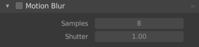
For Eevee the motion blur defaults to a shutter value of 1, or open for the entire frame.
Cycles defaults to the live action filming standard of 0.5.
I would say that Eevee should also default to a motion blur shutter value of 0.5 to have a more natural and typically used value in live action and animation as well as matching that value in the cycles default.
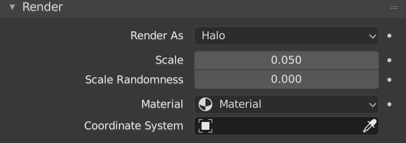
The default particle system still has render as “Halo” as the default. Since Blender Internal renderer is gone this is not a usable option and would be confusing to a new user as to why nothing shows up in their renders.
Removing unsupported particle types until they potentially are put back in some form would be much clearer.
Also as a potential fix setting the default particle “render as” setting to object with the default cube selected and also set up to provide a simple text warning near the top of the particle system settings if no object is selected. This makes it easier to use, provides a good reminder that it needs an object to render, and also allows first time users to get some sort of immediate result even when just opening blender.