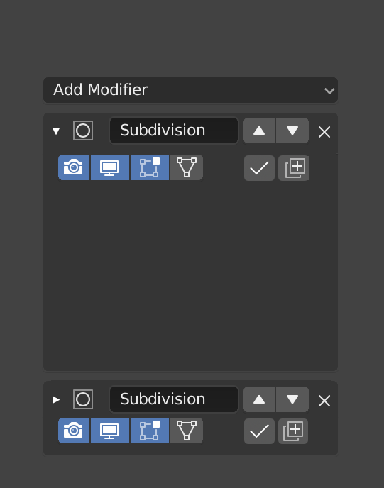
Shadows under icons, matching those under the text labels. It should get done before official stable release, as it will drastically improove local contrast and pictograms redability.
So - shadows under icons are urgently needed.
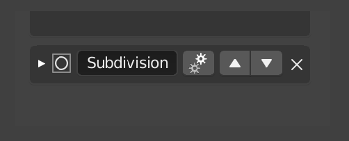
The only thing required would be an editor width check to see if the properties editor width is less than X pixels. If it is, then hide the buttons and add the “gear” rollover button. (I think this code is already there being used on the responsive layout)
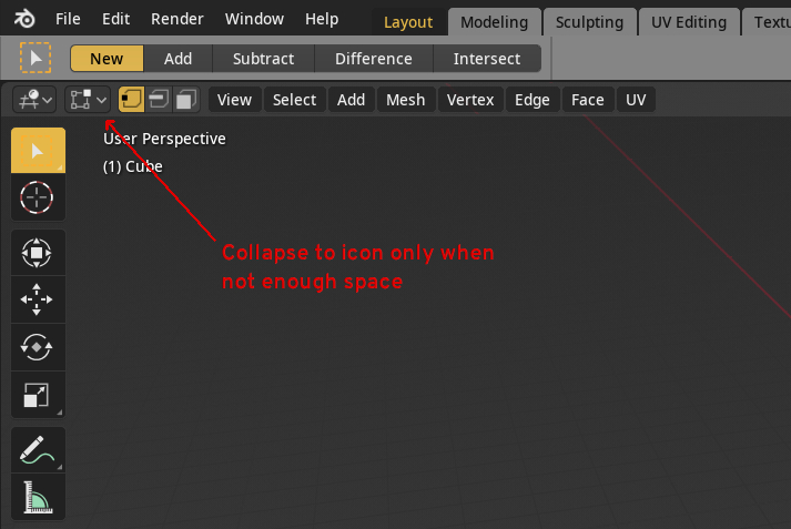
Another solution would be: If the editor width is less than X pixels, push the buttons to a line below.
This way, the collapsed modifier/constraint would naturally occupy two lines on a small screen, and uncollapsing it would reveal the main options of the modifier (not the reveal/activate/apply buttons etc).
It would require more scrolling, but at least the name and main options would be visible at all times.
EDIT: exactly like @enenra mentioned above. Thanks for making the mockup!!
That doesn’t work for some pretty obvious reasons.
you can’t see the state without rolling over each one carefully, one at a time, which is one of the main points of these.
The buttons are then very hard to hit, because you must carefully roll over the cog icon to reveal the others, then carefully move over along the line.
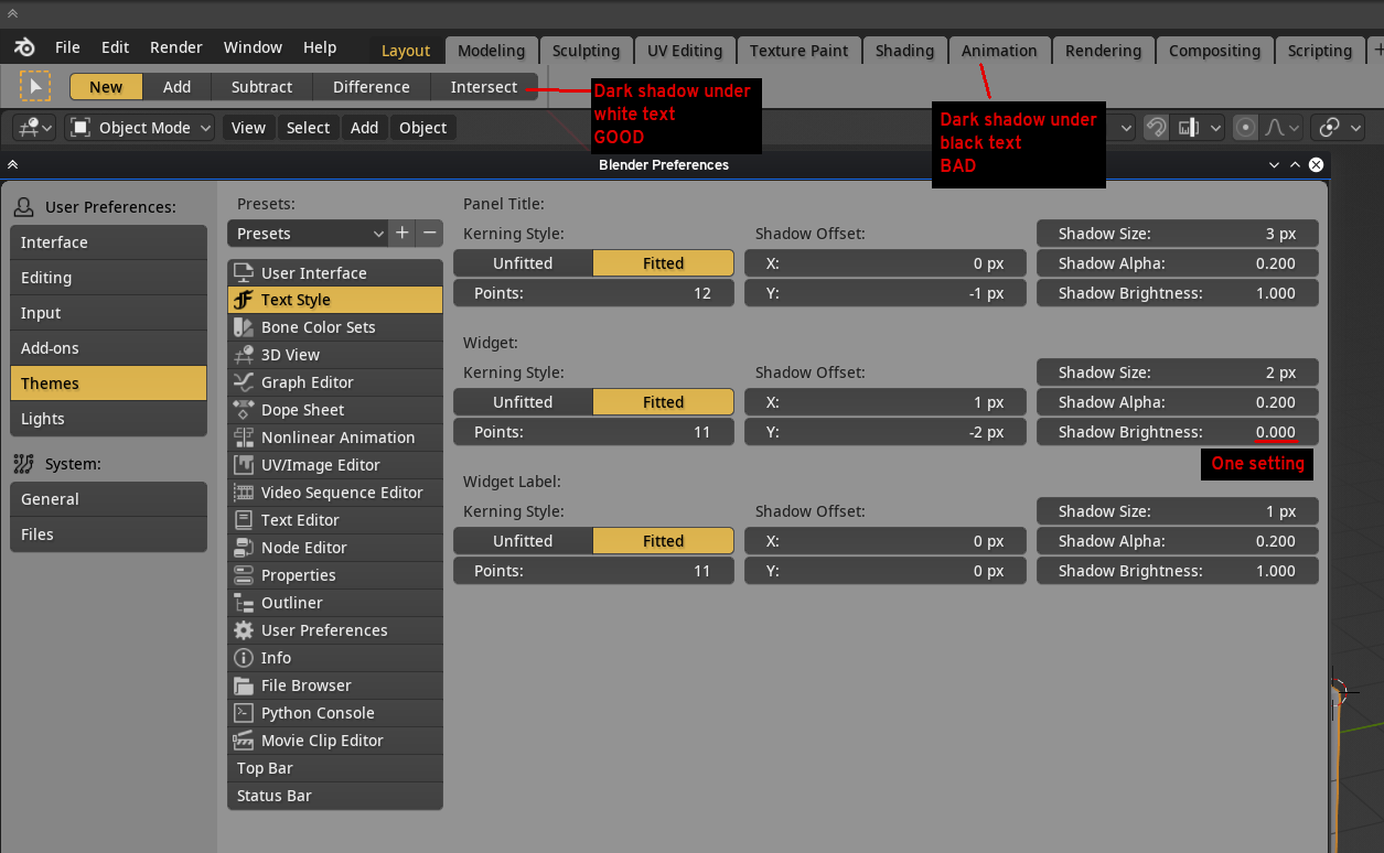
We will probably combine the two visibility popovers into one.
Earlier in 2.8, we had the transform settings inside the tool settings, where we typically have lots of space, and which left a lot more room inside the viewport.
But many users complained, so we relented and put them back in the viewport, which reinstated this problem. I still think it was better to have them in the Tool Settings - both because it makes sense, and because then we don’t duplicate these settings in every viewport, which is silly - even more so if you have multiple viewports.
That controls are really important to move in the topbar, that made impossible to use it. For example, my monitor is a 27’ monitor, with actual topbar configuration is hard to use to use that controls outside the viewport because between my working zone in the viewport and that controls I have ¿30-40cm? of space.
If the topbar was a independent area that you can put in the toppart of the viewport that solution could be really good.
Not 100% sure if this fits here, but the trackpad support is superb… on OS X only. If we could have it work in windows (laptops) that would be excellent.
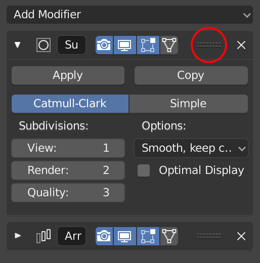
I would find it easier to reorder the modifiers if the arrows could be replaced with some drag system, same as the panels in the properties. I find it quite tedious to click a modifier from bottom to top by using the arrows. It should only recalculate the order of the modifiers when releasing the mouse button. Would be nice if it’s possible.