Either that, or we could re-organize the layout in a different way inside the Input section. But overall it’s probably nicest to just split them apart, and we now have plenty of space in the sidebar for more categories.
1 Like
Hi everybody.
Currently love all the new feature in blender 2.8, I love the new weighted normal modifier but, I think a option for the face strength could be arranged as follow.
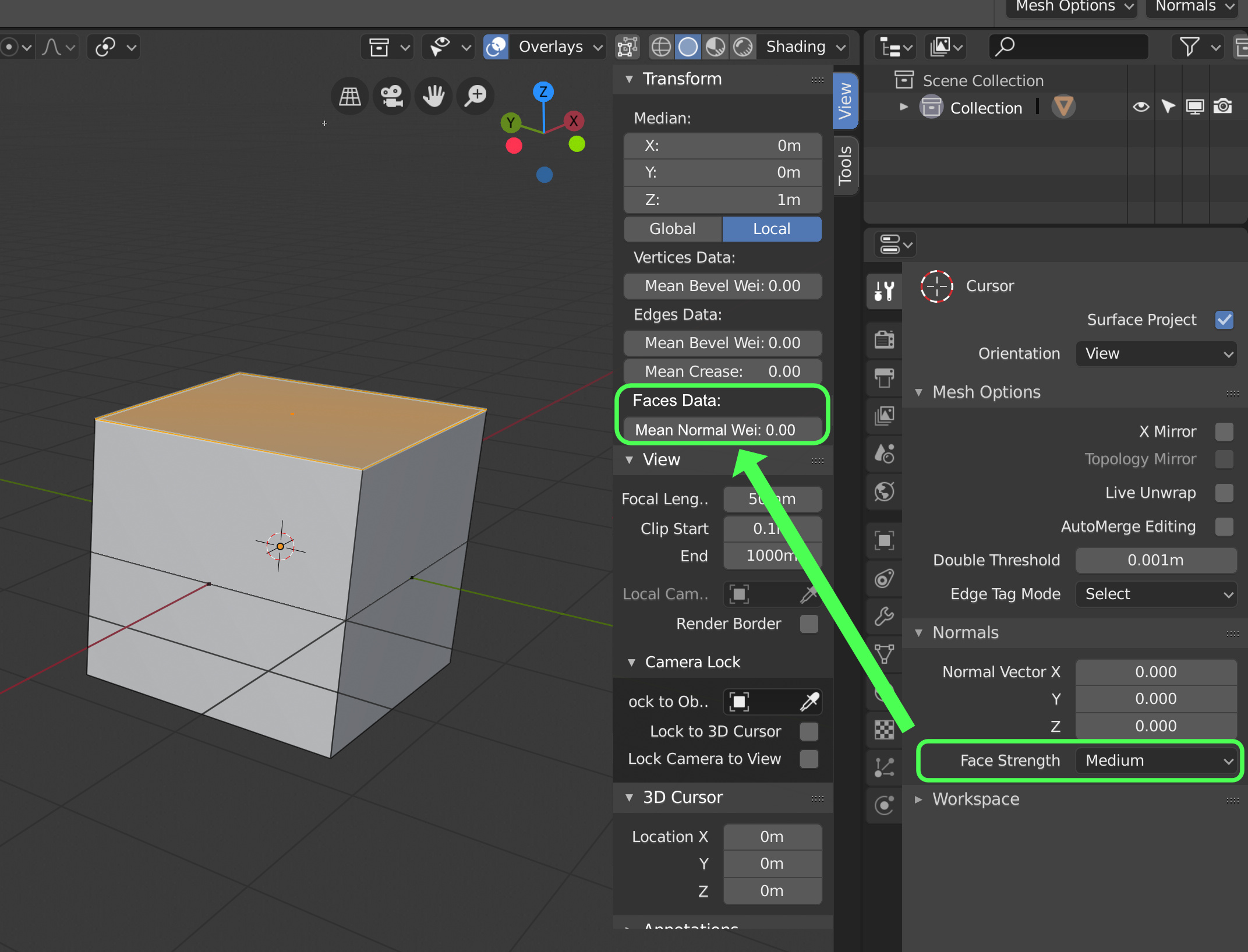
Instead of select Face strength in properties, then going to the drop-down menu /Mesh/Normals/Set Strength
I think it would follow the pattern of Mean Crease and Mean bevel weight for modifier.
4 Likes
There is this proposal which is good I think, don’t know if it would be possible, maybe it is not readable enough, but at least all the edge data can be displayed, and no need to find a specific order ![]()
https://blender.community/c/rightclickselect/nPbbbc/edge-properties-overlay
7 Likes
Yes, that is a less arbitrary solution at least. Overall that is probably better than what we have now. It could look overwhelming, but then users can just disable the edge data types they are not interested in.
4 Likes
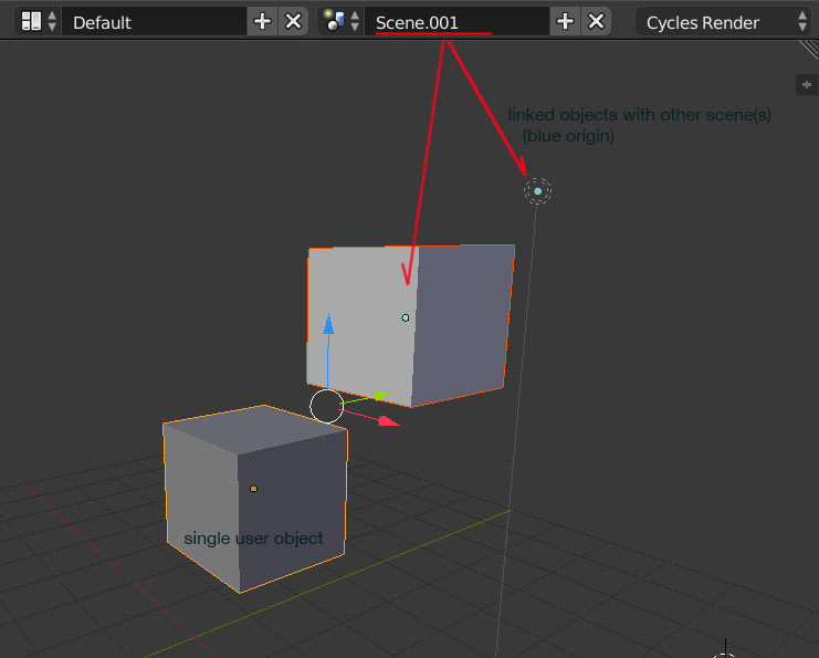
I don’t know if this very useful information was left out accidentally in 2.8 or not. It was very helpful when working in the multiple scenes to check out if some objects are not linked with any other scene.
It was a cyan color which could not be themed in 2.7, so I found it difficult to use any blue object selection theme, but now it is left out completely. Will it be back in some form?
5 Likes
More sensible settings for New Scene.
When you add a new scene(“Add new scene”) of the type “New”, the settings in the new scene don’t make sense:
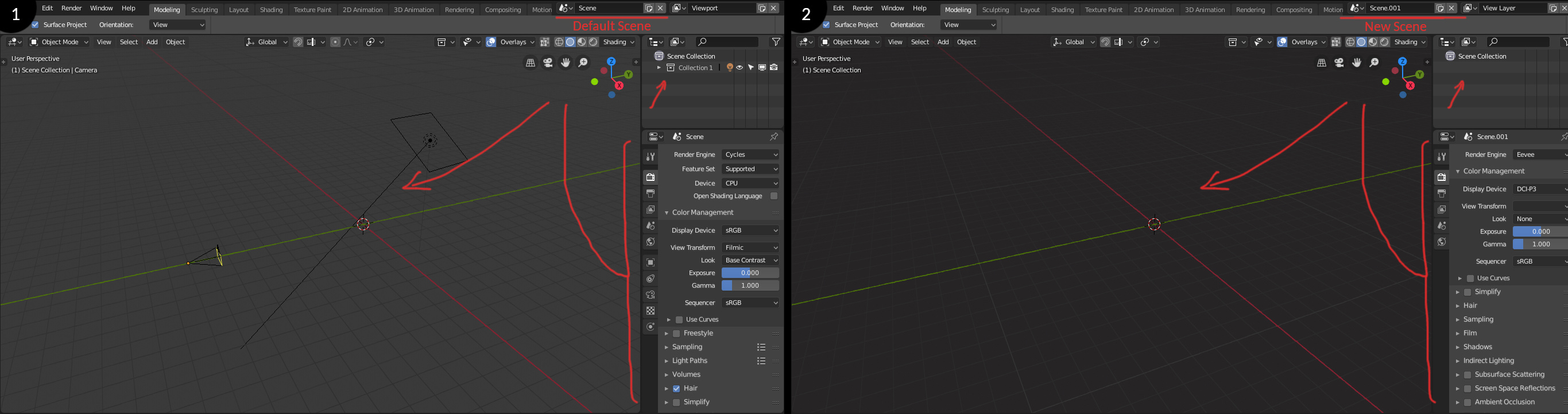
I think the expected behaviour would be the new scene to adopt your default settings(your default .blend file).
1 Like
I really love collections feature in 2.8 instead of old layer system. One thing it is missing, which is very useful in interior scenes where boundary between ceiling and walls are vague is Clipping Border operator. Moving furniture or working in a tight spaces was really easy. It was such a great feature, unique to Blender. I hope that drawing engine will be capable of having this feature, and that is on the list.
9 Likes
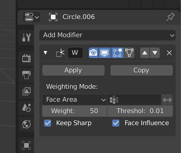
Yes, I even tried to fix it like so:
Takes up same amount of space in total and makes name readable. But I ran into a silly issue with alignment in the code.
This is a stopgap though - ideally the whole UI for modifiers would be reworked, but that might wait until ‘everything nodes’
16 Likes
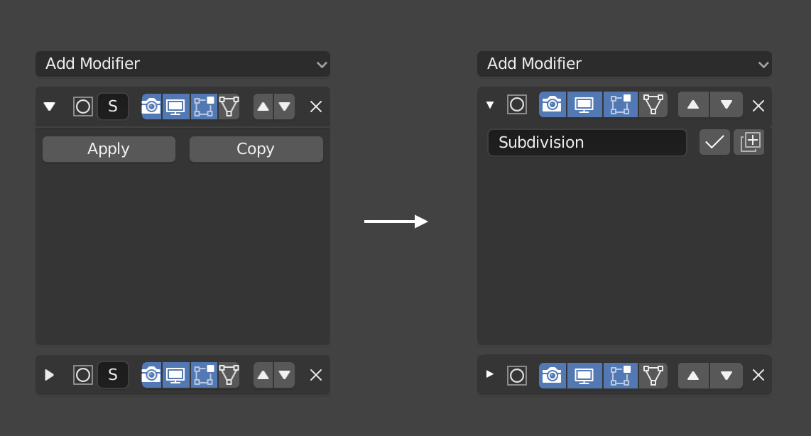
That would be nice to have that, but maybe it should be inverted, the name at the top, so that we can see it when it is closed ?
Yes might be better to wait 
More often I expect people would like to be able to quickly enable or disable them. You don’t really use the name so much unless you are scripting, for example.
The icon would remain to identify the modifier type, just not the unique name, which is not used unless you are making a script that refers to this name.
1 Like
another no-go is that when you collapse it you don’t know anymore what modifier is what
But in this solution we don’t see the name, that it’s the important part of the modifier to identify. Then the user cannot make a fast read to find the modifier and need to expand all modifier to find that he needs.
Another solution is this:
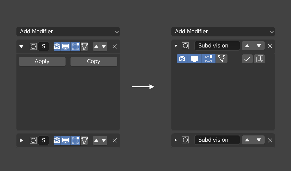
But I expect most users will find that more annoying. Then you cannot easily disable them if they are collapsed. Again, the name is not very important, the type is, which is already communicated by the icon.
And currently, you can’t even see the name. ‘S’ is not so useful-
3 Likes
Yes but for example in a scene with a lot of boolean operations, it is essential to see the name, the icon doesn’t help in that case.
3 Likes
Unless what you are showing is part of a grid flow behaviour ? When it is too narrow to display a useful part of the name, then your proposal is displayed.
This could be solved with a retractable area for the visibility/activation buttons, that expands on mouse roll over to the left, occupying the name space when mouse is over, then retracting again when mouse leaves the area.
I don’t think that would work well. You don’t want buttons to move around when you try and click them. The UI should not work like whack-a-mole.
Ok if you code it ![]()
1 Like
A better layout, with less space between elements, remove or improve the arrows to use less space (or put a simple drag and drop element like any other panel) and use the icon of the modifier to activate or deactivate. These type of changes will help a lot.
One thing I’ve had trouble with the UI is on a smaller monitor the header tabs don’t all display and control+middle mouse button doesn’t work to scroll like it normally does. I think this would be a good opportunity to have icons for common workspaces such as texture or sculpting, and only use text for custom ones. Icons would take up way less space which is important for smaller monitors and for people who have a lot of workspaces created.