1: What the is correct order? It seems arbitrary which edge data is displayed on top of others, both in 2.7x and 2.8. I don’t see any clear order or precedence.
2: You can disable the Status Bar in Window > Show Status Bar
1: What the is correct order? It seems arbitrary which edge data is displayed on top of others, both in 2.7x and 2.8. I don’t see any clear order or precedence.
2: You can disable the Status Bar in Window > Show Status Bar
Until you add something else to the header. I created a small operator and ran into the same issue with the path moving it. I’m all for finding a new place for the path.
Our eye-sight rarely stays at the bottom of the screen all the time, it’s almost a human nature that your eyes would be mostly focused at the center of the screen instead (specially when you are doing a serious work).
However, while one does any sort of editing in the 3D Viewport or UV Editor (I haven’t checked all the Editor’s behavior), there are lot of blinking happening at the header and surrounding border areas of that respective editor window.
Why is this order the correct one? It seems arbitrary.
Again: Not sure if this was pointed out before but her I go.
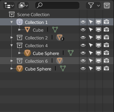
(Note: The highlighted strip is blue in the default theme)
When hovering over an item, the entire strip gets slightly highlighted (Collection 6) but when moving the mouse away from the outliner the highlight stays in place. Instead it should be gone just like when you move your mouse away from any items in the outliner itself.
When selecting an object the orange icon get’s an orange highlight behind it. This is a bit odd in on itself but when the collection is closed the icon has a grey highlight instead. This is less visible and maybe should be made more obvious by making the highlight more white or actually colored.
The grey highlight can also be confusing since the active collection is also highlighted in white/grey, which is a meant to indicate a different thing than selection.
When you make an outliner specific selection on an object (like the highlighted strip on Collection 1) and then close the collection that it is nested in, there will be no indication that you still have something selected in the outliner.
It sometimes happens that I would have some items selected in a collection, close the collection and eventually move something else without noticing that I moved all the items I had selected in the closed collection as well.
This is the first thing I do when I open the text editor. I would also like to see these enabled by default.
Exactly, flashing every were, like xmas tree. If u have decent amount of vertices in one spot they start to blink in wireframe while rotating viewport. But this nav icons just useless and they blink.
We should collect all these Outliner-related issues together. There are lots of little things like this that would be great to address, especillay now that there is a greater reliance on the Outliner.
i cant exactly explain why seams should be underneath. But in gamedev if you had sharp edge there should be seam, so if seams are on top you can’t really “READ” your model
If if it’s the other way around, you’ll just have the opposite problem. What is the rhyme or reason behind the specific order?
its just the order from 2.7 and it works great, so why change it? from now on i need constantly switch seams display on and off to see edge info that seams cover over
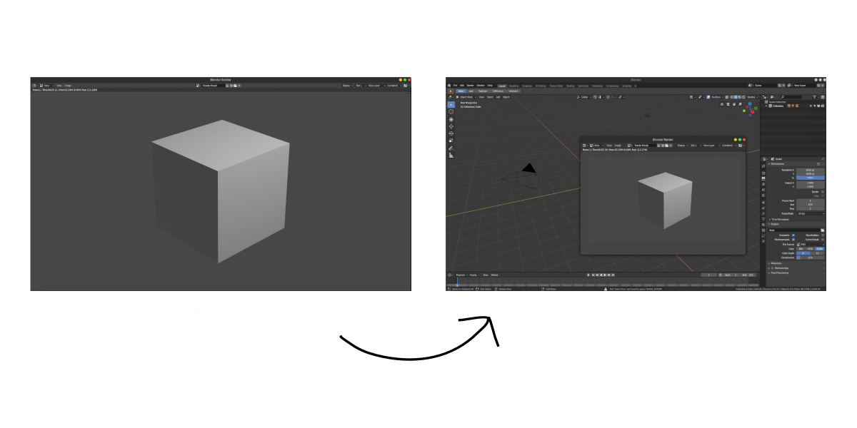
When rendering at the size of 1980 *1080, the entire screen is covered with the window of the image editor. I think that it is better to fix the size of the window regardless of the rendering resolution.
But why is the order you suggest more correct than other orders? Is it not just entirely arbitrary?
I tried explain you about “reading” the model. another example: you have model with uv and want adjust bevel weights, but u cant see weights because seams are on top
In all the examples you mention, that’s just arbitrary. If you have model with uv and want adjust bevel weights, the current situation is annoying, but if you have bevel weights and want to do add UV seams, it is correct. It all entirely depends on what you do first - I can’t see a rhyme or reason for any specific order. That’s my point - it’s arbitrary and annoying in different situations depending on which order we choose.
ok, fair enough. the new one is arbitrary the older one is arbitrary. Then why change it? To make old user suffer even more?
The viewport was recoded. It was not specifically changed, it just got changed as a result of the re-implementation of these display options for the new viewport.
If there is a specific order that is almost always correct, or a different solution altogether that makes multiple edge visible in a clever way, that could be useful.
Oh, I see. My bad.
The zoom level widget might be even more useful for laptop users, if they’re not using “emulate numpad”, then.