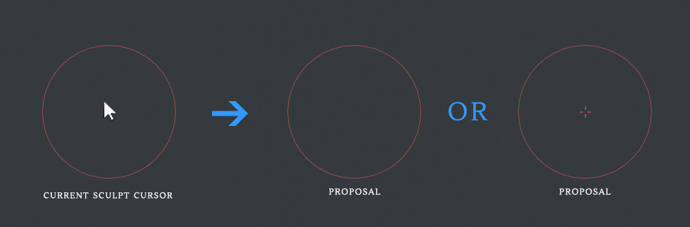
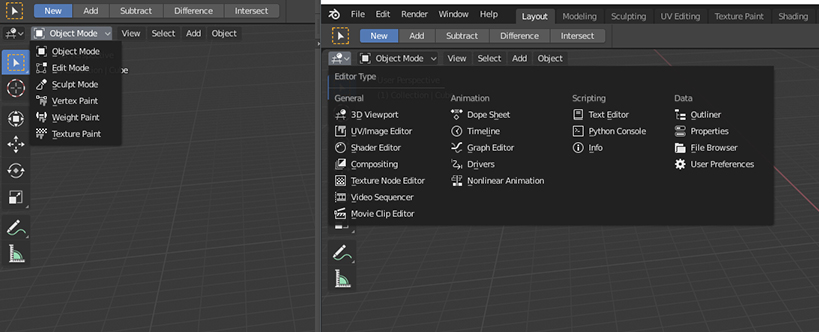
The selection icon looks like OS cursor which makes it confusing. I propose to use the icon from the tool bar. There’s no reason to introduce another icon for the same concept. Also, color helps to quickly find the right option.
Remove the label for the icon. This pie menu is quite crowded with 8 different positions so removing the labels should make it quicker to work with.
I think that the problem is transparency:
in all other window (UV/Image editor, Graph, Shaders, Timeline, ecc…) the header is a bar, and you know that you need to click to open a menu.
In the 3d view the 3d bar is transparent and the menu “text?buttons” are flying.
I personally do not care about having the transparent bar.
I love being able to edit properties and materials of active unselected objects. The selection outline can get to be very distracting sometimes, and it’s nice to easily focus on the one active object.
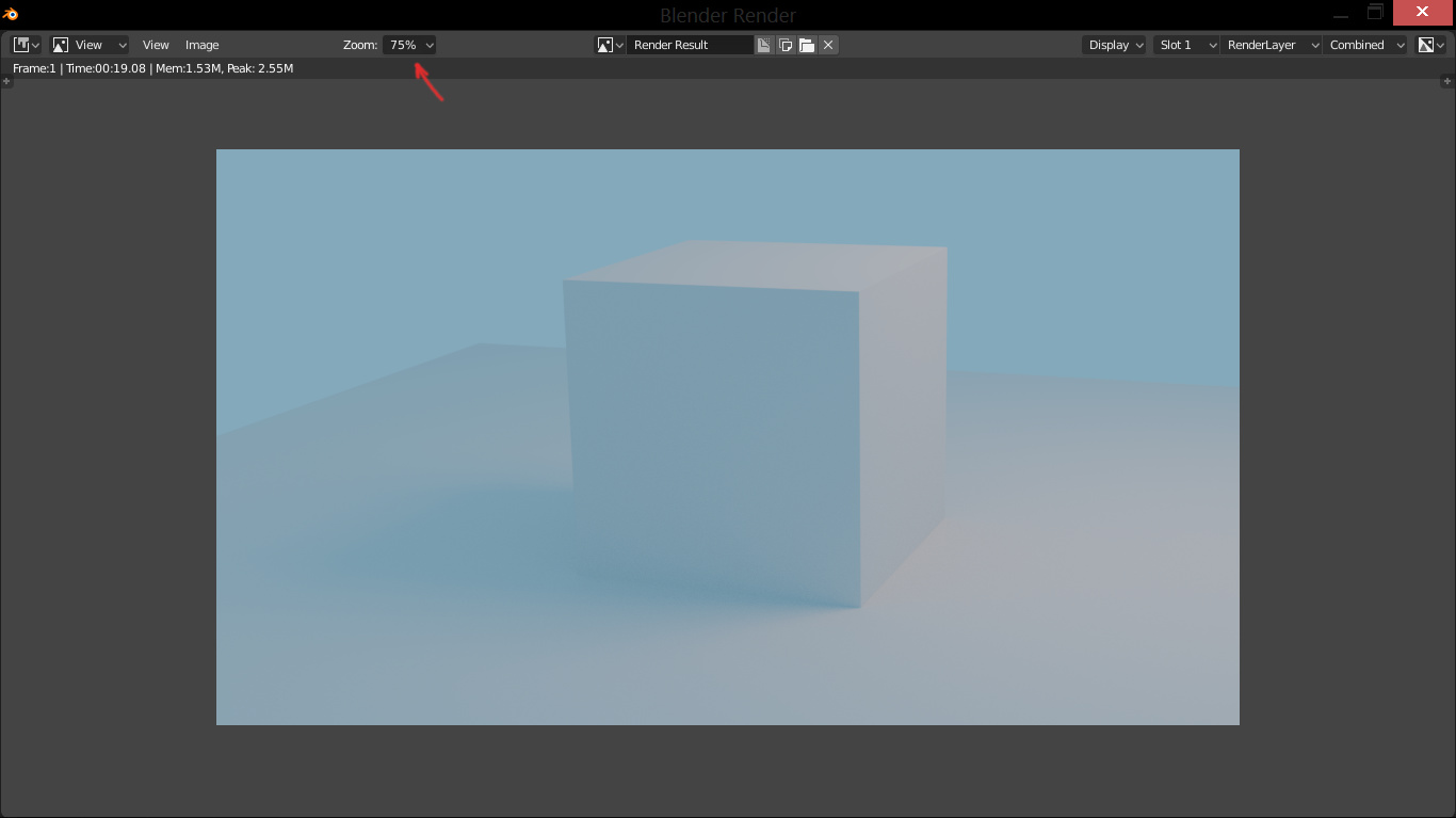
It’s really hard to even know at what zoom level we are, right now. Especially since we can no longer set the zoom level using the 1, 2, 3, etc. keys as we used to in 2.79.*
*Edit: The 1, 2, 3, etc. behaviour is apparently still the same in 2.8. The issue is: for laptop users, you need to activate the “emulate numpad” option in the Settings.
Speaking of the render window, could we have the render progress bar / cancel render button show up on this window? Right now I’m often looking at this Window and I have to move it to find the cancel button back on the main Window.
More than a paper cut, but long term I’d like to have each render start automatically select the next slot and auto-save my .blend file as filename.slot#.blend. This would stop me constantly having to select a new slot before each render, and it ensures that I can go back to the settings of each previous render, and also provides a nice extra backup of the scene as of the render start in case cycles crashes Blender when I try to cancel it as it is wont to do these days. Yeah, I can probably make an add-on if there isn’t one already.
here’s my paper cut:
when left click to select is enabled, drag to move or drag to rotate bone isn’t available since left drag currently doesn’t support move/rotate and right mouse is now in the context menu.
this is the reason I can’t use left click to select.
good to know. just tried out dragging with left drag and the select tool, very cool.
got a paper cut when I found that ctrl drag lasso and cnrl+shift drag deselect lasso modifiers are missing.
another selection paper cut.
circle select shift drag to deselect only works if I shift select on first click. which means the user has to exit and re-enter circle select to add/remove from the selection.
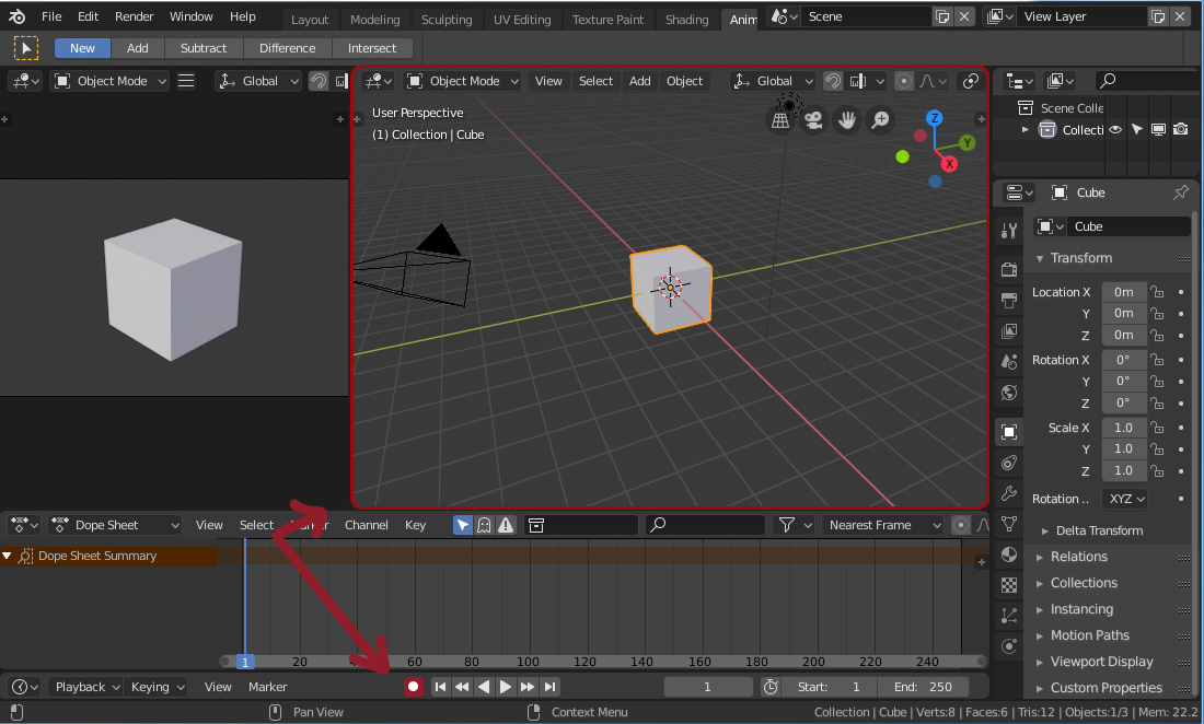
I’m an animator, and when I’m refining a pose, having to move time to before my previous keyframe, play, then reset time back to the pose I was editing is a total paper cut. so much so that I wrote this and bound it to spacebar.
This moves time to the beginning of the zoomed playback range, plays time, and then on stop, resets time to the frame before fastPreview.
might be good default behavior to consider for spacebar.
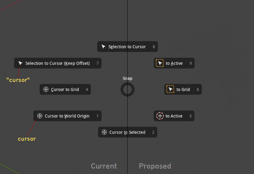
There is a difference between menus that select between different options, and menus that have commands. It’s quite standard across operating systems and user interface toolkits to use an arrow for one, and not the other.
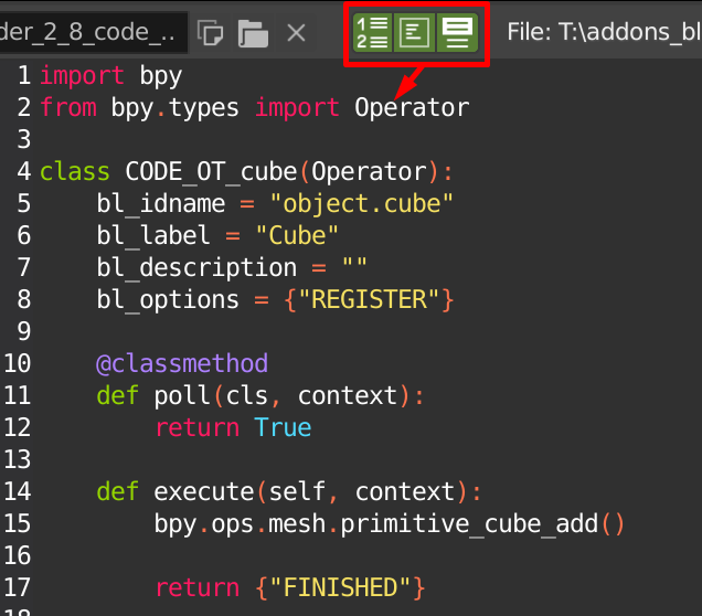
We have to somehow solve the issue of the Run Script button being pushed away by the path. I think we could solve it by moving the path away from the header. Could either be in the bottom of the Text Editor, or in the Sidebar perhaps.
 I love being able to edit properties and materials of active unselected objects. The selection outline can get to be very distracting sometimes, and it’s nice to easily focus on the one active object.