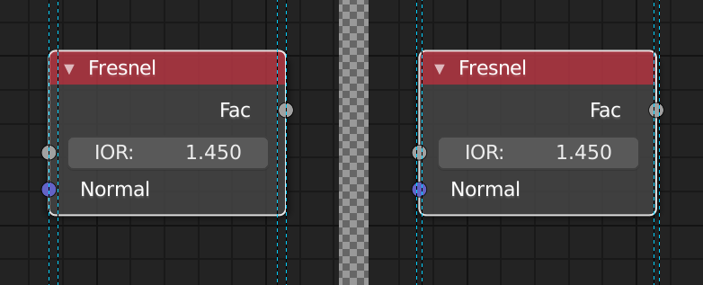
Agree, Contrast between enabled and disabled icons are too low imho.
The problem is that the active area for resizing the node is too wide and in the wrong place. As you move your mouse from outside toward the node, it doesn’t change into a “resize” cursor until it hits the middle of the outside border. And then works as resize for too wide of an area inside the node content area.
The active area for resize should be narrower and be horizontally centered at the edge, so should work the same distance on either side of it.
13 Likes
I was talking about the Color Ramp but it looks like all of these areas need a little bit of TLC.
1 Like
This applies to all nodes, each and every one of them. I specifically didn’t use ColorRamp as the example so people would not think it was a problem with the one node only.
1 Like
Yes! I find the primacy of the Collections view completely confusing. I would much rather see a parenting hierarchy view as the default, as I think in most cases you’re likely to parent something to something before you get to the point of needing Collections for scene management.
I agree with all the confusion or potential confusion demonstrated in this video clip. I would love to see someone demo a complete workflow using the current Collections-based UI involving assembly of a model (robot with arms etc.) that includes parenting, along with what the expectations are for utilizing Collections and View Layers.
I feel like I need both the Scene Outliner as well as the Collections Outliner (to replace the old layers grid):
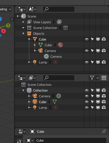
But here in the Scene Outliner, The View Layers and Scene Collection items in the list don’t seem to serve any purpose and nothing is shown when you expand them.
The names of the different Outliner display modes (and the quantity of them) are likely to be confusing to a beginner as well. For example there’s “Scenes” (plural) and “View Layer” (singular). I think “View Layer” is a very confusing and unintuitive name, and including the word “layer” will confuse users who really are looking for “collections” as a replacement for the old “layers”.
6 Likes
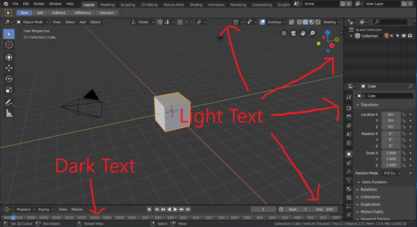
I believe the default themes in Blender should have more consistent text colour. At the moment the timeline, dopesheet, and probably a few other editors have dark text while pretty much every other editor has light text. This stands out to me “like a sore thumb” and I believe should be changed by default.
Current setup:
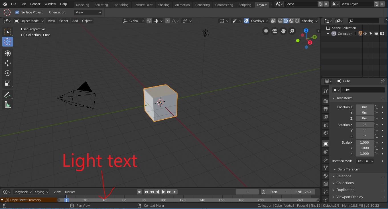
Proposed change:
3 Likes
Replying to myself: This was brought up in Pablo’s stream today. Apparently it’s a theme problem. It’s part of “Region Background” for the UV/Image Editor theme category. Changing the alpha there will fix both UV and Texture Paint workspace issues.
This menu feels gutted in 2.8 as it is (plus, no way to discover unless you know the shortcut, right?).
Why not just move it into the new tool & workspace settings tab?
5 Likes
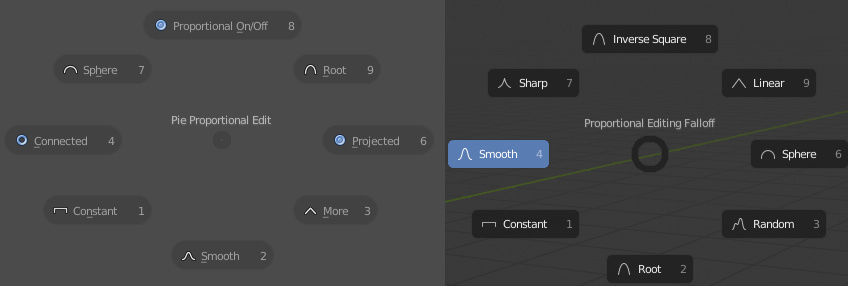
Please look back at the original piemenus, there are more logic and useful than new one.
For example O menu. Now O only toggle prop. ed. on/off and shift O to change falloff. But with old pie menu we can do it with one button
5 Likes
But you have to move your cursor out and away from the circle (or away from the whole manipulator) first in order to do that. That takes a little bit of time and it is one more unnecessary step. If you do this a lot it adds up.
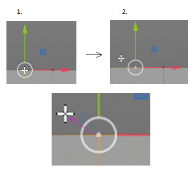
Whereas in Maya and other 3D software you select your vertex and move it right away because your cursor is already inside the circle (or square). It is faster, simpler and more direct than the Blender method:
Also what if I want to reserve the left-click-anywhere operation for deselection of everything. It is probably not possible in Blender right now but it might be in the future. Or someone finds a way to hack Blender to do that. Then I would be left only with the option of grabbing the circle’s curve.
Click to deselect in Maya:
The inside area of the circle doesn’t serve any purpose in Blender right now as far as I know. It is just confusing and counter-intuitive for beginners who will try to grab it and hit one of the axes instead. Then they will observe that they have to aim for the circle’s curve instead which is quite a fiddly operation. This might discourage them before they learn about the grab-anywhere trick. This is not a good advert for Blender.
So why not to make it easier and more elegant for everyone (beginners and long time users). There is a reason other professional 3D apps have had this feature basically from day one.
Please consider fixing this at least in the future.
P.S.: I have already made this request before: Blender UI paper cuts - #224 by r4p7or_3D
7 Likes
1 Like
because we’ll need it for addon and when working full screen mode.
2 Likes
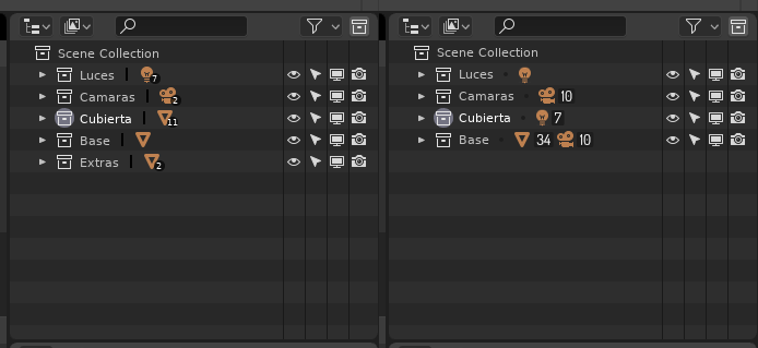
If I can make a suggestion for the outliner, it would be to make the little numbers bigger and actually readable as in the screenshot above. The only problem I foresee is that people would probably confuse which number is for which item.
I also took the freedom to remove the | and change it for a filled circle and made the text centered vertically on its grid cell. I think it looks much cleaner.
1 Like
That’s exactly what I meant when I was referring to the white circle.
NM… I’m stoopid for this one ![]()
1 Like
But I showed the N panel in my screenshot, not the T panel.
Why would add-ons move from the T panel to the N panel in 2.8? Shouldn’t they get their own, unique lower-left corner floating pop-ups like the other tools got?
1 Like
What you mean? The cursor is already there.
1 Like