How about click “anywhere” to move?
-
In the VSE the file paths should not be drawn on top of the strips when the height of the strip is less than the hight of the font. And maybe it should be optional to draw the paths on the strips at all? Or at least not use the full path, but only the file name? (The full path can be found in the strip properties if the user needs it)
-
You can only work in 32 channels, but you can scroll far, far beyond that channel number. Why?
Strangely, if you open the file explorer, for any purpose the buttons are placed at the top 
Move the Run Script button and the Register checkbox to the left side of the file path
If you are editing a file with a long file path, the run script button and the register checkbox they go too far to the right, requering a lot of scrolling or window resizing to reach them.
Can they be placed before the file path, so they don’t move?

Yes, either that, or we could display the path in a different way along the bottom, or perhaps not at all. The current situation here is clumsy.
You can click literally anywhere on the screen - no need to hit the circle.
Yeah, in the bottom would be nice.
Yes, this is annoying. This is related to the (rather strange) convention of popup menus always spawning upwards, rather than down from the selected item.
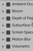
checkbox nice in dark theme
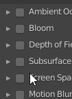
checkbox weird corner in light theme
navigate gizmo
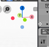
navigate gizmo when mouseover
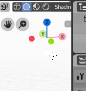
need outline or contrast
Not really the right place i guess, but I just wanted to chime in and say I love which direction you took the user prefs. Great job!
A new papercut would be that the fixed tab in the prefs is not themed as it seems. It remains black when installing new themes. Is there already an option to fix it by updating the theme?
It was a bug - it’s now fixed.
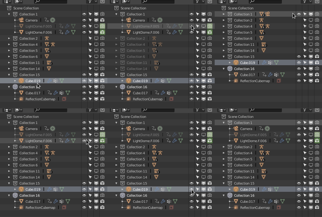
What is going on here?
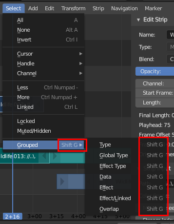
VSE Header Menu: Shift+G shortcuts are not necessary on the entries in the sub-menu. The shortcut is already in the main menu.(The menu is hardcoded and can’t be fixed in the space_sequencer.py file)
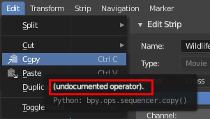
VSE Cope/Paste tooltips are undocumented:
What’s going on is just confusing UI. The eye icon is a per object setting. If that object is in those other collections, it is disabled there too. Use the screen icon for ‘proper’ hiding that works as you would expect. We are discussing various ways to make this less confusing.
No, all objects are different:
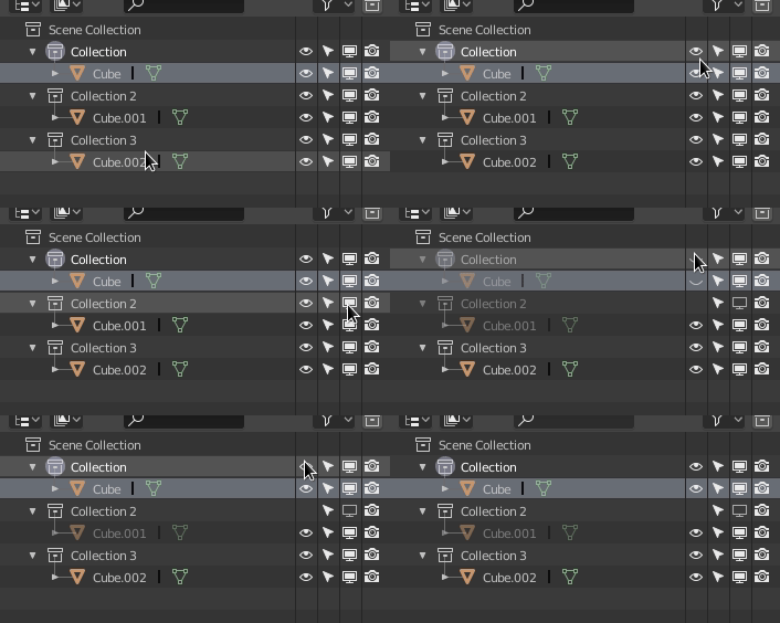
I’m about why Collection 2 changes color, when Collection 1 hides?
If it has some logic behind, I can’t understand it.
Gizmo needs dark backdrop. That’s all.
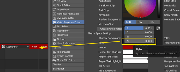
The VSE menu header can’t look consistent with ex. the 3d view because it is not possible to make the header transparent:
If you’re in Rendered mode in a 3d view the Shading drop-down is disabled, but it should still consume mouse events. Right now if you try to click it when it is disabled, it just passes the click through and you will end up doing something like moving the 3d cursor (shown in image below) or you’ll deselect everything.

Tab click-and-drag as now implemented in the Properties window tab column is very nice and works as expected from other programs. You mouse down and can drag up and down to cycle through the tabs. While doing this you can also move the mouse left and right (orthagonal to the axis of the tab row) and while the mouse moves out of the tab row and even the panel/view, the cycling operation continues. This is all great.
In the TImeline you can also click and drag to “scrub” the active frame. However here it physically constrains the mouse pointer to remaining inside the timeline while dragging, resulting in the pointer bouncing back and forth between the top and bottom of the area. This really ought to work the same as the new tab dragging, in that the pointer would not be constrained but could be moved outside the control/panel/view while continuing to scrub. This would result in a much more natural feel as well as expected behavior compared to other software.
Color Ramp Handles: I’ve checked the code, it’s an issue since the handles are drawn slightly outside the active area (color ramp). Simple solution is to resize the color ramp but downside is that it wouldn’t line up!. It’s one of those can live with it issues! Similar problem in reverse with the curve map points too.
Another possibility is to change the cursor when it’s in the active area, this would give a visual hint.

