The default workspaces are awesome for workflow, but we should have a way to reset them after rearranging the windows. I’ve already found myself rearranging my windows not realizing I was still in the UV Editing workspace, which means the next time I want to use the UV Editing workspace it’s all messed up.
Right now the best we have is to save, quit, then reopen without loading the UI, which isn’t terrific.
It would be great to have a right click option to “Reset workspace to preset layout.”
A few paper cuts I found playing with Blender 2.80 today :
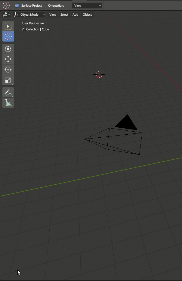
Lamps target When grabbing the lamp target, it doesn’t update unless there is an object behind.
Viewport motion blur When motion blur is on and in camera view, the viewport samples don’t update.
One window available When a render is open in a new window, and then I want to open the User Preferences window, it takes the place of the render window.
Timeline doesn’t refresh When I have some keyframes on an object, if I select another object, it doesn’t refresh unless I click inside the timeline.
Studio lighting There is no way to differentiate if it is camera based or world based.
Browser editor The icons are not aligned with the text.
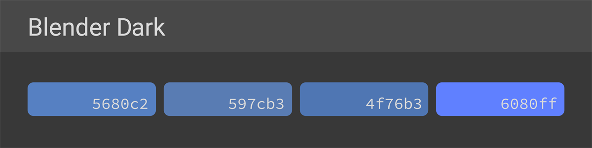
Blender Dark has multiple accent colors that look less different.
By unifying these color codes, it is easier to make bulk changes of accent colors using a text editor.
Oh wow, you’re right. I just tried lining it up in Photoshop and it was fine. I guess I was just seeing a bit of an optical illusion because of my curved monitor.
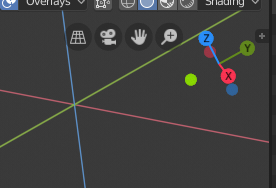
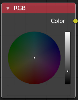
I did notice however that the gizmo and the 3D View axes only line up as long as the 3D View is centered on the world origin. I guess there isn’t a better solution. But it does look a bit strange whenever the 3D view is not centered:
I wonder how it would look to give the gizmo some kind of offset equal to the 3D View’s offset from the world center point.
Whenever your cursor goes to the left or right of the 3D viewport window (or any editor with sidebar panels), it turns into double-headed arrow (that’s basically telling us that something can be moved either ways). It could be very much confusing for a new user, specially if this change of cursor display to double-headed arrow doesn’t happen at the “actual” proximity of the sidebar panel .
While expanding the toolbar, one have to reach to that + (plus) button.
And I find it bit annoying specially working on a complex scene in the 3D viewport when this change of cursor display happen, when I don’t intend to collapse/expand.
I am currently trying to export Stuff to substance painter and realised … similar names will give you similar results with the random Object Colors … and it pretty much makes the thing not usable for me right now, since I need diffrent colors but I also need to use similar names due to convention.
And as long as
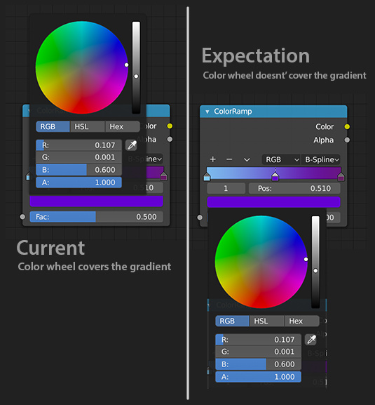
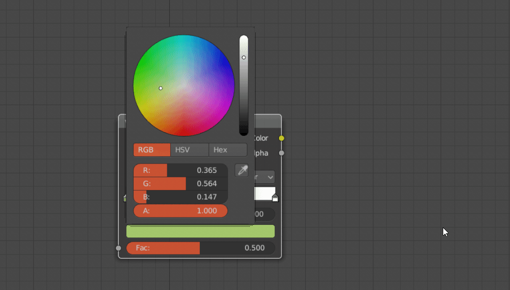
The color selector wheel currently covers the gradient ramp in the material editor. I feel that this is annoying when I try to select a in-between color for the ramp and need to see the other colors while this is done.
I think that it should be kept as it is, don’t you? You clearly understand why this is happing. Offsetting this will only make it harder to understand the view-rotation of the world.
Speaking of Colors … I stumbled across two more papercuts:
if you have a grey similar to the node background color, it kind of hides the “color button” … I managed to accomplish that on accident and it really took me a few seconds to figure out, where it went. This is tricky with elements like the ColorRamp, where the placement of the color button is not tooo obvious.
If you want to sample a color with the little pipette but abort it using escape, your color is actually lost and replacd with black.
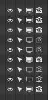
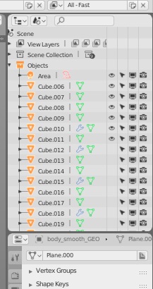
I don’t know if this affects just my cheap monitor, but icons for enabled and disabled visibility in the outliner are too similar in color, and it gets hard to distinguish them when you see that wall of icons.
If it’s just a matter of color in theme, please just make disabled icons darker by default.
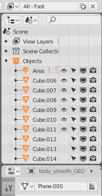
I do not know if it is an optical effect or not, but the horizontal space between these icons of the outliner is really too much, on my monitor that has 1440 x 900 resolution there is a lot of waste of space and practically take half outliner … I think it could better optimize the space between the icons … or at least it should find a solution to compensate for the various resolutions … I understand, having tried blender on a higher resolution monitor, such as 1080p. that this problem is not so obvious.
scale 1 and scale 0.76 on my monitor
edit:
With the display scale option the situation improves a bit, because the icons become smaller … but there is the problem that also climbs the text and becomes difficult to be read …
Perhaps separating the scaling of the icons from the scaling of the texts the situation becomes more convenient.
Although it must be said that the only area for the size of the annoying icons is that of the outiliner … and therefore should be separated more areas of items that can be scaled …
Because the icons of the other areas are more than good.
This is the thought that comes to mind …
Please make the whole white circle clickable for unconstrained free movement. It’s very annoying having to click exactly where the circle outline is to move it freely.