That’s even weirder then. Was this issue ever reported?
Dunno, I thought it was like that by design, and frankly never had any problem with it.
here is what that window looks like, for a second or two, right after double clicking “blender.exe”
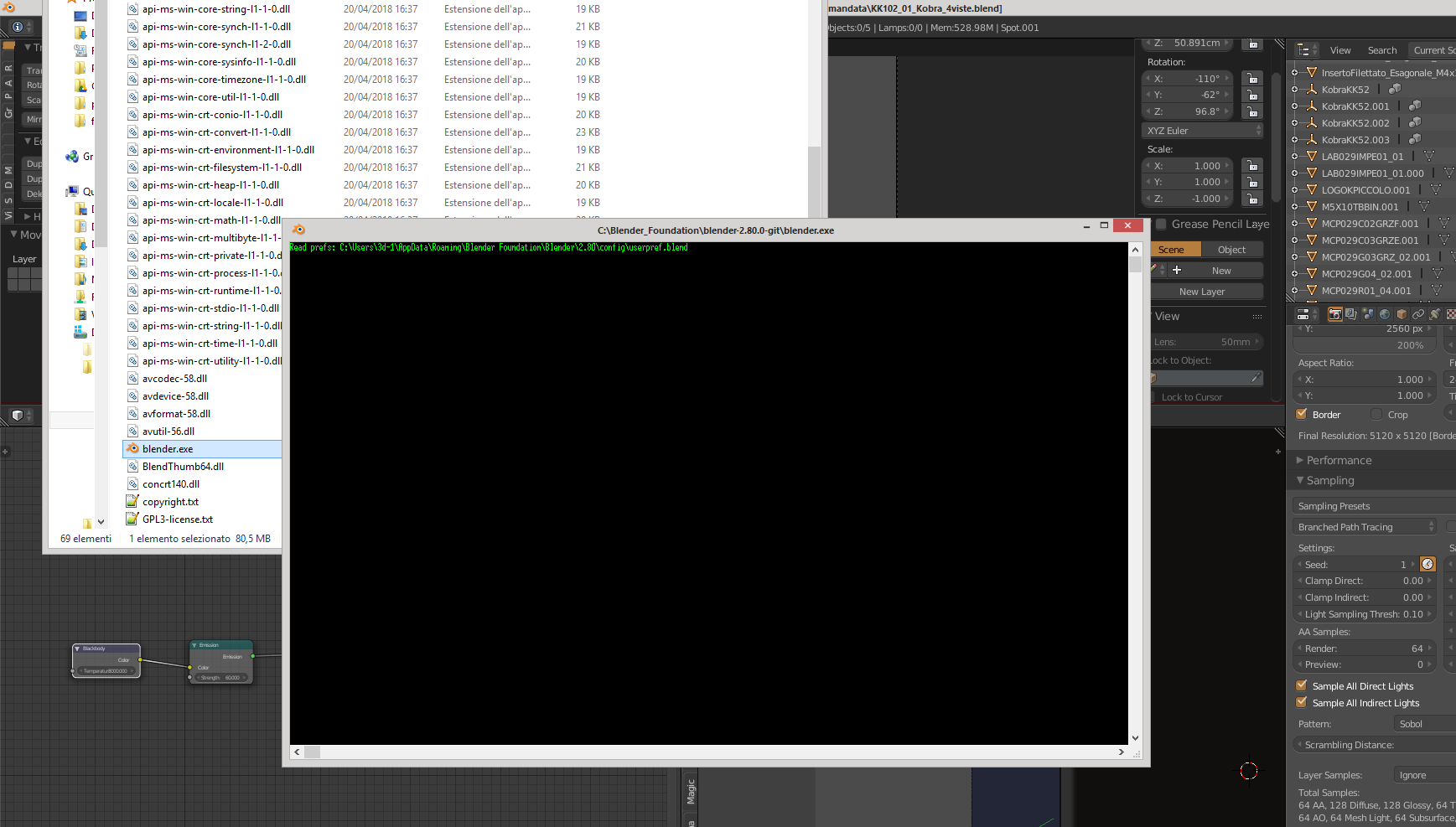
Btw I’m sure that’s a terminal window (cmd.exe), since I customized the text color to green
yup it works but i’m using emulate 3 button mouse option enabled so alt + click is not working (my middle mouse button sucks  )
)
1 Like
This is getting a little off-topic, but do other apps in Windows have a terminal or console that opens when you launch them? And what happens when you close that terminal, does it close Blender then? If so, that’s not good at all.
1 Like
On that topic, here’s a paper cut: that console isn’t relevant for everyday users. Luckily it was hidden by default some time back, but it really shouldn’t show up and scare the average user at any time whatsoever. We should hide that console at all times, and show the actual Blender splash screen during startup before the Blender window opens. That’s what splash screens are for, anyways, even if Blender happens to open marvelously fast!
3 Likes
For me Blender is the only app where it is appening. At the beginning I would say it looks like the old versions of Blender (before 2.5) where you had the console always open, as soon as you started Blender, but now the console hide itself after a few milliseconds.
@billrey yes, only happens with Blender. And if you manage in time to close that window, you just instantly terminate Blender, as it does with Blender Console (I actually often close Blender via console window because it’s faster: it doesn’t write quit.blend in temp folder i guess)
This is why we should get rid of that - if users close the console, they close Blender too. The console is a developer feature, useful for developing addons and debugging, but not an end user thing that artists should ever see.
6 Likes
Yeah it’s the Window -> Toggle System Console feature. But this will also show if you run blender from the command line on windows which is still valid to do.
Here’s some examples of bug tracker noise: https://developer.blender.org/search/query/YGs15.OcwNsL/#R
Thinking back… I think this text/warning may originate from one of the libs blender links in, one of the audio ones. Perhaps a better default will silence it, not sure?
Another thing I just noticed today:
Some of the actions you can do in the “Copy Attributes” menu (Ctrl + C) and the “Make Links” menu (Ctrl + L) do the same thing or at least similar actions.
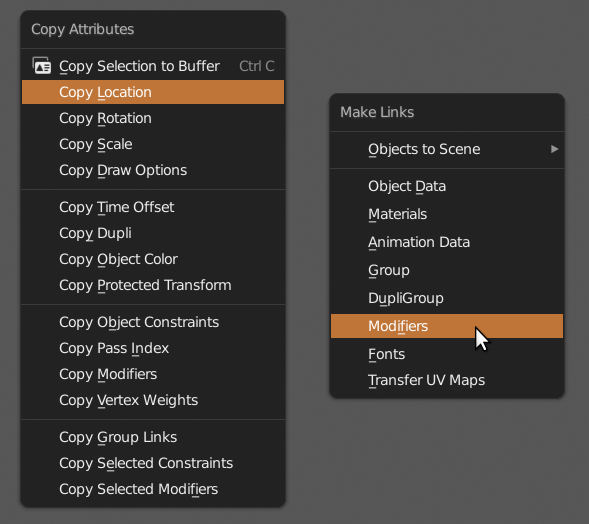
I was under the impression that with the copy menu you can copy and then paste attributes but not transfer them. If I’d known this before I would have used it way more often.
The terminology on these is pretty confusing since you don’t copy or link modifers for example, you “transfer to selected”.
Perhaps updating the menus or at least the terminology in the menus will help to not confuse users … like it did for me for years now.
5 Likes
One more, and I’m not sure if any of these got pointed out before in this thread:
Some buttons are very near to the corners of the editors. Take for example the “new collection” button in the outliner. A good third of the button is inaccessible because when you click and drag on the corner it splits or merged the editor. So it often happens when you want to use the button you accidentally split the window.
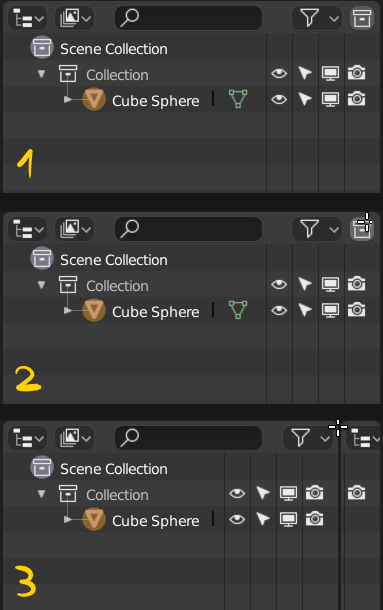
I would suggest to add a bit of distance to the buttons from the corners so this happens less but when the outliner is too thin, the buttons get closer to the corner anyway.
But perhaps that’s ok. So users have to take a minimum width for the editors into account.
2 Likes
5 Likes
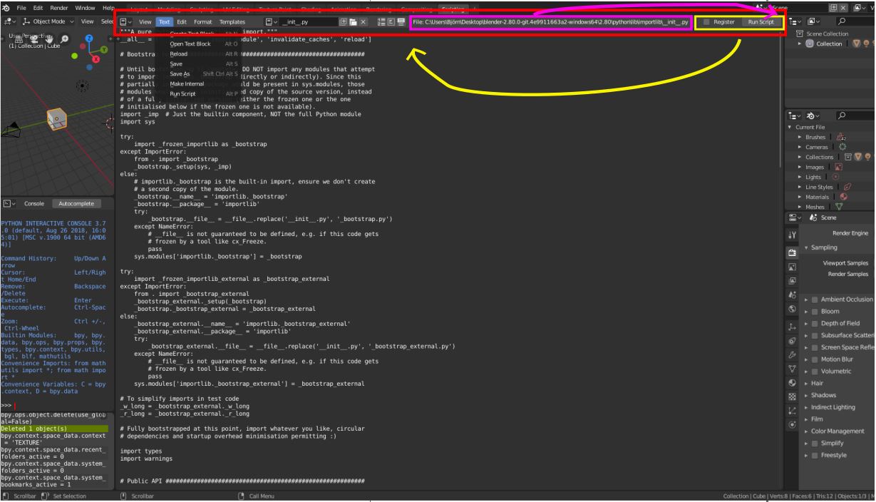
2 Papercuts concerning Scripting in Blenders text editor:
-
When working with external files the path of the file is often so large that I need to scroll a lot between Text/save on the left side and Run Script on the right. Still it make sense to have the path there/somewhere could you simply move to Register and “Run Script”-Button next to the other buttons.
-
While I had the scroll for issue one and made the console, 3D View … smaller, I realized that you can’t maximize the console. Is that on purpose? Would be nice to have sometimes

thx for the great work and the possibility to give suggestions on all these channels. you are great!!
1 Like
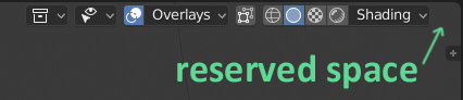
If in 3d viewport you click on the Render Mod button, then to popovers will be added one more button “Pause”. And all icons will move to the left. If you turn on another Mode, then Pause button disappears and all icons are moved to the right again.
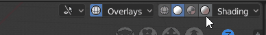
It is not very convenient to switch modes, if the buttons are always moving. This is how to shoot at a moving target.
I suggest to reserve there an empty space for Pause button.
8 Likes
It’s annoying that it moves, but also poor if there’s always a blank space on the far right. We could also just move the pause button to the other side of those viewport controls so they aren’t shifted around.
4 Likes
I think that 5 mm of empty space will not be a problem.
If empty space is a problem, then it can be filled with an inactive greyish Pause button. But I prefer empty space. Move Pause button to the left is not the best solution. Button location next to the modes is justified, I think.
3 Likes
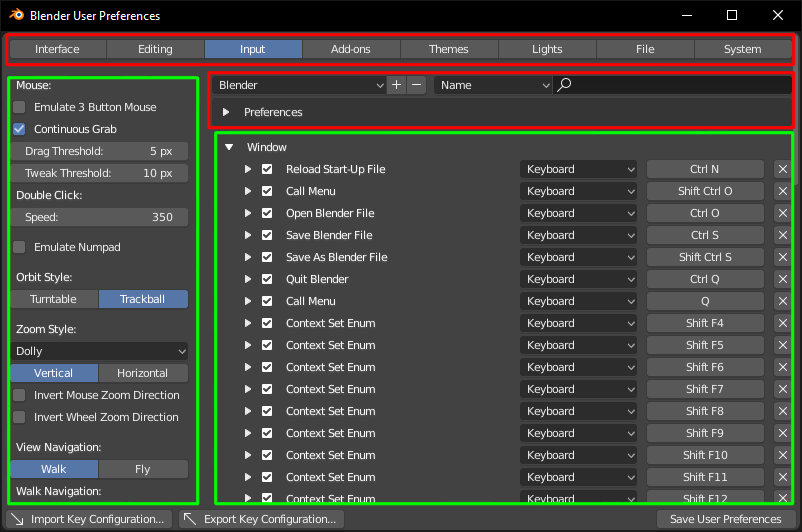
Hi guys.
There is one very annoying thing about user preferences window - everything is scrolling. I think there should be areas that stay “locked” and other that can be scrolled.
This is a fast example (red - locked, green - scrollable):
8 Likes
The header actually have a lot of elements nad text. Could be good to change the overlay and shading words to a simple arrow toexpand the options
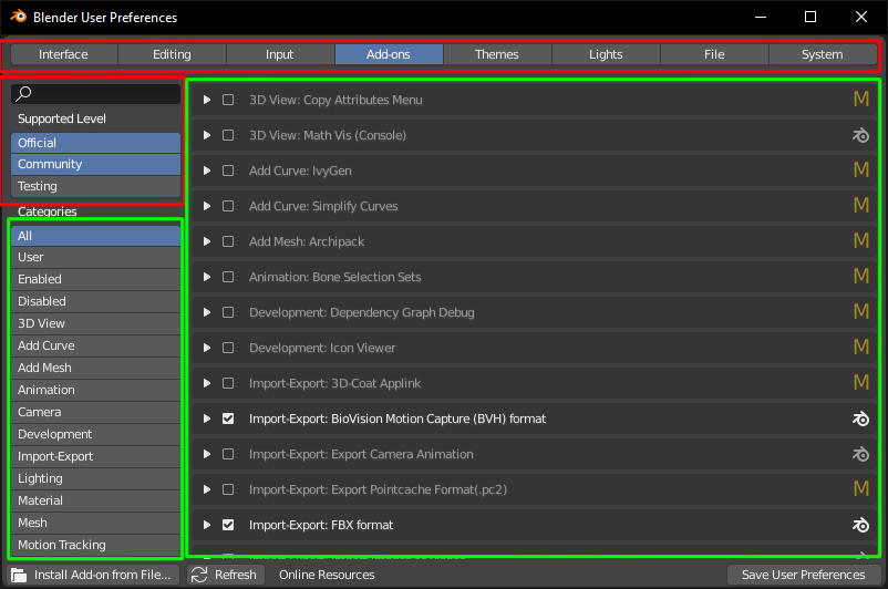
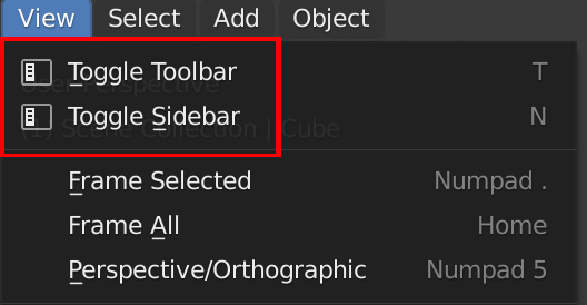
Hi guys, not sure this is a paper cut, but in the user preferences of the latest build there’s an inconsistency over the spelling of toolbar. Here it’s “toolbar” (which as a native English speaker looks more natural to me):
whereas here it’s “tool-bar”:
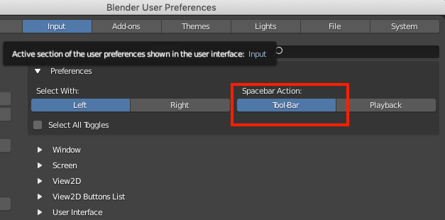
It should be consistent at the very least, and I think it should be “toolbar”.
7 Likes
Maybe ‘Tool-Bar’ is an aussie thing 
1 Like