Could the menu show the classic order RGB instead BGR? also tell that the black and white icons don’t work here very well.
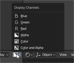
Could the menu show the classic order RGB instead BGR? also tell that the black and white icons don’t work here very well.

The actual toolshelf and n-shelf don’t have easy way to change the side. The old F5 hotkey have changed and we cannot find the option in the area menus
It’s funny that I stare at that screenshot and imagine how I want it to look. Those “RGB” letters could be in the proper colors, but then they’d need a shadow. They could remain white (or black) with a colored background…
But in the end I think it is a case of… we just don’t need an icon for every bloody thing. When there is a list of text items and icons we need to treat the icons as optional. If an icon isn’t obvious we should just leave it blank rather than try to justify something, just anything, being there.
You just brought up another thing very annoying in blender, which is: The order of the items in the menus changes depending of if your header is at the top or bottom.
That’s why you’re seeing it as “BGR”.
This is how mine looks like:
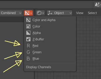
This should be fixed. Never saw an app behaving like that.
If you see my screenshot you can see that the header stay in the top of the area. I thought that in the first moment, and I tried to invert the header, but I obtained the same order. But the menu go down in your case and go up in my case.
I don’t know the reason of the difference.
Top or bottom was for easy understanding,
The difference comes from the direction the menu goes, up or down, depending on the position and room.
Like so:
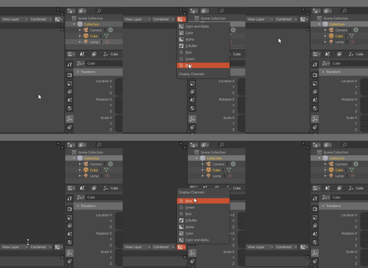
Hope you understand. Non english speaker here.
I can’t load my old keymap (was using a pre-icons 2.8 version)
This would be a bug I guess, but the actual papercut is that the python errors are displayed in the lower status bar and it’s too long to be read properly!
currently we don’t have an option to select display as Wire for multiple objects at same time with alt+click but if we enabled Emulate 3 button mouse it doesn’t work, if we have a Display as Wire toggle in collections it would be great. (Sorry i’m not good at explaining things)
Another nice feature would be to have the same logic for hiding/isolating this filters as the outliner does (currently I think the only one is ctrl to isolate, but there could be more)
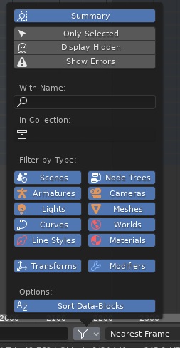
Well, I guess all of these kind of menus could share the ctrl-isolate function, probably.
Not a Blender papercut per se, but ANT landscape has misspelled presets.
![]()
should be volcano
![]()
should be canyon/canyons
It’s kinda annoying but I don’t know how or where to fix this. I would be willing to patch it myself if I knew where that addon’s code is stored.
I’ve found
https://en.blender.org/index.php/Dev:Doc/Process/Addons
but it looks like it’s outdated.
If anybody could point me in the right direction I would be grateful.
When purging orphan data in an unsaved Blender session, it automatically saves “untitled.blend” in the default installation path.
Could we have a prompt/warning to save the blend and choose the location?
While I agree there should be a more informative part of the UI to support this feature, what you’re asking for is already possible: Hold down alt while clicking anything on that menu, and all the selected objects will have that setting applied.
Another huge one. Please remove this bit of “UI” text that continually causes folks to erroneously blame it as the cause of blender crashing on startup  - this is sometimes all they see before things disappear:
AL lib: (EE) UpdateDeviceParams: Failed to set 48000hz, got 44100hz instead
I don’t follow - where is that UI text?
in the startup console window in MS Windows maybe
I did a search for Windows Startup Console - has this got anything to do with Blender? What is that?
He may have been referring to Window->Toggle System Console option in Blender’s menu on Windows.
When you launch Blender in Windows, first thing you see is a terminal window just like the console one that you can open with
It disappears as soon as the main Blender window shows up.
Maybe @rboxman was talking about that?
Yikes, that sounds terrible. Should be fixed or changed.
er… maybe I worded it bad: it’s been like this since forever (at least in windows)