I’m not sure if it’s a good place to post this. If not, please advice on a better place.
I love Blender new 2.8 UI but I find many places that can be improved UI/UX wise. One such area is check boxes for settings to visualize on/off states. It seems outdated and toggles communicate the nature of the action much better in my opinion.
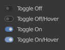
Here is a design change I was thinking about. Toggles design:
There should be a “link to different scene” menu entry in the outliner collection right-click menu.
My use case is the following : I have split my (simple) project into three scenes that have interlinked objects (mostly utilies) as well as some mesh objects, sitting in their own collection so that I can instance them several times over in all three scenes. These objects I want to keep at hand for quick editing and seeing the propagated changes on all instances at once, which is why I’m linking the collection into several scenes in the first place. I hope that was clear enough, it’s kinda convoluted.
So right now the only way to link a collection to another scene is to do it from the “blender file” view, and I think it should be less hidden.
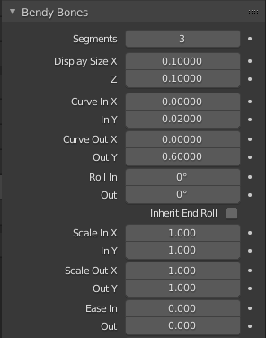
When using Bendy Bones I often like to move both the In and Out of an axis at the same time. Since Blender lets you edit multiple fields at the same time this would be easy to do but it’s laid out with In and Out grouped together and not the Axis grouped together.
Current layout shown
Bendy Bones is my favourite feature in Blender and I’d love to see it get more love. It has lots of quirks in places, like when pasting mirrored keyframes they don’t get mirrored, and the Copy Transforms Constraint doesn’t copy them.
Adding a keymap would be really nice. Maybe when grabbing a bone you could press something like B to tweak them.
I can’t see geometry information in Status Bar on 2.90. I’m not sure if I’ve touched any settings, if that feature is in the middle of some new development, or if it’s a bug.
I really wish that the Search bar in the Keybind editor had an “Exact match” checkbox. For example if I want to find operators that are bound to the G key and only the G key (not Ctrl+G, not Shift+G, etc.). Right now I get a huge mess of results which almost all have some sort of modifier key and are not what I’m looking for.
I like it.
Would be nice if Blender themes could support alternative UI elements like those, and also custom icons too (for the left toolbar and the rest of the UI). But of course, as an option.
Yeah, I was watching Blender today and then like WHOA?! When they began discussing my suggestion . Pablo gave a pretty weak reason why we shouldn’t have toggles, in my opinion.
I must say that I didn’t made enough research into the matter yet but I don’t see a good reason not to use toggles. They make sense to me in most places and I’m planning to prepare a better fleshed out proposal for this.
Currently it was just a first draft but since I see there is interest I’d like to do it properly.
My main concern is about the dimensions of these switches. It might not be possible to swap the current ones with the ones from your mock-up easily (I worry about the width that might break the rest of the Blender UI).
I am not 100% sure but the current checkboxes are 19x21 pixels, aren’t they?
What are the dimensions of your switches?
It’s true. They’re bigger than the checkboxes. I was initially trying to create a toggle constrained by check box dimensions and it wasn’t working. Toggle wasn’t readable so I ignored the square size of the checkbox and scaled up the toggle just to see if it’s working better and pleasing to the eye and matching the rest of Blender UI well. It was basically a prototype/idea to see if there are any other people on the same page as me.
I don’t hate check boxes but I think toggles are better. It would be nice if we could get out of checkbox dimensions constrain. As I said I’m planning to think about it more because there are other areas of interface where toggle is not a great solution and many when I believe it’s much better than a checkbox logically and visually.
I’am also planning to explore other visual solutions. Let’s see what happen.
Hey, indeed i shared you idea, i’m really liking it.
Imo it’s way more clear a switch turned off than a toggle unchecked.
it’s doing a bit of a sh*t show on my twitter, some people are loving it, others find it extremely controversial…
. Pablo gave a pretty weak reason why we shouldn’t have toggles, in my opinion.
hmm… This article has good arguments, especially about (checkboxes’) intermediate states.
It made me think that in some cases checkboxes are needed and having a UI which would feature both checkboxes and switches could look like inconsistent (visually).
UI/UX is important. The changes introduced in Blender 2.80 have been widely pretty well accepted (even if there are still areas that need improvements): a user-friendly interface is pleasing and helps users work more efficiently.
I think that it’s one of the reasons of the growth of number of users.


 . Pablo gave a pretty weak reason why we shouldn’t have toggles, in my opinion.