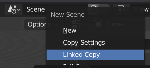
Well all of the tooltips say New. But New in Blender is a crapshoot on new or a copy or whatever. For example, you can’t make a new default material from the view I just posted. It’ll copy, but the tooltip says New. If you hit the x to unlink the material it’ll let you create a new default material but the tooltip is exactly the same as when you copy. The scene ‘new’ button will bring up a menu for new, copy settings, linked copy, or full copy. I think the view layer will copy, again with a tooltip that says New. It’s an absolute mess and you never really know what you’re getting when you click that button. So I guess it’s not really just the icon but the interface has icons that do completely different things all over the place. I guess I can investigate more and document every time that stupid icon shows up.
Another case of “What does the “New” button actually do?”
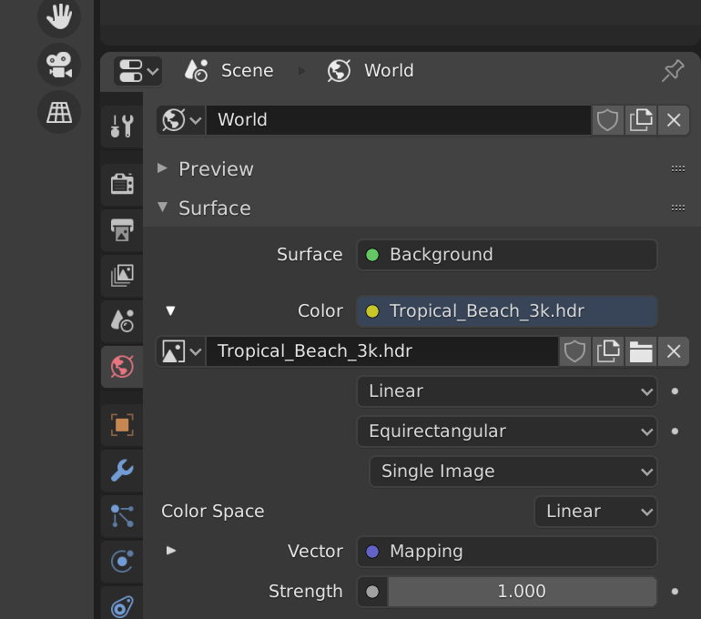
The new button for World will copy the existing World even though the tooltip says new.
The very same button for the texture image creates a new blank texture.
I don’t know how much of this is relevant to UI, but this is just annoing from usability perspective:
In sculpture right mouse button menu appear not centered.
In Weight paint mode we’ve always* had the “X-mirror” feature, that mirrors painted weights, and in addition, knows about .L and .R (etc.) suffixes to vertex group names, and will instead of mirroring a .L group, paint mirrored weights into a .R group, etc.
Recently, the new Symmetry options (X/Y/Z) were added into a bunch of modes (modelling/sculpt/weight paint, etc.)
so now we have the following:
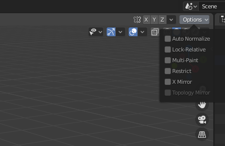
So a user sees immediately the X symmetry option which is not useful for weight painting bone weights and hidden under options there is an X-Mirror option which is
furthermore, the names of the options nor their tooltips indicate how they are different, and the UI is acting with multiple personalities. you can have them both on (in which case, your .L groups and .R groups will be identical).
As a secondary, pre-2.8 paper cut, the left/right suffixes that are special (or indeed that they have to be suffixes and not prefixes) are not shown anywhere in the UI.
The solution isn’t clear to me. Perhaps fixing the names/tooltips to be more clear, or making the X-Mirror more visible in the UI is enough. Or, special strings for left/right, top/down, front/back, should be in prefrences, where they can be found, internationalized, edited, etc. and then we could have further options to make the X/Y/Z options individually ‘smart’ with names… or replace them with enums instead of flags… or?
This is tricky because it feels like a papercut from a user perspective, and it might be easy to code a fix, but it should have some designing work before coding.
- before 2.80
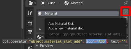
Just so that everyone is on the same page: It appears that the plus sign is called the ‘ADD’ icon.
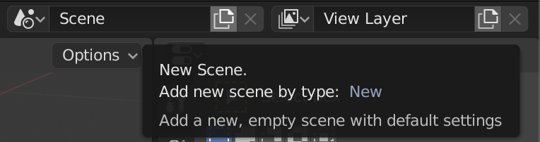
A while ago I committed a change to the view layer add operator that made it behave more like the Scene add op (options to Copy, New with all collections enabled, New with all collections disabled). In that case it was a bit more than a paper cut since adding new viewlayers with everything enabled could seriously lag or crash on larger scenes and there was no alternative.
With other ID’s, like World or Material etc. the “New” button copies most of the time (you pointed out Image as an exception, there are probably others too) but you can always make a brand new one by removing the existing one before pressing new.
Idk if the approach of adding a menu with New, Copy, ... to every instance of the New ID button is a good idea necessarily - it might get in the way too much if that was the behaviour for materials for example, but I’m curious what people’s thoughts are on the matter.
For a start all of the tooltips need to change. If it’s making a copy then it’s a copy, not ‘new’. Personally I think defaulting to copying sucks, especially since in most case you’re not even given the option to create new from a default template of some sort. The interface is so different depending on what component you’re looking at. In modifiers you have a copy button. In Object Data Properties let’s look at UV maps for instance, although I think most of the properties work this way. You get these nice + and - buttons and a list. Of course the default is to copy whatever item you have selected so you can’t even get the default blank UV map until you’ve deleted them all. It’s just all over the place, and on top of that the tooltips are just wrong. In the Blender universe it seems that New really means Copy, most of the time, and Add means new some of the time, and new means new some of the time, and copy can mean so many different things in regards to linking that we never really know what’s going on until we try it a half-dozen or so times. Oh, and then there’s duplicate. Let’s not forget that we’ve got that word thrown in there for good measure just to change things up. I know there are people arguing about the alignment of damn checkboxes meanwhile we’ve got a user interface designed by at least six different competing factions.
Nope, It’s new
Wasn’t this control going to be upgraded to a simpler and cleaner one? It’s by far the worst problem for new users that blender currently has.
Don’t trust a tooltip.
Can we trust the “new” menu that popup if the user click?
LOL. I mentioned Scene in one of my posts above. The button does something different everywhere you find it. The tooltip is wrong again. It should at least be “New…”. How often do you get a menu when you click on something like that in Blender? As I’ve said it’s all over the place. The icon is for copy, the tooltips often say New, and the resulting action is anybody’s guess.
I never use the scenes, they are of no useful to me. But we have that same element in many places in blender and I have always considered that it is by far the worst for beginners, the first thing that had to be solved in 2.80
When a new users must to confrontate to this… is a pain
I think the ID management UI is good visually, and is actually one of the most consistent parts of the design, it’s only the New/Copy operator that’s inconsistent.
There’s a distinct difference though in that some datablocks are “freestanding” (scenes, images) while some are only accessible to users through objects (materials, meshes, actions etc.) There’s no concept of “Fake user” or a reference count for Scenes or Images for example, so I think those should all have popup menus when clicking the “new” button.
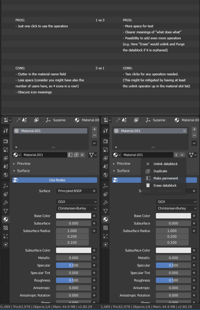
Datablocks like this, on the other hand
![]()
have redundant buttons. If a user wants to copy they should press the user count indicator, and pressing “New” should create a brand new, empty datablock. In the case where there are no other users why would the user want to copy the datablock since the original isn’t going to be used and will be deleted?
If that’s too restrictive then I think every instance of the “New” button in these datablock selectors should be popups.
this reminded me of an old RCS entry:
Bevel tool displays single unreadable sting of text in global statusbar:
so with turned of statusbar values are not acesable during modal
instead of displaying values in 3dview header and keys in statusbar like transform does:
Similarly Inset is displaying hardcoded keys in 3d header:
Knife and Bisect are not using icons:
The issue with the icons is there’s currently no way to indicate the sate of the modal tool. There are no on/off key icons.
For better or for worse you can cycle through enums with those modal maps, so displaying the current entry is important.
I agree the icons fulfill the purpose of the status bar much more effectively.
I don’t know if this has been mentioned already, at least I didn’t find it.
In the compositor the “Map Range” node is under the “Vector” menu, which I don’t think makes much sense, especially when the equivalent node in the shader editor is under the “Converter” menu.
Similarly in the shader nodes Light falloff is in Color submenu, which doesn’t make much sense. Probably Input would be better