lol guys ![]()
Following the file browser party, why the header is at the bottom and hidden by default? ![]()
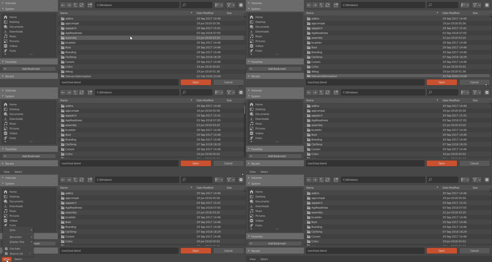
Why not move it to the top and make it visible by default? ![]()
lol guys ![]()
Following the file browser party, why the header is at the bottom and hidden by default? ![]()

Why not move it to the top and make it visible by default? ![]()
Well I suspect because it’s almost empty, takes up space and is superfluous since all the entries from the menus are available in the popovers to the right. I could be wrong, though.
then let’s turn filebrowser into a headerless type of window (with dancing icons)
One thing that annoys me is that I’m so used to press the first letter of the file/folder that I want to open to not scroll or search for it, but sadly this doesn’t work in the file browser.
Agreed, I tried to do just that the other day (out of habit) and obviously it didn’t work. It would be quite nice to have !
and some particle effects when you click something (anything!)
Not sure which OS you are referring to, but as under windows you can type in longer searchphrases in the filelist, I’d be happy there would be an option in the preferences for the openFileDialog/openFileBrowser in blender to start with focus on the search function. That’s not exactly the same behaviour as autoscrolling in the filelist but would be similar enough for me. But for sure making the filelist scroll to the first entry would be as welcome.
Yes, or remove it completely. Currently it’s really just about Select All, None and Invert. Shortcuts for these could be added and the whole menu could be removed
I have 3 wishes (for the filebrowser)
Allow file operations on files and folders via drag and drop in the filebrowser, especially dropping files and folders into other folders.
Remove the current folder drop feature to open them. At least forbid dragging folders from within the filebrowser itself to change the directory. That operation can’t even be cancelled once it has been accidently triggered as ESC does close the dialog instead. In thumbnailview this happens much quicker than in the listview though.

This is especially confusing since I’d rather expect to see the droptargets content if a change happens but not the dragsource content. I see why this is happening but it’s strange anyhow.
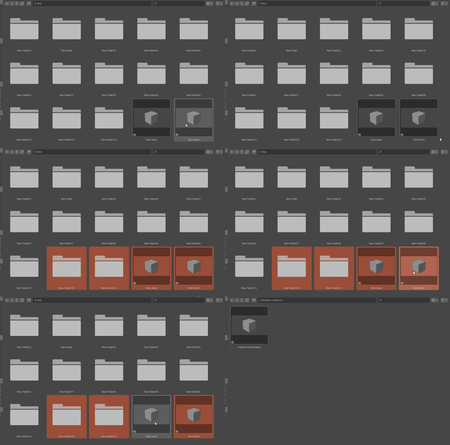
These are all ctrl clicks btw.
I am blindly voting for this!
The knife tool does not display options when being invoked by a hotkey.
The only way to change “occlude geometry” and “only selected” is by going through the menu or the icon in the t-menu.
Ideally the options should be setable before the first cut is being made.
Even better if a cut that’s being edited
In the Preferences I’m always searching for the option to switch off the viewport navigation controls in the… Navigation section. ![]()
For the sake of logic I’d love to see the option being moved to the Navigation section. Thanks!
I think no because it makes more sense as it is now, despite the matching word “Navigation” that can play you tricks 
Look at that, in Navigation panel you have mostly options that control how you navigate in 3d view, while in the interface you find what is shown on screen in various editors, including the navigation widget. Sounds good to me.
I think you mean the knife modal operator ? the options are accessible from the hotkeys, which are shown in the info bar at the bottom of the window. They’re the same used in the tool, as far as I know (z, c, shift and ctrl).
I’m thinking dangerously but : why not show them in two different places ? could be misleading, but easier to find, kind of a “tag” system (one item can correspond to several “categories” or “places”).
that was my first thought but… naaah too dangerous! ![]()
Yes, somewhat - I did find out (or better - was reminded) about them later. The nodal operators don’t save the last setting, do they? Also at least “Only selected” does not seem to be reachable by nodal shortcuts and to me it feels weird that there are operators which are simply only reachably by keyboard only. But if that’s by design then that’s the way it is. I also found out that [Alt] followed by [K] invokes the tool instead of the nodal which I found out by total accident. If the tool would display it somehow like C4D does (“Alt ~ K”) then at least this would have been clearer. Maxon use “~” as a way to communicate a key succession as opposed to a Key combination.
It’s okay now that I know but it certainly wasn’t too intuitive to find out.
ON a totally different note (maybe I will be corrected here as well): Adaptive grid size seems to be not working in 3D view.
In orthographic view the grid adjusts when zooming in and out and also displays the current measurement of the grid. Cool!
In 3D view it doesn’t. If you want to work in perspective with a smaller grid (in centimeters for example) you have to adjust the size in the viewport overlay. Which in turn screws with the display in orthographic again (because it shows an adjusted value).
The grid should scale to
Ok, so this one tripped me up for a bit:
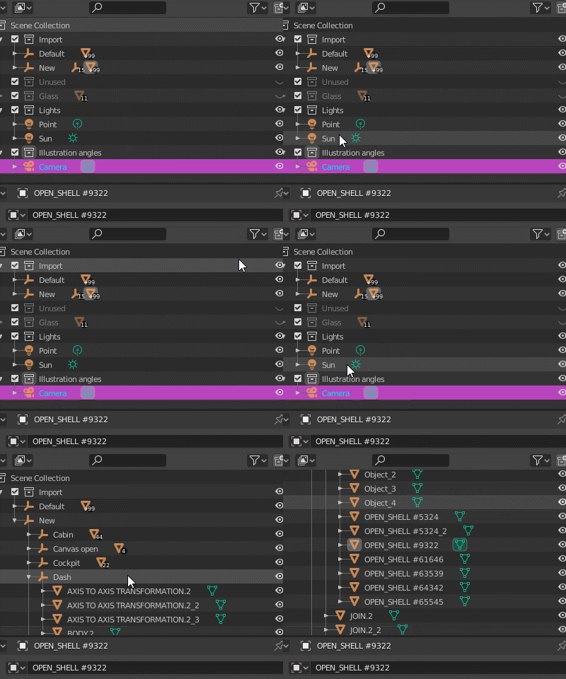
Can you guess what’s wrong here?
Edit mode as activated.
What’s the beef here?
Tried to uncheck “lock object modes” in the edit menu? (terrible place for this setting btw)
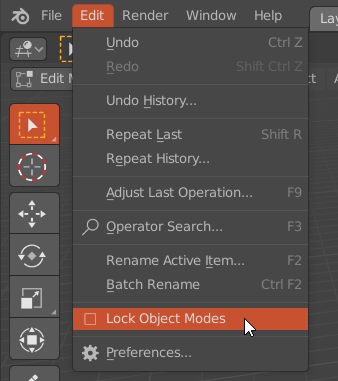
The beef is that I shouldn’t even be able to have that semi-selection-highlight move around when I click in the outliner when I’m in edit mode.
If, instead, say that highlight would have just flashed a little bit and disappeared, it could have highlighted to me that something else was up.
(I didn’t know about that option you showed, btw, so thanks for that.)
Same goes for moving objects, it seems. If you select a hierarchy, and then drag it over to another collection in the outliner, only a single object will be moved.
If you, however, use “move to collection” in the viewport, they all move over.
About those selection highlights, I hate them. ![]()
My man Red wax once requested an alpha option in the themes for that selection highlight so we could be able to turn that off if we wished so, but still no love.
The text in the outliner already changes color when selected, why on earth do I need those giant bar highlights. That’s just too much clutter to me.
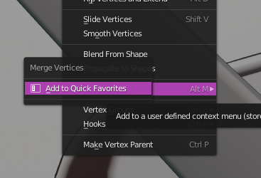
There’s no right-click option to “change shortcut” for menus with submenus:
