One thing that drives me crazy is in the Rotation input field. The values shows the degree symbol °, but when you click in the filed to write down an angle it shows a “d” letter after the value.
Two options I see here, or keep the ° or not show anything, but that “d” letter doesn’t makes any sense (I know it stands for degree).
The render window doesn’t have the progress indicator from the main window, and it’s so large that it hides that indicator by default:

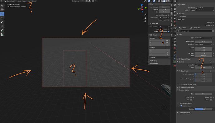
So I’m trying to search the internet as to why a large portion of the viewport is darkened when looking through an active camera, and all I’m finding are various weird shortcuts to press that don’t do anything apparent, and now I also have an extra border that apparently doesn’t go away even if I delete and re-create the camera:
Changing the camera view frame preview thingy shouldn’t be this difficult. ![]()
to solve your immediate issues:
darkening (“passepartout”): with camera selected: properties -> object data (camera icon) -> viewport display -> passepartout (aka the thing in the bottom right corner of your screenshot).
extra border: properties -> output -> dimensions -> untick render region.
A paper cut (I don’t know if it’s been mentioned but I noticed while writing this): apparently you can click and drag the render region border, but it’s super finicky (you have to be very exact and at some zoom levels it simply won’t highlight at all).
I should have been more careful with my wording.
I don’t mind the border. I think it’s important to see it when viewport is linked to the active camera. What I don’t get is why the border has to bee so small, and how to resize it (I’m rendering 4k and I’m not even on a 4k monitor).
I have not been able to click to resize the border yet.
Not 100% sure, but I think that if you chose to import your 2.81 settings when you started 2.82, even “load factory settings” won’t show this new toolbar:
You have to go to do you %appdata% folder and delete userprefs.blend and chose to not import 2.81 settings to see it.
I might be misunderstanding something, but you want the camera frame to be larger in the viewport? I think you can just use scroll wheel to zoom in?
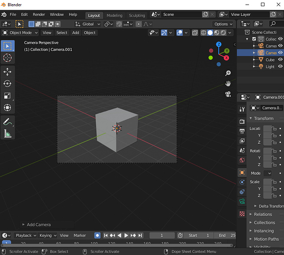
No, I just want an easy way to go from this (default huge border, small actual camera preview):
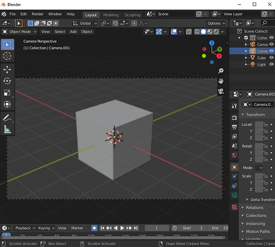
To this (maximized camera preview, but still with a border):
Press HOME. Or Scroll with the mouse wheel.
It should remember this size the next time you switch back to this camera.
Home worked, thank you, but there’s zero discoverability to that shortcut (in fact, it’s the “frame all” button according to the menus).
Scroll wheel does not work, since my camera is locked to the view.
It’s still a paper-cut, imo.
idk if this can be done without RollViewport addon, can you add a roll option in the emulate 3 buton mouse? I think you can roll the view only with the numpad now
You can unlock, zoom, and lock again
That seems simple enough to me, it takes about four seconds
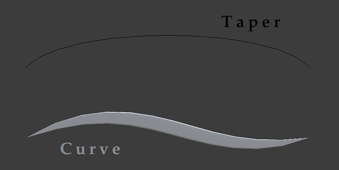
The taper of the curve is used over the object.
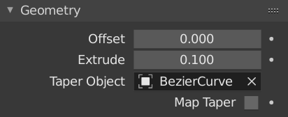
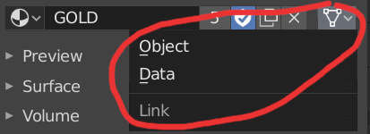
Why not give the opportunity to indicate not only an object, but also data? Those. indicate the curve used (not an object). Something similar (in the opposite direction!) Is used to bind material to an object, or to data.
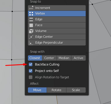
I wonder if the new option “backface culling” supposed to work only on faces like it does right now? Vertex and edge both have this option but it doesn’t work for them. Would be good if it could work for them too, it would mimic “target weld” or “point weld” from any other app. Or if it should’t work then maybe option to turn it on should be deleted from everything except face snapping.
The knife options should be displayed on pressing the hotkey, by default.
Currently if you want to change the way the knife tool works (cut through and only selected) you can’t invoke the tool by hotkey. Otherwise it will use the default/last settings without asking.
Which is not ideal at all since the knife does not let you change these options after the fact.
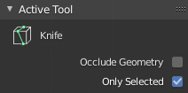
I think the knife needs instand displayed options and additionally a way to invoke it again without needing to press the hotkey again, first.
Modo for example uses a Shift-Click to re-invoke most tools. So shift Klicking would end the cut. Apply it and immeadiatle start a new one with the current settings.
I’d love to see PSD file format support upgraded with controls which layers should be active / visible.
Even more useful would be having the option to auto-import PSD file layers as separate planes via the Import Images As Planes add-on. That would push Blender a lot more in the direction of an After Effects / Apple Motion competitor.
Thanks.
This is 2.82:
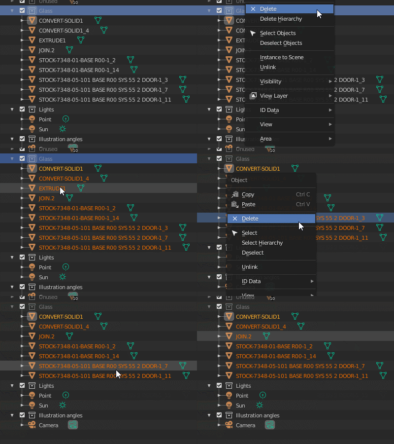
Blender is made for still for single objects per file it seems. All operations throughout the UI defaults to only affect a single object. The outliner is just a bad dream. The selection is just an illusion. ![]()
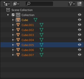
That’s because you only have one object selected in outliner.
One object selected
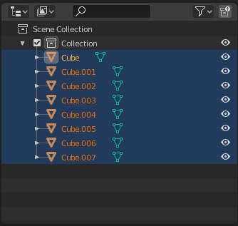
Multiple objects selected
Oh, so you mean right-clicking on a collection and choosing select, like I did in the movie, doesn’t actually select them?
So selection really is just an illusion then!
That selects them in the viewport. The blue is the outliner selection, the orange is the viewport selection.
