There is an option to see parenting in collections view, but it’s unchecked by default I think.

(F2 ) Rename gives you the option to type the name directly…
It would be convenient if " Move to a new Collection" to do the same.

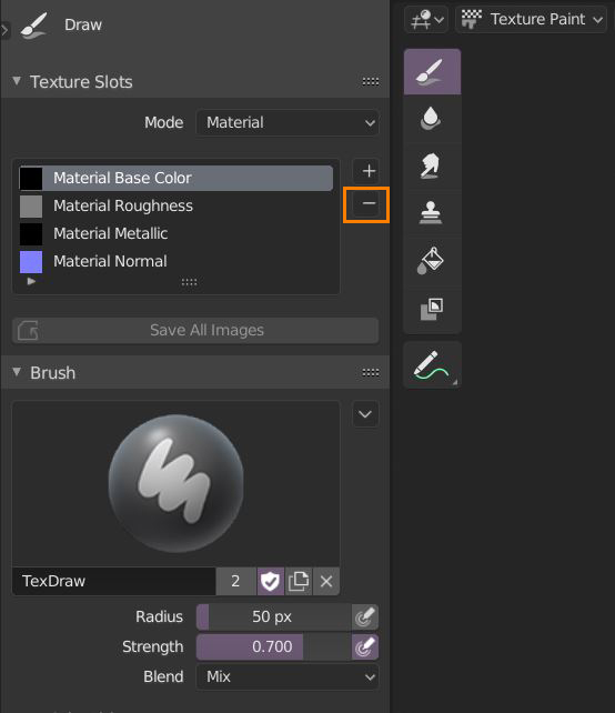
Would be nice to add a Minus button to be able to remove the textures directly from the Texture Slots panel (in Texture Paint mode), so we don’t have to switch to the Shader Editor to remove the Image texture.
I’d imagine I just can’t find the option but when you add new objects the menu is always minized on bottom left. Default should be always opened in my opinion but if not then at least there should be an option to have it always be fully open.
Reference images with invisible parts (png with mask alpha) does not allow selecting through invisible parts when using the object picker.
To create this issue download any .png file from anywhere that has invisible parts. Add that to your blender file as reference image to 0,0,0 and scale it up to say 10x. Lift it up say three meters. Add a bezier curve. Add a cube. Add array modifier to the cube and set it to fit curve and then using the object picker try selecting the bezier curve through invisible parts of the reference image with the object picker. Can’t. Annoying. Not an issue with array modifier but with the object picker.
Also if you have a reference plane and bezier at same level (both at z 0) the reference object will obscure and make the bezier almost impossible to see because of flicker (some z-fighting issue). Obviously invisible reference image should not affect the drawing of the bezier curve for example in any way.
Should I edit all these into one post or post individually?
Anyways in 2.7x it was possible to turn on and off the gizmo’s rotation, move and scale individually. So you could have rotation and scale gizmos both visible at the same time. In 2.81 you have more but worse options. Either turn every on or off or each on individually. Solution is to have option to hold shift so the user can select from the t menu which gizmos s/he wants to use.
The measuring tool needs more work. Currently it is impossible tell whether it is selected or not. Make the selected bit of the measuring object yellow when selected. Now if you add a measuring object it is impossible to tell what is selected because you can have measuring object that is black that is selected along with a yellow normal object that is not selected. This makes it a bad experience deleting useless measuring objects.
Hi folks!
I wondering why there is still no proper display of sharp and seam marks at same time?
If I remember correctly in early versions of 2.80 there was some sort of double edge display for that purpose.
Why don’t use new color (v2) or two colored overlay (v1) for that purpose? It is very annoying to toggle between seam and sharp to understand if everything is correct on mesh.
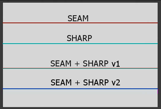
I think dashed lines are better, there was good proposal on RCS: https://blender.community/c/rightclickselect/nPbbbc/
Better to user decide which one on top or like 2.79
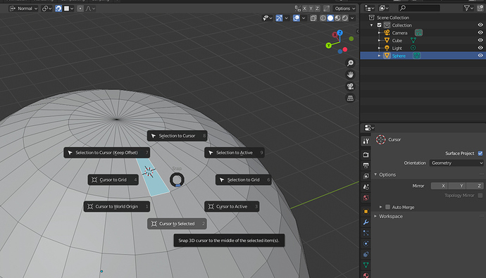
“Cursor to selected” ignored geometry rotations regardless of what the cursor tool OR snap options are set to. ![]()
that just feels like an unnecessary amount of customization, all for what- deciding which one gets obscured by the other? how is that a solution to the problem? What happens if you need to see both bevel and sharp? go back into preferences, rearrange your ‘stack’ and then go look again?
Why not just use a dashed line a mix of both colors or something along those lines?
that’s what I’m getting at, essentially. makes way more sense than hiding information by “stacking it up” and letting the user decide the order things get stacked in.
just my case. i prefer as it was in 2.79
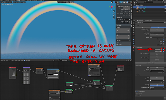
I don’t know if the bug is that Eevee works without this checkbox, or that Cycles doesn’t. The behavior from a user perspective is inconsistent, either way.
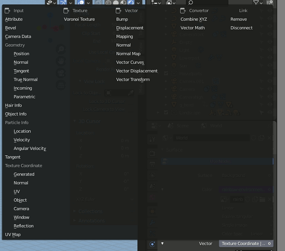
When you add an environment texture as a background image for the first time, the vector is set to “default”. But if you’ve changed this, you can never go back to the “default” value because it doesn’t exist in the menu.
Remove?
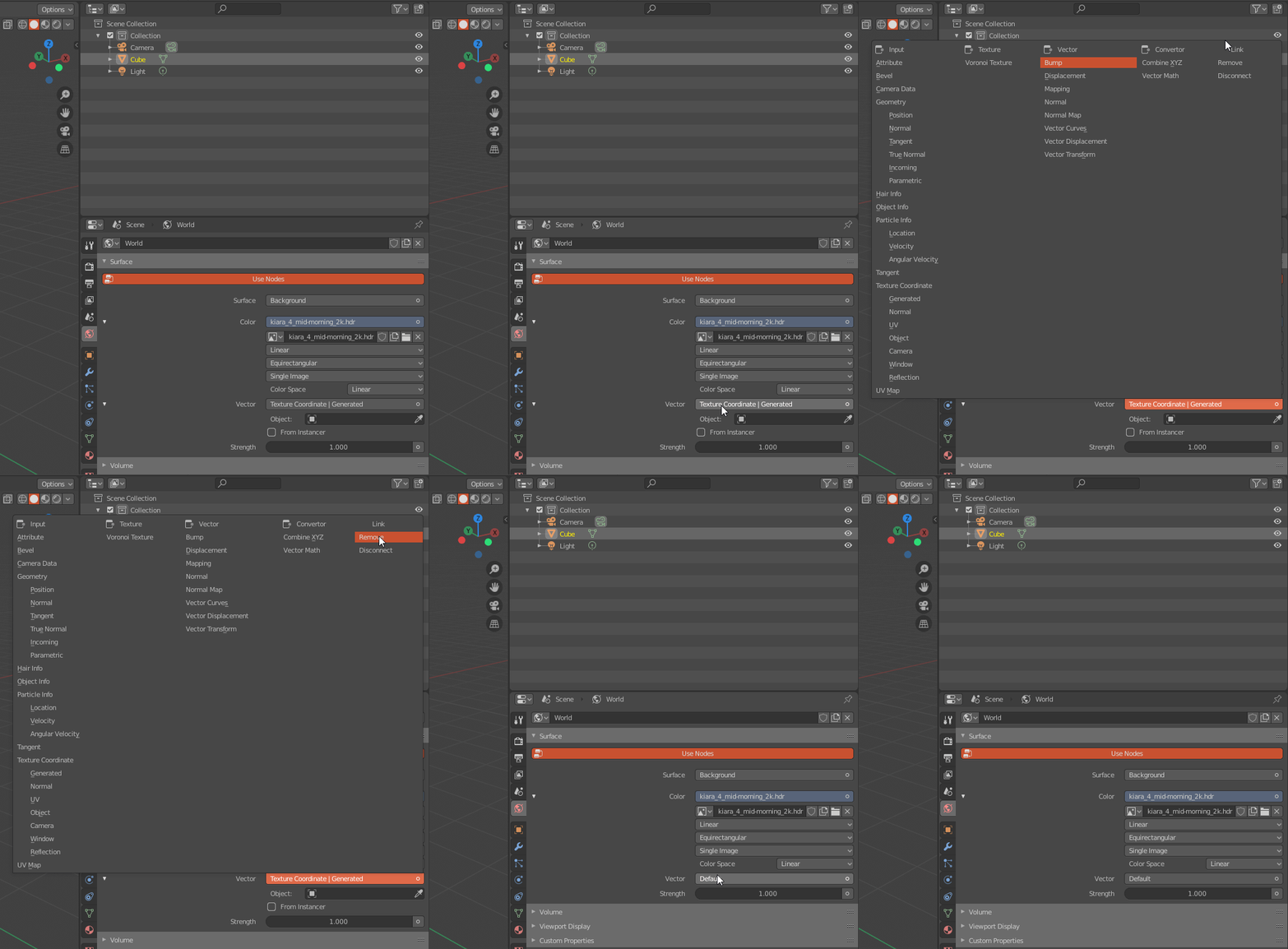
Uh… but the link is to the file, isn’t it? And after you select remove, the linked file is still there?
That’s a really poor choice of words, imo.
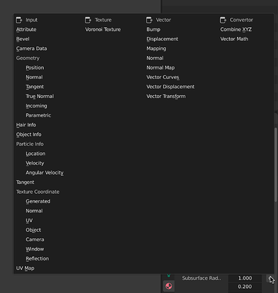
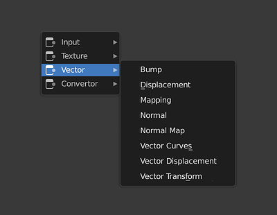
Hide things is always great… but where the “geometry/particle info etc” sub-categories would be? In a sub menu inside the input sub menu? That’s a pain in the butt, man.
