Sometimes the alpha channel is used in a roundabout way to store some data that is not actually used as transparency later on. I.E. I’ve seen some productions using the alpha chanel to store the z depth.
1 Like
Request to Move “Select Boundary” and “Select Loop Inner Region” Back into the Edge Menu (ctrl+E)
Select Boundary and Select Loop Inner Region are edge related operations. They should be in the edge menu and easily accessible with the Ctrl+E shortcut.
Having to navigate through the new Select menu just for these two commands is infuriating and slow. AND unlike verts (ctrl+V), edges (ctrl+E), faces (ctrl+F) and normals (alt+N) the select menu has no pop up menu so you need to navigate through the top bar menu to access those commands. The same applies for Select Edge Loop and Select Edge Ring (although these have standard shortcuts).
I’m fully aware I could add these to my quick menu or create custom keyboard shortcuts but my point is - that as these are edge related operations, they should really be in the edge menu by default (as they were in 2.79 - as much as I hate to be that guy!).
7 Likes
My big paper cut!
Alpha checker colors discrepancy
There should be an option in themes to able to change those colors, because I’ve been using lighter alpha checkers for my entire life, and as an artist having that dark alpha checker pattern that you see on left side, really throws me off in color/value perception of whatever is on top of it
This is tiny fix that would be a great quality of life improvment for our fellow artists

5 Likes
I think I’ve seen this mentioned in one or two places before but on a quick search only found this thread. Basically “light lines” are very long and can’t be directly controlled. In scenes with many lights, these lines can clutter up the view and extend way beyond the area the light affects.
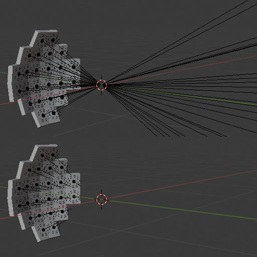
You can control the line length through object z-scale, but I think this is an abuse of object scale as a workaround and may cause other problems (though I can’t readily identify any). It doesn’t feel right!
There should be a control for adjusting the size of these lines. Either:
- for each light under object data tab (like the size for empty objects);
- for all lights under viewport overlays menu; or
- both (per light, with a global multiplier).
(Alternatively, a simple show/hide toggle in overlays menu, although this is less desirable.)
Currently, hiding all overlays helps, but at the cost of hiding other useful elements. Hiding “extra”-type overlays hides both light and line. There is no way to view some light lines and not others without hiding those other lights, which might be undesirable.
I think this counts as a UI papercut, assuming overlays count as UI and assuming that the remedy would be (relatively) straightforward.
Thank you for your consideration ![]()
Edit: You can change it in the UI. Look in the Outliner (Data API mode) → Lights → [Light Name] → Distance. You can hold Alt when changing the value and it will apply to all selected lights:
Looks like this used to be more discoverable back when Blender Internal render was about (was part of the light data panel in properties editor for spot and area lights), though it had an effect on lighting as well as viewport display. Now (post-BI) it has no side-effects and only determines the drawn line length.
Would still be nice to see it back in the properties editor!
15 Likes
Quick text editor paper cut…
The “line number highlight” doesn’t follow the cursor (caret) when selecting multiple lines of text.
Here Blender. ![]() The line number highlight stays where you start the selection…
The line number highlight stays where you start the selection…
Proper. ![]() The line number highlight always follow the cursor (caret)…
The line number highlight always follow the cursor (caret)…
8 Likes
Yes, I noticed that when I was recently playing around in there. I left the behavior the same as I wasn’t sure if there might be some reason why it behaves that way. It seemed weird but purposeful so didn’t want to change it.
Looks like a bug to me.  Most text editors doesn’t work that way.
2 Likes
You can’t find “Clear Sharp” using the search menu, with either “clear” or “sharp” keywords. You can only find it in the Ctrl+E “Edge” menu.
3 Likes
Long standing issue with design of operators or at least initial choice of operators design that is hard to change now.
Check Fix T38819 or T38819 or T30584. Or you can search bug tracker for any of the mark/clear operators to find many reports.
First I want to point out that the transform Gizmos need to have 100% intensity and a different Color highlight when hovering preferably if it’s a theme setting, it’s really hard to see the difference of the states like that. also it’s pointless to have a tooltip for them an i wish they are always visible for easy of use like in any 3d Software.
here is just an example for inspiration on how to improve it.

12 Likes
So the tool-tip naming of the tabs in 2.81 was finally fixed, which is very nice, but apparently a wholistic design approach that considers the end-user hasn’t fully sunk in yet:

How is any new user supposed to find this shortcut? You can’t even search for it.
(Oh, god, have I posted about this before? I got a sense of deja-vu… but I think the tabs being human-readable is new, so at least one developer is reading this thread. Hi, and keep up the great work!) ![]()
![]()
@Harleya I’m kinda curious, any deep reason why Blender’s text cursor doesn’t blink?
This is what I would expect… ![]()
![]()
6 Likes
Yeah, sometimes I keep asking me where is the damn cursor lol. Blinking helps a lot.
In almost all other applications, the UI is done using widgets and resources supplied by the operating system. One of those things is a shared text insertion caret. It is drawn (and animated) by the OS and is shared so that only one is shown at a time in whichever program has keyboard input focus.
But in our case we are drawing everything ourselves in order to be platform agnostic. Including drawing that shape as a little rectangle. We could conceivably have a little background thread blinking that thing, but probably not worth the trouble.
2 Likes
It’s not the end of the world, but would it be possible to get rid of this floating 1px line down the left side of the tabs on the sidebar?
8 Likes
Yea lol, but what bothers me the most there is that, first, the text is inverted, and second, those tabs are kinda harcoded or something, they don’t obey the Tab settings in the themes. That’s really weird.
4 Likes
Please make PREFERENCES window bigger or make it remember last opened size.
Some of us has bigger screens than 800x600px
3 Likes
blender will get confused when you name a UV map the same name as a vertex color name which result the vertex color be completely ignored by blender
5 Likes
Agreed these names should be exclusive, just like objects are. In any case I think custom data layers are bound to be revamped sooner or later to be more flexible.
1 Like
Can someone tell me what good reason there is for this button to disappear once you synch the selections between the UV Editor and 3D viewport?
For a new user to not get unnecessarily confused…
- The synch button should be activated by default
- The island selection should be available even with synched selection
(I think I’ve lost count now on how many “pro” options are enabled by default in the Blender UI and how frustrated and lost this leaves new users. Pros know how to optimize their UI, new users don’t!)
4 Likes