What you mean exactly?
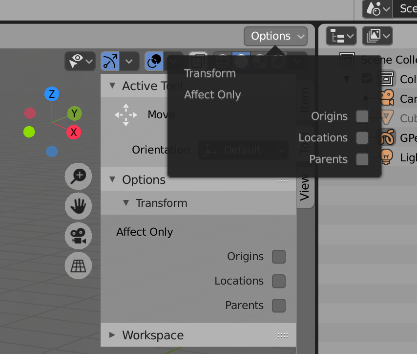
My main concern with this is the usability. Right there on the right it’s hard to reach.
I would prefer to have it in the middle section of the header, kinda like this:
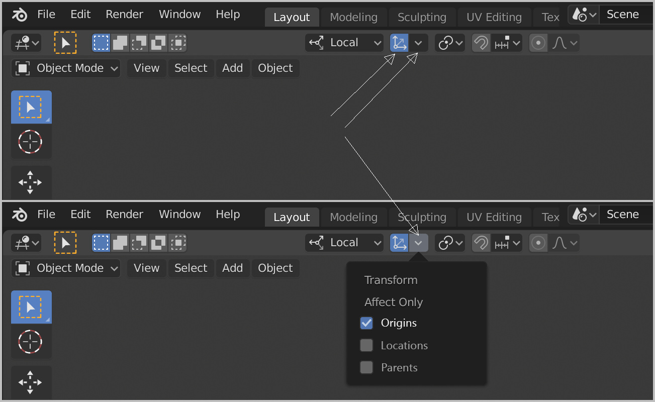
Better place/easier to reach.
With this type of popover+button we would be able to activate more than one option with just one click/hotkey.
We can see at a glance if it’s enabled or not.
Perfect…
@ideasman42 Please.
That mock-up makes sense. We could re-use 2.80 icon for Only Origins (same as 2.79 icon) to facilitate adoption of this popover.
Yeah, hiding it in in sidebar / tool properties tab is not optimal since transforming origins is gonna be fairly common operation. Having it in popover is better for both discoverability and ease of use for primary mouse users.
I feel more logical that you ask for the intervention of @billrey
Mate, I even posted it in the design task itself. Ignored ofc. It even got a hate comment from a random user. lol
I don’t think there’s something else we can do.
I also think the same, even the pivot point popup was a fair place to put it, but that options popup? Bad idea, at first I thought they thought about hidding it and keeping the shorcut because it could have some bug, but I only could find it looking on google.