Yep thats 100% true, there is already a proper working tooltip 
Whos gonna make it happen 
Yep thats 100% true, there is already a proper working tooltip 
Whos gonna make it happen 
Nah. Blender is not a mobile app. Those “icon only” type of UIs has no place in a complex 3D software like Blender.
You’ll gonna regret it once you upgrade to a high res monitor.
what does it has to do with it?
I posted an animated gif taken from the web just to give the idea …
On large screens, it is convenient to increase the scaling of the ui.
The problem is the space occupied horizontally on the painting-sculpting bars… that’s what we’re talking about …
The question of compressing and optimizing space is already taken into account by other professional software.
And in any case the fact remains that on blender there is a problem currently and needs a solution when we work in split views.
Currently there is a waste of space (which is needed) that is frightening.
painter optimizing example… certainly not a mobile app …
The keyword is “customization”, it can’t just be one thing or the other.
But if you could split that screen into two different editors (as you can do in Blender) you’ll probably run into space issues again. On the other hand, if you maximize an editor like that Blender has no issues too.
So this looks like a biased comparison.
if you notice the situation it is undoubtedly better than blender …
and consider that even in painter there are empty spaces that could be optimized (from what is seen in the image ) but painter does not need this, blender instead needs it …
I don’t think that a good comparison is use a screenshoot of a screen so tiny like that. I think that blender target must to be 1080p monitors with a correct layout.
I think that it’s enough space with a little redo of the toolbar and a way for user to change selected objects and have access to some options
What is not normal is that the half of the toolbar is used by color, radius and strengh
The graphic tablets with the screens are not so big … so it should be considered a minimum screen size of using …
On large screens you can always scale the ui or even single “font-icons” if you feel a sort of “empty space to compensate”
Maybe, but if you want to use a limited hardware with a 1280 width screen you cant wait same situation and you will need to work with workspaces to move between 2D and 3D view
no it is not a small screen, but it is the sight of the eyes that does not work as it should … so I expand the font UI …
however the problem also remains in “superbig screens”
Son, pro tip: look at c4d to learn how great UIs are made. 
The UI fighting here sometimes is ridiculous. 99% of the UI issues posted here are problems solved in decades ago in other softwares. That’s hilarious. 
Exactly.
While there’s no customization, the war will never end. ![]()
Easy tweaks after @Alberto suggestions. There’s room for improvements everywhere
blender is a strange creature … it allows you to dream of going to the moon, but sometimes it gets lost in so easyl banalities like these … 
that “TextDraw” space if possible would halve it …
also “mix” and even the brush value sliders would make it a bit shorter
and then I can consider a good compromise
edit:
have you already shortened the value sliders? I made a comparison and it seems so
yes i did. And I intentionally leave texdraw and mix that wide to allow for longer strings (Multiply, overlay…)
will you propose a patch on code review?
(explaining the reasons obviously)
Ehm… sorry, I coded that with Photoshop! I’m pretty sure this patch won’t be accepted 
Change the toolbar is easy by code. So if devs didn’t change it until now is because they don’t want to change it…
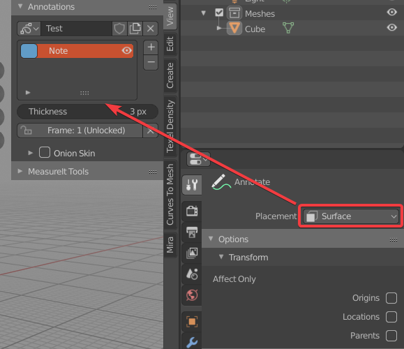
This button is not available from the N panel, so when we use quick annotation holding the “d key”, we have to active the Annotaion active tool and then go to the active tool property panel to finally change the setting…
