well as a windows user I prefer my folders to be orange.
basically your design but swapped the blue and orange.
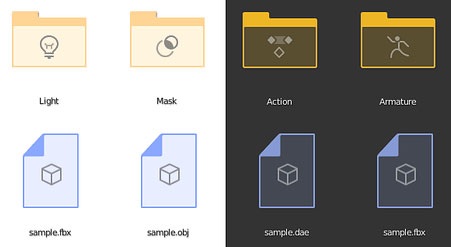
well as a windows user I prefer my folders to be orange.
basically your design but swapped the blue and orange.
Select Material button works right.
Try to select 3 materials in a row, if it will override.
(that is impossible)
Didn’t found a discussions about new file manager.
Two questions
Is there reason to keep filename so far from it’s path? It forces to took back and forth in order to see it’s full location.
Pasting full filename path don’t splits it into path and filename fields anymore.
Workflow case:
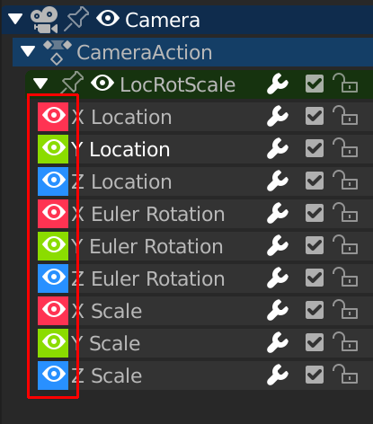
Where those “rgb” colors in the graph editor are coming from? They are too strong , they need to be tweakable in the theme settings.
But its a WIP, hope they can change some aspects, but this is just first testing i guess
PS for me it does split filepath and filename, i justneed to press return/enter. For me its OSX
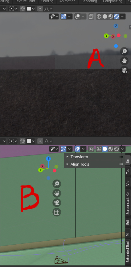
The new vertical alignment for the navigation icons looks nice “A” but in “B” im not sure if its right
Nice? Are you serious?
This was a bad design from the start. Now let’s enjoy the consequences.
This should be reverted asap.
lets be honest in the last two weeks there where really controversial changes that are actually a problem, vertical icons its not a problem, if the properties editor wouldn’t be where it is those vertical icons would be ok.
its different but its not ugly, the thing comes into play when the properties editor its open with the tabs closed, there its no longer that nice.
In my scale of “nop doesn’t work” this rates a lower than other lot of things at the moment.
Why not considering to move the four buttons a few pixels higher, in the header ?

Better yet, somewhere outside the blender window.
You can switch off the Navigation Controls in Prefs if you’re used to keyboard + mouse/pen navigation:
My current top 3 Blender UI desires:
Blender Foundation actually made a public request for that position (see somewhere near end of the page)
I remember seeing Pablo doing exactly that in an old blender today video. But now it is not possible anymore… ??
oh come on! that’s an euhemism. B is terrible
They had a open position for a UI developer, but I think that like an programmer, not designer of UI and UX.
Oh yes. In a file I’ve worked with I think I had the problem that the graph colours were edited in a different UI color theme (very low on contrast/bad readability) which somehow carried over in the file but couldn’t be replaced by switching back to the default color scheme.
I also could never find the coresponding color settings in the teme editor.
Maybe we could have somethhing like an eyedropper tool in the theme editor which scrolls directly to the corresponding color when clicking a panel in the UI?
Re-reading now, I guess you’re right

The outliner improvements in 2.81 are great but one issue I had today was if you drag an object into a collection that has children parented to it they don’t move with it. Even if you right click and select hierarchy it doesn’t seem to work. I feel like children should move with parents by default as that is more likely to be the default case than not.
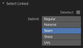
The Select Linked (L) F9 redo panel has a duplicate:
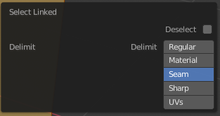
Should be: