+1 about the size and position of the dialog not being saved, it is always compacted and I have to drag it out to see certain directories, would be great if it was saved somehow or at least more expanded by default.
1 Like
Would be bad use a main hotkay like ctrl+click with that… wont be better ask for a gizmo to increase power in any light?
whatever, just as long as they solve, it makes no difference to me
Have you seen the new shadow system? completely new
1 Like
Yes, I like it. I had gone back to Cycles for a while, especially now that OIDN denoising is implemented in 2.81, but the new Eevee shadows made me return to Eevee.
A few more paper cuts for me:
- The new file dialog allows for renaming and creating new folders via the right-click menu:
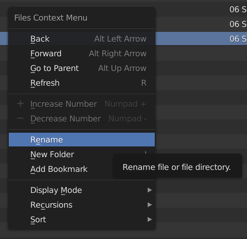
I would love to see the old Delete option back in there as well, to get rid of the need to open an Explorer / Finder window just to delete a file. The old Delete function needed confirmation, which was sufficient to avoid mistakes.
- Also, I keep wondering why the Perspective/Orthographic switch isn’t present in the ` key menu. It’s the only reason you still have to reach for the numpad to press 5 there.
2 Likes
can we change this to the old version? maybe a slightly bigger gap? between the buttons above?
3 Likes
Watched Blender Today #76 yesterday and notcied the changed File broswer. It looks nice but is certainly not done. I find this one counter intuitive, just like many items in the new UI, they are scattered all over the place. This makes finding them and pressing them more time consuming, your also moving all over the place. The back and “history cycle” buttons are not close to the action. Than we the option is really hilarious if you ask me. You add a button options on the bottom left and they show on the top right?!?! What is that for weird location?
But biggiest issue i have and also have with the preferences windows, its to SMALL, why are the new windows always 50% of you screen size. Why is that? First thing i need to do is always scaling so i have more space and see more items. Why does it need to be small?
Also we have all these nice functiuons about auto saving, not havinig to save Preferences with a click like we used to be doing. But why is the pref window size saved?, this really needs to be added in some kind of way. The current size is hardcoded in the back-end i believe. Already tried look into hacking it. Probably i can build Blender myself, but that just weird.
I did notice some settings in the panel header, but i guess its not finished. Changing it to display > large or anything else does not have influence. But i do hope the window size will get a save option as well…
PS i also hope 1 click open comes back, i really like that and even want it on my OS.
I hope this is the right place to say this:
Here is the scenario, I set the view to Front Orhto, by pressing 1 with perspective off, then I rotate the view using my mouse, Blam! view is back in perspective mode - why? and how do I stop this, there is nothing in Preferences that says “Stop Blender switching to Perspective mode all the time when I don’t want it to”
Cheers, Clock.
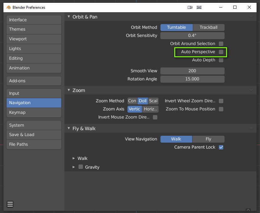
Oh thank you, now I feel a complete fool, I did not find that at all.
1 Like
That’s just because they didn’t name it “Stop Blender switching to Perspective mode all the time when I don’t want it to”  , so don’t worry. Cheers
5 Likes
I find the manner for the “Info Log” really nice. Though reaching should also need a physical button. The window was/is my big friend when checking code and issues. We can find it true the operator search, but its hardcoded so we cant give it a shortcut or call in another way. At least i did not find anything in all the code.
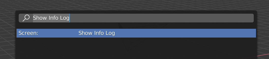
I found it. i can use bpy.ops.screen.info_log_show(‘INVOKE_AREA’) than i can call it. So i added this my own add-on. I think a dedicated button in the bottom right would be nice
EDIT
okay added it myself, quite handy if visible
1 Like
The new Voxel Remesher Label is not aligned to the left.
3 Likes

1 Like
So it’s like the one in the header but not visible! Okay that makes sense.
Looks like developers still prefer white mess instead of distinguishable color icons. I can’t understand why it’s that. The people in Blender institute really need someone who is a UI/UX specialist.
2 Likes
Is there a way that file browser can remember my choices? In the last bot build of 2.81.
It will quite soon, but possibly not until we are done with 2.81. Feature freeze is in a few days. Until then the default initial color could change too. Have any color to share here?