Yeah, tabs solutions are good but it was avoid in blender design except in a few parts.
Yes, that image of mine wasn’t very instructive. I only sent that particular one because I already had it saved and I’m lazy.
At that time it was made I was only making sure that I had the means to recolor those icons if needed (which is what required using full white for solid parts). And in particular I was checking to make sure that the recoloring would have the latitude to work well on very light backgrounds too.
The assumption is that these would be white at the merge and default to white afterward. And then add a theme setting to change the folder color to anything if desired. I don’t have a need to change the document color but there might be times when that might be nice. I included them in that capture because at the time I was making sure the smaller internal icon was visible regardless of color chosen for document color.
Would you prefer that we use a particular color for folders by default? That is still possible, but I worry about how they might look in non-thumbnail views.
Actually it seems a bit jarring to have colored folders. But maybe someone else can choose better colors when that becomes an option.
Earlier iterations of the folder included less contrast but more tonal variation so pulls it off recoloring a bit better I think.
2 Likes
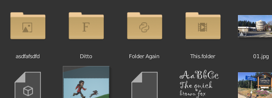
I like solid folders more, but those won’t work with planned overimposed icons…
As long as they are flat and closed I don’t think solid is a problem for that as I can just do the little folder-type icons in dark colors instead if over a brightness threshold.
4 Likes
The tricky part is knowing that white at opacity 1 will become the target color, so variations from that are all done with changes of opacity to let the background darken (or lighten if set to a darker color and on a light background). Obviously they can’t be more than monochrome, like having a white piece of paper inside while the rest is manila, in order for this recoloring to work. We could instead just have one unchangeable full-color folder icon, but that could get tricky on multiple backgrounds and I like the idea of having manila folders on Windows or Blue folders on Mac if we want.
@jendrzych - In case you are considering this, I have a bit more information about how the recoloring works, so might help you designing. You can both add color and subtract color, so can add shadows for example if you like.
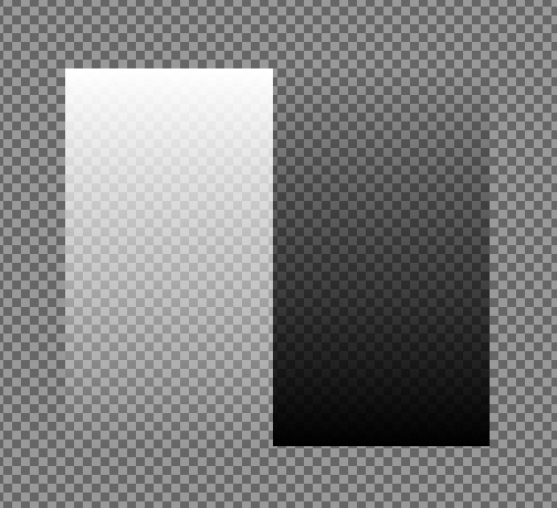
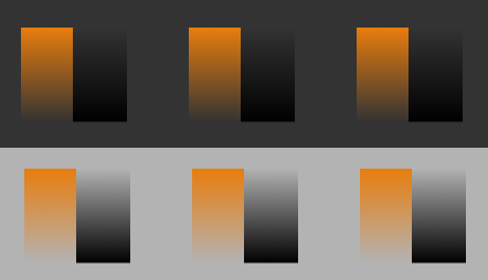
Here I started with a monochrome bitmap. Two gradients from pure white at full opacity to zero opacity, and the same for black:
Then during the writing of them they were altered to use “Blender Orange” and this is the result on default theme background and on a lighter background:
Will make filled version of thumbnail Folder icon then.
2 Likes
to be honest i’m much more interested in coloring the type of objects … especially when we entered the file browser via append …
1 Like
This looks good. About the colour imo it is just a bit too saturated
The Render Display Modes are still a little awkward to work with because the window pops up or goes full screen even when the image editor is open.
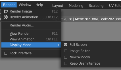
Could we get an option to render in the rendering workspace? That would make much more sense than any of the current options.
2 Likes
I’m stealing this picture (sorry jon) for another papercut: those display modes are radio buttons but visually they are checkboxes. Being the difference: checkboxes = multiple choices ; radio = only one.
In my most honest opinion they should be circles with a dot inside the selected one.
13 Likes
Little papercut, could we stop to select other objects inside edit mode with cttl+click? Before in 2.79 it wasnt a problem because other objects select didn’t interfere with user actions. But now when you change to object mode and to edit mode it is a pain because you edit the selection. Sometimes it happens with your object that you high poly mesh to retopo.
PD: I find the option in the keymap, but still thinking that must be a default behaviour
4 Likes
Problem:
currently it is very inconvenient to set the light power parameter via the context menu (with the enabled metric system)
Solution:
increase the power light parameter exponentially by pressing crtl
3 Likes
Trying to model something. The change of all the controls of the modal tools like bevel to the statusbar is a s***… now I need to low my vision to the bottom desktop only to see what I’m doing and I can’t hide the statusbar that I DONT WANT
How to go back to the old behaviour?
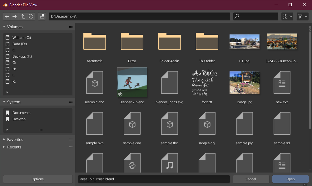
Just tried the new file open / save dialog. I like the minimalism, but there are two annoyances for me:
- When using a pen + tablet for navigation, double-clicking to open a folder is cumbersome. Often the folder icon is only moved a little in stead of opened when double-tapping on the tablet, and/or a file thumbnail inside the folder is grabbed by the pointer and sticks to it until I press Esc, which exits the file dialog.
➔ Suggestion: please add an option to the Preferences to open folders with a single click.
- The size and position of the file dialog doesn’t seem to be stored, forcing you to resize the window every time.
4 Likes
I hadn’t noticed, it’s something very recent …
why these changes?
the parameters of the tools have nothing to do with the helper of the shortcut , otherwise they accumulate everything on that strip and it is a mess of misery
edit:
I believe that it was only with the bevel tool that this change was made …
looks more like a mistake.
1 Like
Maybe, i’m to tired today to check things
1 Like