Other Idea for the Viewport Shading Popup. The main part is the solution for the strange gear integration in the Lighting panel changing it for the “add/remove presets” that could be “Manage Presets” or similar.
Other Idea for the Viewport Shading Popup. The main part is the solution for the strange gear integration in the Lighting panel changing it for the “add/remove presets” that could be “Manage Presets” or similar.
Those are sexy mockups!
What I would like is having a highlight of the area that I’m entering/hovering on. I don’t know if is better to have it as a permanent highlight or just when I enter it (first inner pixels would trigger the highlight).
the highlight itself could be something like this (property):
A subtle lighter border around the whole area.
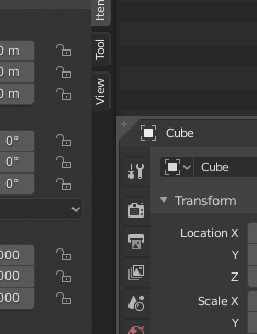
Also, right now the dark borders of the opened sidebars add visual confusion to the vertical properties tabs. The lighter border would help detecting where the area ‘ends’. This border could then also be used to suggest the interactive corners spots.
What do you think?
wont it be confusing and bothering when you only move the mouse near but without that destiny?
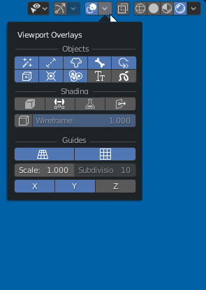
Popovers full of icons only? Nope. 
do you have arguments? or only a negative answer?
Icons improve discoverability of certain features but menu full of icons makes it harder to scan (braking it up with text is unavoidable to improve usability). we already have a problem with the blue accent color, it draws so much attention that it takes a while (I’m clearly exaggerating here but I think you get what I mean) to understand what’s selected and what not.
Icons are not hard to read by itshelf. If they have a good layout that allow user to learn a shape is a better way to work. In the proposal the only that have a bad shape is the mesh edit subpanel.
But if we compare the base popup with the proposal is more easy to read and learn.
It’s true that the worst problem is the blue accent. that make hard to put near a lot of buttons. But I don’t think that devs will go to change this now when they have picked a mobile style. Anyway with a more smooth white the panel is better
Initially I also twisted my nose a little while seeing icons instead of text.
But after a little reasoning about it, and having passed a few hours, to recognize the icons and their functions, I believe that all in all it would not hurt to have icons … it is just the time to recognize the icons … but maybe I would do as it was done for the properties buttons, add the colors to better distinguish their functions …
Just because the mind associates and distinguishes and better finds what we are looking for.
I really like these mockups! By comparison the original seems very disorganized.
I do think it’s a pretty subjective thing what people are going to prefer though. I agree with your argument of the discoverability and intuitiveness of the icon UI, but I could see that being a controversial change.
How did you make the mockups? It would be interesting implementing them as an adding for now!
it’s all photoshop… well affinity photo. But main idea is easy to do in blender. Otherthing is some details like titles.
Condensed and/or icon-only panels are bad for discovery when they’re the default expansion state for a popover, but they can fit into a progressive disclosure model if you present (and then remember) the option to condense the popover after the user has interacted with a more verbose version. This would involve something like a “scrunch button” at the bottom of the popover, and preferably an animated state-change that uses easing to draw attention to where the options move to in the condensed layout.
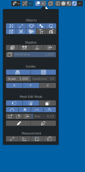
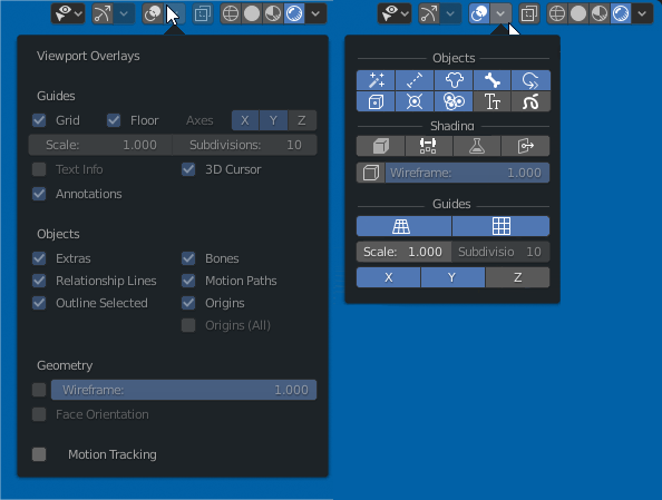
I’ve been accumulating a junk-drawer of settings I like to fiddle with; it doesn’t cover everything in the overlay menus, and a few of the settings are only in there because I wanted to see if adjusting them on the fly was even possible in the first place, but I feel like it strikes a decent balance between density and readability.
As per:
It would be nice if we could adjust the increment value for snapping, could work by using the scroll wheel or the numpad + & - keys to adjust the increment size(by value of 5 or if also holding shift, by value of 1 in case of rotation).
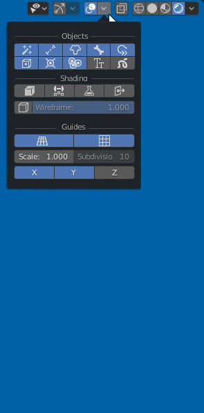
but in your example from 60-70 controls of the popups you only have 9.
it easy to make a control panel when you delete 80% of controls.
And the problem of discover the control is a problem 5 minutes. The next 4 years working you don’t ask that.
The Icons would need descriptive Tooltips for sure. And for good measure I’d also include an option in the System settings to display as Icons and/or Text if desired.
While it is true that it makes the panel much smaller and thus also faster to navigate (less ouse distance), I have to admit that by simply looking at the icons I wasn’t sure what they all were supposed to mean even after having worked with 2.8 for 3 months now.
Otherwise - sure. Icons look good to me. 
(Speaking of descriptive tooltips: I’d really love if most tools had much more descriptive tooltips than mostly just echoing what the name of the tool already says it is. When I read a tooltip I expect to discover more info about it not only the info I already saw  )
)
 nice idea (…)
Ah! No! Colouring only folders will be more than enough. And I’d avoid blue, making them yellowish brown (as if made of real recycled paper/cardboard) - this colour is not used by any of glyphs in GUI, and it was colour of the Folder in Blender 2.5x~2.7x.
I can’t create 42 icons for a quick mockup. The icons are place holder picked of blender icons that I have used only to show the idea
The tooltips were part of the proposal, without this the proposal have few sense.
From my pov the good will be better use only the icons of used files colored. Other formats are hiden by default. And the folder icons is enough to differeciate from blender files that must be orange.
My post was a bit of a non sequitur; sorry about that. The second half doesn’t really relate to the first half, and I didn’t intend to imply that my junk-drawer panel was an improvement over your popover mockups. As I said in my first paragraph, an icon-only layout can work if it’s handled properly.
The top row is a tab group, containing 24 settings, and the full panel has total of 63 settings in it at the moment. They’re a mixture of Viewport Overlay options, Viewport Shading options, Object Display options, and some random things pilfered from other places (theme settings, navigation settings, a custom script for toggling object shading in edit mode, etc).