not being able to organise the n panel into customisable sub folders, same for the favourites menu. Something like google chrome favourites system would be nice.
Uncheck the Load UI toggle when you open your new scene. This will preserve the UI of your Saved Startup file.
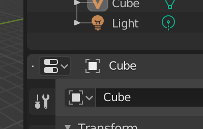
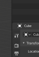
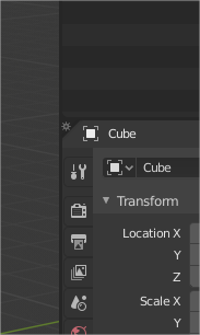
To be clear, I am not referring to opening or creating another .blend file. I am referring to the “Scenes,” within the .blend file itself, of which there can be multiple (upper right hand corner in default UI)
Oh woops. Sorry for misreading your post.
Hello @Harleya sorry to bother you, but since you like to deal with “obscure” UI stuff, here’s something to think about 
Is it possible for the modifiers to have a colored header?
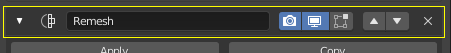
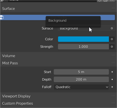
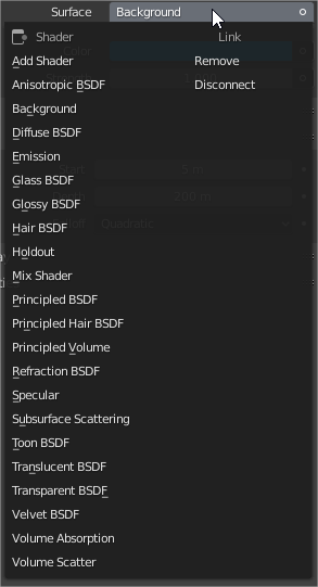
I’m talking about this section right here:
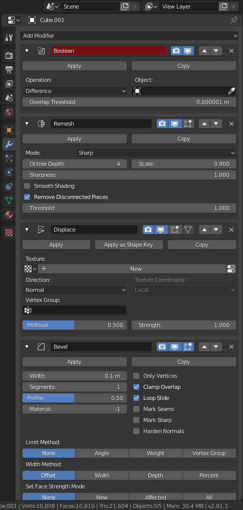
Here’s the thing. when you have a bunch of modifiers open in the modifier stack, it’s really, really difficult to see where a modifier starts/ends.It looks like one giant continuous panel of settings, see:
So I thought that maybe if the modifier “header” had a different color it would help to spot where things are a little better, see:
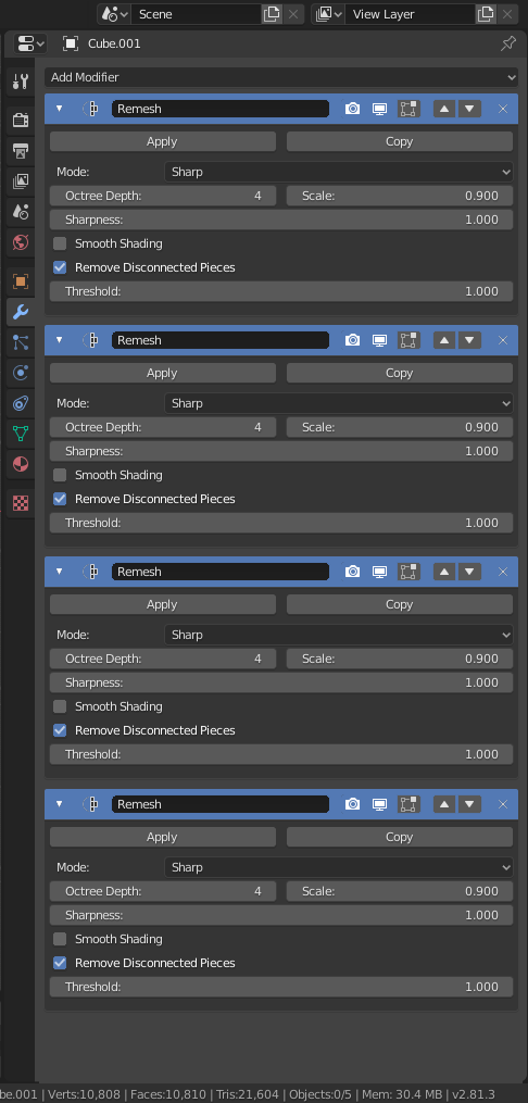
Trash mockup, but you get the idea
So, do you think something like that is doable?
24 Likes
Hi!
I do love finding and experimenting with little obscure UI stuff. But I have been avoiding the Modifier list so far…
Although a lot of the Blender source is (necessarily) complex, that list of modifiers is really hard (for me) to understand. There are so many problems with it that it is hard to even start. I think most people are just hoping that the problem will go away with “everything nodes”.
I agree though that, among its many faults, multiple modifiers just turn into a single mess. Your color suggestion does help. Although I think that might be addressing general concerns seen elsewhere on how we show section headers versus the associated content. It might be enough to just color that more like similar things in Properties, where the title/header does not have the same background color as the open content section below it. But that wouldn’t address how we not only want to see them as distinct things, but also recognize that it is an ordered list. And it still wouldn’t size well.
Yikes, that thing makes my brain hurt. I might have to think of some lipstick to throw on it temporarily if “everything nodes” is going to take too long.
9 Likes
Hm, that would actually help a lot…
Funny, recently I saw someone complaining about that…
1 Like
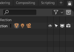
In uv editor the search can not find the unpin tool.
Hi, there are some interface issues in 2.8x I’d like to point out:
- Scroll bars are too tiny and hardly clickable.
- Scroll bars should be at last as wide as in 2.79.
- Make scroll bars visible if there is more content. I don’t want to guess if I have to scroll or not.
- In file browser, in bookmarks when you click in empty space below or above the scroll bar the scroll doesn’t move. You have to drag it to reveal what’s hidden.
- Splitting windows using invisible button is a bad idea. This is hardly clickable either. Can you add something more usable like triangle in 2.7x
3 Likes
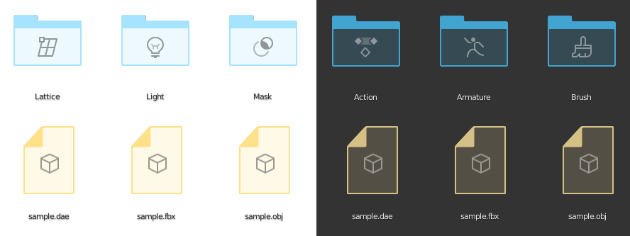
Hi, can you make color distinguished file and folder icons in file browser? Now it’s a big white gathering of icons that is not very readable. Adding different color to folders, .blend and image files files would clear the mess up.
1 Like
@billrey @brecht Little PaperCut…
Could we put the option to remove a link here? in the context menu with RightClick?
Instead of here
Also a shortcut like “Ctrl-Click” that be remove, Alt disconecct or something like thas will help.
5 Likes
That feature is absolutely terrible and undiscovered to new users. But is an awesome time-saver once you know how they work. The only real trick is knowing where to click, and it is NOT right in the corners…
https://docs.blender.org/manual/en/latest/interface/window_system/areas.html#splitting
But instead of using those hidden corner zones you can right-click on any edge between areas and select options from a popup menu instead.
That’s in the plans for after the merge of the new file browser, currently being reviewed. Some experiments with color:
4 Likes
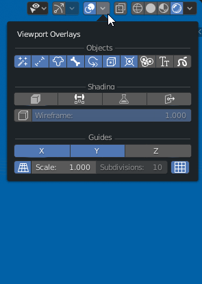
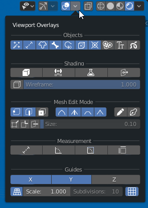
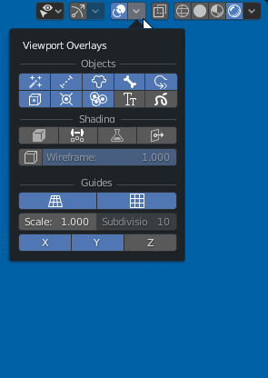
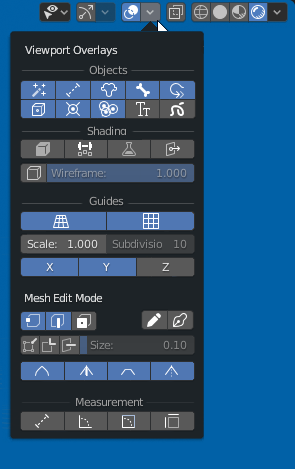
Could be great change the overlays popup layout to a icon layout, more compact and easy to find the things. The info about each button will be added in the tooltip
Normal PopUp
Mesh Edit Mode PopUp
Edit: New design for proposal
13 Likes
how about something like what Campbell did for the fullscreen area? small yet clickable & enabled by default but optional for those who don’t want it and know how to split.
That is certainly a possibility.
My current personal opinion (only) is that the corner action zones can never be truly simple and discover-able for new users, So I like that process to work as quickly and easily as possible for those who do use them, but also make sure there are easy and discoverable alternatives for everyone else.
But I am always interested in new ideas. But it isn’t just a matter of showing “something” at the corners. What exactly do we show? Even when we had the corner triangles, new users had as many problems because those did not indicate well exactly where to click.
One (odd) thought that I want to explore one day. The idea of making one zone move visible and more instructive. So the zone at top-left corner (assuming the header is on top) would be a bit wider and the height of the header. And then place a single dot in the middle of it, like this:
Still obscure, but it might help lead new users toward using them better. As someone new to it, you’d wonder about the dot, move your mouse over there. The cursor changes and a tooltip gives you instructions. That dot is at the best place to start a split or join so it it guides placement.
That new user, having discovered that, can do most splits and joins quite easily. But later might hover in the other corners to discover hidden actions zones there too. Even if smaller they have already learned how to use them. It seems like it might lead down a path of instruction well.
1 Like
I want to remember an old proposal to make all area options semi hide, adding a little icon that allow select editor, divide, fuse,… and hide it by default for new users thanks to a “lock” icon in the upper right corner
and hide it by default for new users thanks to a “lock” icon in the upper right corner
Other concept
3 Likes
That last idea would work okay if, like in my idea, we treat one corner differently from the others. Otherwise that corner would also have a mirror image above it. And the two together would look funny and might still make people think that they should click between them.
And it would also be halving the size of the zone itself, since only the top-left portion of that available space. And of course the best place to click is right in the center of that triangle so the ideal hit area needs more precision than now.
I was about to propose a combination. So treat that one corner specially and have that triangular notch only there. But then realized that we allow users to flip headers to the bottom so screws that idea.