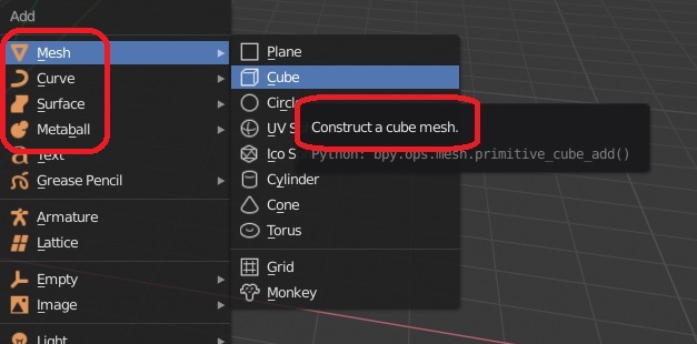
these 3 object types have “construct” in their tooltips while the rest have “add”, is it a technical term? shouldn’t all be the same, like “add a cube mesh, add a bezier curve…etc”, that would be more consistent.
6 Likes
Yes! I use quad view just for the “sync” or box mode. I don’t really need 4 different views… I just need them to sync. Having the option to use box or lock modes independently in the 3D viewport would be real useful IMO, especially if you have multiple views that span across multiple monitors.
1 Like
i have an old UX papercut regarding metaballs:
Ctrl - J for joining two metaball objects into one, to make it more consistent with the rest of blender.
and also P, for separating metaballs inside a metaball object.
those Join and Separation operators are consistent through all the other blender Object classes like meshes and curves. And it also should work with metaballs to make the UX more predictable and consistent.
2 Likes
First of all, with the quad view the work is already done, and above all it is well done, so here is not a question of having or not having the quad view.
The question is that we could make the “quad view” more customizable allowing 3 views, 2 views etc, also in sync if necessary, having a single “top bar for all 3d views”,
Currently each split 3d view reproduces the same tools for each window, and is a bit of a waste of space …
If before the global top bar was inconsistent, now the local top bar is ok, but when you have more 3d windows all the tools designed for each 3d view are superfluous …
It is not a criticism, it is only to highlight what emerges clearly …
Obviously is one of the flaws. The problem was similar with the old design except for the active tool. It was even worse, because there was only one header that didn’t fit all the controls.
With the new interface it show all controls.
But yes, come on, it’s a problem that comes from the modular blender interface. That’s why I comment on the quad view, because it’s a very simple way to solve the problem.
But for people who want to use several views in blender the quad view is quite unknown. Maybe because of its rigidity.
1 Like
And talking about that, Could be a good idea show a button for quad view in the navigation widget.
2 Likes
Of course it would be a good idea. ![]()
See the date? Ain’t gonna happen son.
1 Like
there is a fact about having both "modes of 3d views "
the 3d space view is not the same as the “quad view and a more customizable version, hopefully”.
the “quad view” is a subset of a 3d view … and therefore all the 3d areas splitted makes sense that they are all interconnected …
while I think that 3d space views should be more independent of each other, especially in working edit-mode … painting, sculpt, edit poligons etc …
the current situation:
I highlight this because in other treads “these little things have emerged that should be corrected” …
someone has also asked, that since in blender 2.8 the work spaces have adopted a new form of " fast - switch" from one work mode to another, for example from edit workspaces to paint workspaces, to sculpt or texturing …
“3d window instances navigation” that are in sync with each other, could be useful …
3 Likes
That could be good, but it implies (apparently) big changes in the degsgraph.
And honestly, as a user, I think that the depsgraph has been touched up a lot and that we should start to see faster changes like the ones we are seeing with Pablo Dobarro and the sculpt.
If I was seeing an improvement like this every few days in the series modeling tools much happier.
Well, don’t think that.
We had the same problem with “bevel shader”, a proposal with years that nobody implement. One day I sent a email to bretch about the importance, explaining that a lot, with a worked proposal, clear examples of time wasted,… and he implemented that in two weeks.
So maybe if you can do a clear proposal directly to campbell or bretch, explaining the benefits, and with few work for devs (If we’re lucky)… maybe can be implemented without problems.
Of course actually they are working in the priorities of blender2.8 but I think that It could be a good feature for new interface UX. For example, show the feature like a improvement for blender2.8 interface projects, for new users (quad view is normal in other softwares), and give closed design (for example only three presets, actual, horizontal split, vertical split)
1 Like
I don’t know if this is so. I have the impression that since blender 2.79 worked with mostly only one workspace and only one 3d view at a time … it’s something that was designed to work one mode at a time also for edit modes …
but I think and hope, that to make changes of independence between a 3D views and another is not a big change if not at the level of gui and little else …
1 Like
I don’t know, but I have read a lot of times that it is the problem. For that reason we only can access to that feature with different scenes. Something that it’s new in 2.8
Maybe @billrey or @pablovazquez can give you more info
Here’s the thing, that thread that I linked that seems to be mine was actually created by Campbell. I originally requested that in an existing thread, and he split it in a new thread.
So he’s fully aware of the request and it’s benefits. I don’t think there’s much I can do about it, besides waiting for their animators to ask for it too.
Campbell is moderator in BA? I don’t remember that. Anyway, that decision appear to be more for William or Pablo Vazquez
Anyway, many times things go unnoticed, are forgotten and to remember someone thinks “walk, it’s true, if it was a nonsense to implement”.
I think the biggest problem with your proposal is that the navigation widget, and especially its icons, are not very successful and another icon is already ugly enough. Which we could also propose some improvements.
Oh, you didn’t know that?

ctrl+click on the eye icon in the graph editor to show just one curve doesn’t do the same thing as ctrl+eye in the outliner to show just one object.
3 Likes
No, really… (filling message with 20 characters)
1 Like
A good paper cut that I see in RCS comment…
Could be possible to change the size of middle control point in a spline? to make different from the in and out control points.
Maybe Its more PaperCut
That sounds like someone who’s not familiar enough with Blender’s toolset, to be honest (there’s an ‘automerge’ toggle which does just this).
edit sorry didn’t notice you were quoting yourself. So yeah, there’s a context toggle for that. Enabling it auto-merges vertices which are moved to the same location (using regular transform tools).
1 Like