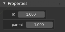
Custom properties have inconsistent width in the sidebar. Looks like the container is flexible based on the number of characters in the name:
3 Likes
Could be great put a option in the context menu of the N-panel to move to other side. Because right now we only can change with a custom hotkey or blender2.79
1 Like
Pie Menu
Hello. I am a new user in Blender, but I have been working in 3D for a long time.
In my Pie Menu is a very good thing and significantly speeds up work without having to memorize a large amount of hot keys on the keyboard. But at the moment I see that the Pie Menu itself has about 12 hotkeys.
- I propose to structure the Pie menu and reduce the number of hot keys.
- It can be combined with the context menu that appears when you click on the right mouse button.
- Make it contextual - the same keys depending on the selected editing mode or window - give a different result.
If necessary, I could develop a document with the possible structuring of PieMenu.
2 Likes
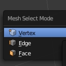
Where did mesh select mode (Ctrl+Tab) in edit mode?
3 Likes
You can also press 1/2/3 for vertex/edge/face…
Don’t think of the active tools as being useful only for things you’ll be repeating one right after another, mix them into your workflow as something you will be using many times during the modelling process. So, as a 3D professional since 1995 and Blender user since 2015, here’s where I see the active tools being useful:
- switch to inset tool > inset
- (e) key to extrude
- drag to inset (since to tool is already active) > (s) to scale
- (e) to extrude
- drag to inset
- drag to inset
- g, z to move along z axis.
So, you’re not constantly having to change tools, mix the keyboard shortcuts with the active tools. Enable one tool that you’re going to use many times in the process and then you’re not having to constantly be hitting keys OR switching tools.

The other reason for the active tools is also simply that it makes using tools more visual. Using modal operators via the toolbar in 2.79 and earlier basically didn’t work, which meant that users had to use hotkeys, making learning curve extremely steep.
Some devices like tables also work better this way, where you may not have a keyboard, and not even a cursor.
If you already know the hotkeys you don’t have to use the toolbar to activate the tools manually.
That said, the active tools do become a lot faster when you can switch then faster as in the Industry Compatible keymap.
So, use them if you don’t know the hotkeys, or you are using specific devices, or if you simply prefer that workflow. There is a reason we did not discard all the hotkeys for the experienced users out there.
1 Like
Markers turn into a big mess when you zoom out or the name is too long:
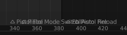
Perhaps they could turn into just arrows without the name when overlapping? Since it’s not readable anyway.
3 Likes
Or it could truncate the name of it starts to overlap. Although that might be more expensive.
2 Likes
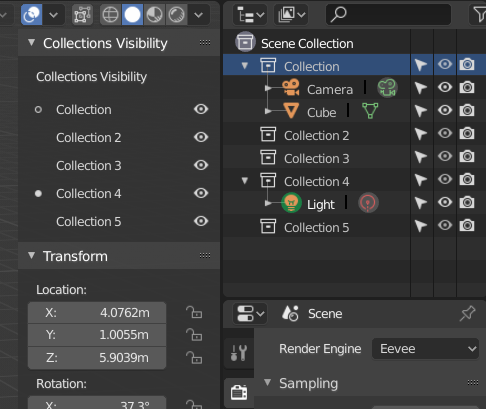
this is more of a suggestion due to the new changes that it’s happening to the collection system, i think having just the hotkey “(M)ove to collection” is limited and not discoverable…we could have “add & remove selected object” in the contextual menu for both in the outliner and collection visibility, that would make it simple and consistent.
1 Like
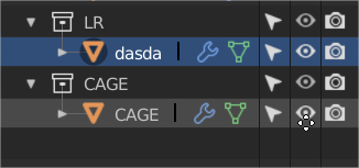
its not possible to alt+click in the eye icon to change colection visivility to “disable to all viewports” when “emulate 3 button mouse” is enable.
Is this a paper cut or is it just a plain bug that i should fill in the tracker??
2 Likes
And now we are here, Ctrl + click isolates colection, but Ctrl+click its not showing all back again
3 Likes
It’s technically not a bug but a known issue of conflict.
It is planned to be addressed before release by making some changes to the Outliner, so there is no need to report it.
4 Likes
Thank you, I thought I was the only one complaining about this. It’s s horrible plunge in usability since 2.79. 
It’s like the interface is booby trapped, and then you have to spend time getting out of the mess.
1 Like
yes and get that black square out of the way they take almos twice as much space as they need to for no reason
1 Like
Some UI Paper Cuts i would like to propose for the Graph Editor and Dope Sheet.
Box Selection should be the default mode when nothing is selected with Shift plus drag to ADD to the Selection and Ctrl to SUBTRACT from the Selected Keys.
Editing Multiple Keys is much needed.
Move common functions to the top bar instead of the N panel
Graph Editor - Current

Proposed

Similar love needed in the Dope Sheet
Dope Sheet - Current

Proposed

ALT + Scroll Wheel to scrub the Timeline was very useful in 2.79 any particular reason it was removed ?
5 Likes
@billrey Not really sure if it’s a bug or paper cut. I noticed some assignments have changed with themes and there is one that bugs me.
That Accept button at top right gets Background from Menu Item > Inner Selected but the “Text” doesn’t actually change color of it’s text. Somehow it also looks weird that a button uses Inner Selected while actually not being clicked atm.
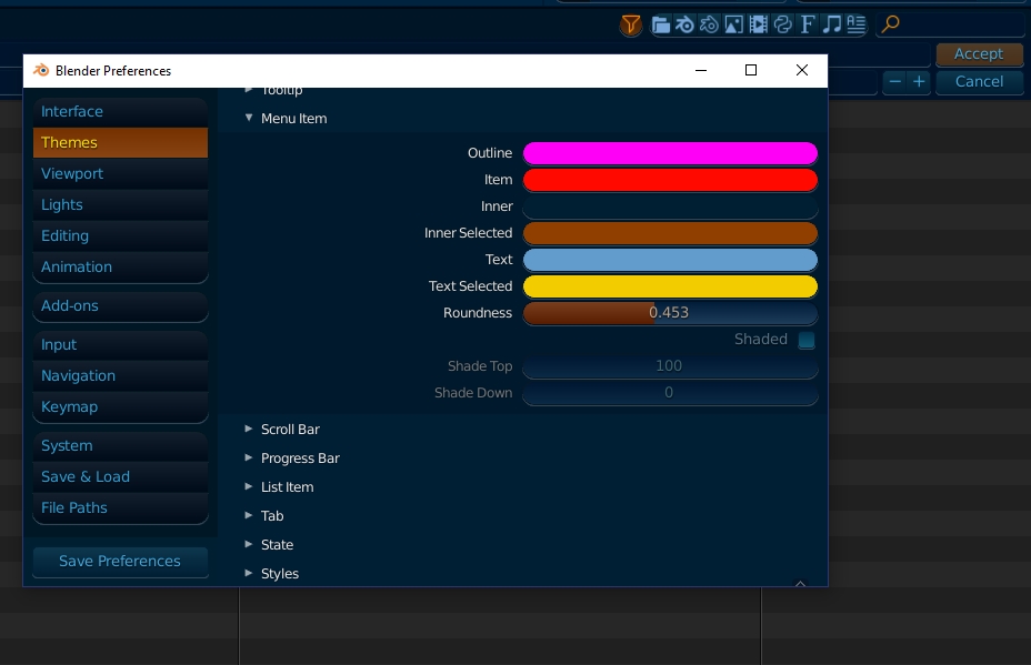
Yes that is intentional. This is the button that gets activated when you hit return, so it is highlighted.