It does do what it says it will do, you’re just assuming a couple of the settings, and not even looking at the tooltips.
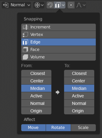
Target is the object you’re moving or rotating, what point will snap to the thing that is under the cursor.
For instance, the ‘Active’ option will snap a group of objects to a vertex/increment/edge/etc, making sure to position them such that the active object’s origin is the thing that gets snapped.
I’m not sure how you could assess that the ‘center’ option would snap to the center of an edge when the option also appears when selecting increments or vertices, and the option is one of a list which includes with ‘median’ and ‘active’, options that would make no sense in the context of what part of an element to snap onto. It uses the same terminology that the pivot point selection does.
Also, a mouseover tells you what it does - “Select which part to snap onto the target. Snap transformation center onto target”
Affect, is whether or not snapping applies to moving, rotating or scaling operations, it’s a separate on/off switch each for G,R,S, or the associated active tools.
Then mock one up.
I think you’ll find it’s very hard, because target can mean either the thing your snapping onto, or the thing being snapped.
It’s plenty logical, it’s just a complex concept to express with singular words on a panel. People should be reading tooltips if they get lost.
Simple renaming “Snapping” to “Snapping To” would make a lot of sense.
The “Target” label is very strange to me. When I read that the Target is “which part to snap onto the target”, it turns out a wonderful recursion, the Target is a target.
For me, the word “target” means goal, destination, that is exactly what the “Snapping” is.
Renaming “Target” to any other, even vague, will eliminate misunderstandings. Like “element”, “point”, “base point”, “reference”, “anchor”.
Also “Align Rotation to Target”, here we mean “Snapping” element not “Target”.
You’ve just added functionality (a ton) to the snapping system.
That’s way outside the scope of a paper cut.
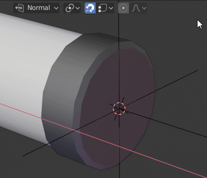
Also how does snapping ‘to’ median/active/origin/center work? Wouldn’t origin be the only option out of those that makes sense, and wouldn’t it belong in the snapping list at the top?
Origin is absolutely not the only one that makes sense, because maybe you want to snap the midpoint of an edge to the center of a face, for example. I guess you should be able to switch the rotation between tangent and normal, though…
Maybe whoever split out the topics before can do so again?
I don’t know, this is such a great workflow enhancer, I’d hate for anyone to miss out on this functionality just because it’s hidden in the preference editor. If it bugs anyone, they can google how to turn it off. Noone will think to google “how can I have my last used action indexed in blender menus.”
In general, I agree with the idea to show users that there is some feature. But only if it’s a neutral feature that will not annoy some part of the users. Just because most users will not search at all, neither how to enable nor how to disable. Most people use the default settings.
So in the case of this particular feature and its default state, there are two possible situation:
You do not know that there is a function that can be useful to you. But it does not cause any inconvenience, you are working normally. (if disable by default)
This feature annoys you and you have a bad user experience. (if enable by default)
Most people use the default settings, but that doesn’t mean that these settings are the most convenient for them, it’s just that people don’t think that it can be changed. Give to most people a positive UX by default, without customization.
Give people the best, fastest, workflow by default. So they can learn once and use forever. Also predispose all of those people who stick to default to have a faster workflow, and not have to configure every hotkey in order to do it, which would result in every workstation having entirely different settings.
This is the same issue that crops up every single time blender’s ux cops flak. It’s YOUR responsibility to learn the damn software, or look at the settings if you can’t adapt.
This crap is why we now have awful defaults for workflow.
Yes I have believed , it should be considered. eg windows file exploler, Ctrl-click exchange selection status. Shift -click decide the end of selection list., then remove item from selection by Ctrl key
About blneder file browser, there seems up-date (by Blender Today), but I could not clear confrim,
the option already added or not,
As for me which modifier key is not matter. (Alt or Shift or Ctrl)
But I prefer to select with simple 2 click begin and End as boundary. (not Border select)
I often hope it when I select bones o in outliner too.
Hello! This is a Blender UI paper cut i am reporting. This is how Blender 2.8 Outliner, in its first startup, looks on a computer screen with a 1366x768 resolution. I am using Windows 8.1. Thanks!
I share with you some interference I’ve noticed while teaching blender.
The first one is it always happening, in 3 university:
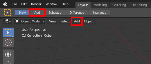
People who have never used blender often choose the wrong add.
I don’t think it’s right to have two buttons, so close in the interface, with the same text doing different operations.
This second one happens less often and has the same pattern as the one before.
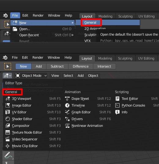
People are trying to click the “general” editor type. Also in this case the same word is on the top right of the screen, on a sub-menu. Even if it seems trivial, it happens and it has to be considered.
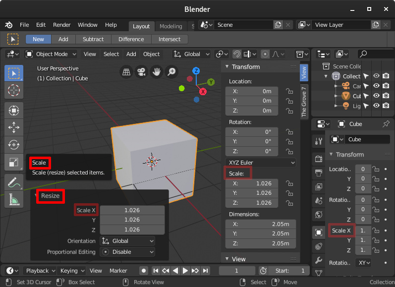
The third image instead underlines a small indecision on the terms: scale and resize.
Looking at the last operator and remembering that the commands are the initial of the transform command (grab, rotate, scale), students look in the “resize” panel and tries to scale with R.
I think this is easy to fix: isn’t to scale a verb too? Can be used instead of the word resize in the last operator panel?
If they are going to cater to people who don’t know much, who can’t be bothered to open the settings or look around the internet for help, efficiency is a lower priority than retention. Most of these people are either unfamiliar with working in 3d space, or used to using software that works like everything else.
Intuitiveness and some adherence to convention (redundant?) goes a long way towards retaining these people rather than them sticking with, or switching to, the competition. I think this is the direction 2.8 has gone in. It got me to have another try with Blender, to stop treating it like that awkward teenager that does everything backwards just because it can. As cool as speedmodelling at 3 gigapolys per second is, I can work fast enough, and I can’t exist in Blenderland alone. Not having to shut my brain off every time I go between Blender and other software is really nice.
User hostile is the term I have always seen when people talk about Blender, and as hard as it is to get that stink off, I am confident that Blender will be treated differently going forward. It starts with a few compromises here and there, and it’s not like it isn’t open source with a huge built-in community of people that want it to stay like it used to be. If 2.8 really is that awful for OG Blendologists I imagine there will be some sort of great schism and multiple devteams rise from the ashes of UX warfare