T is now for Active tools and N for Addons.
Addons can add themselves to anywhere. Addons can define active tools in the toolbar, complete custom Editors, panels in Properties, or panels in the viewport and menu entries anywhere.
There’s no ‘addon area’ - the whole UI can be altered or augmented by the addon.
2 Likes
Yes… I just downloaded new version… I swear a few days ago it wasn’t 
In the immortal words of Supertroopers “I’m an idiot”
yeah i know ,but to have both toolbar and Addons dispalyed at the same time, each has to be in seperate area and not the same one, if you work in full screen mode you’ll use both and not keep clicking tabs to swtich between them IMO.
Hell yes.
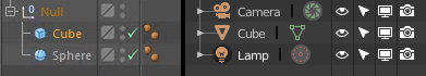
On a similar note - please make the visibility options less obtrusive in the outliner. Now the 4 huge white icons seem way more important than the object data.
Also everything else is dim and subtle in the whole interface beside those.
Here’s a quick comparison of C4d’s object manager and Blender’s outliner
-
The first square is for assigning to layers (that would be collection for us). It has a color so you know instantly which layer your object is in. I know we can assign objects to multiple collections (I have no idea how though) but that’s actually an overcomplicated feature for any basic user so this method is pretty nice.
They too have a layer/collection view: there the objects are under those colored squares and the whole view is super easy on the eye. -
the two other dots actually cover our eye and camera icons in 1/8 of the space as those. And it does more because it acts as an override if the top of the hierarchy is hidden you can still turn those dots to green to still keep them visible. Brilliant imho…
-
the checkmark would be the disabling object toggle. But how is it not redundant for us when we have viewport visibility and also viewport selection toggle right beside it. Just asking as a simple-minded user…
So their benefits:
- less space
- more subtle / not in your face white
- they are not so explicit and yet they do more!
I’m all in for the new icons but I honestly hate these in the outliner.
- they are big, obtrusive and WAAAAAYYYY too explicit and detailed.
When you can solve something (better) with 2 dots and a check mark then you definitely don’t have to draw an elaborate monitor and camera icon for the same task.
As a graphic designer I’m gladly proposing something if someone tells me why we need all the first 3 of them side by side everywhere.
5 Likes
Very good and correct description, thanks.
What you describe is one of the many issues of selection in Blender.
Maybe you can add something to this comment:
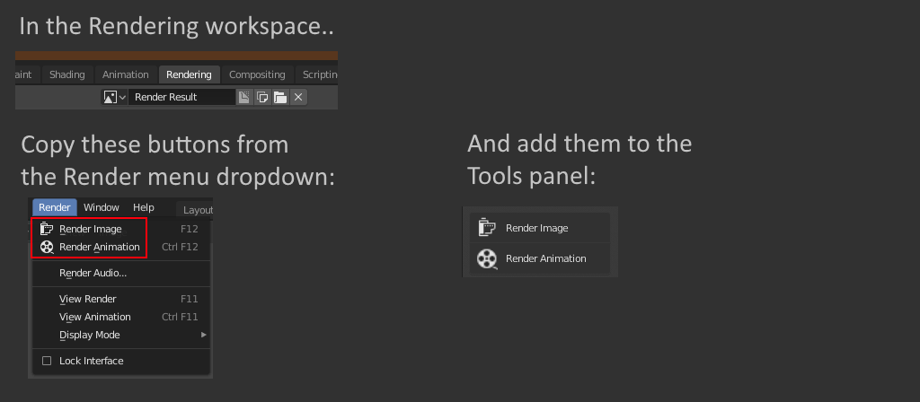
Rendering workspace has no tools in the tool panel! Why not show the render and render animation buttons there?
2 Likes
I think this is a really good idea, its a little tucked away now. I have been making game assets for about 3 yrs and never new where render was or what f12 did lol.
The API for adding regions is missing. Ex. there is no left region(sidebar) in the VSE and it can’t be added through python. So many of the vse add-ons becomes very cluttered in the strip properties panel (ex. take a look at the Blender included KinoRaw). So there are limits to the freedom of the add-on UI integration.
2 Likes
More natural version of the Numpad navigation. (I almost forgot to share this, Blender Today’s video reminded me.)
Double MMB = Show active (numpad .)
Nothing is mapped to double MMB yet, so this feels like it completes the default MMB navigation perfectly. I am a bit overzealous on this but I’m not the only one. A long time ago I set this up for my cowork when he just started, and of course in minutes he zoomed off in the viewport and got lost in infinity. Like any person does when frustrated, he mashes buttons, since his hand was already on navigation MMB, he instant stumbled upon the solution without me saying anything. I’m thinking it just comes so natural because double clicking is always used to “show active” for anything (programs, file, ect.). There are a few paper cuts with the current numpad method (not that we shouldn’t keep both), it requires a keyboard with a numpad, your hand has to leave the mouse or tablet, there is more of a learning curve,… also the current navigation info line (alt=axis snap) looks lovely but lonely by itself. Which brings me to the modify key variations that I personally cannot live without. My personally set up sounds experimental but feels consistent with the zoom and is amazing if you like a minimalist setup.
Shift Double MMB = Local mode (Numpad /).
Ctrl Double MMB = Toggle Maximum area (Ctrl Up Arrow & Down)
Alt Double MMB = tablet mode (mega screen? I am having trouble remembering the original name and mapping)
For most other people I would suggest this setup.
Shift Double MMB = Front View (Numpad 1)
Ctrl Double MMB = Camera View (Numpad 0)
Alt Double MMB = Perspective (Numpad 5)
Thanks for reading. Whether this makes it in or not, I strongly suggest anyone that reads this to give it a try, it up is 100% worth the 5 min it takes to set.
1 Like
Why not having parent relatioship nestings also inside collections?
Latest windows build hash:26b1aa99436
Ctrl+Z in Isolatete mode (Local view) = crush
Because the children may not be in the same collection.
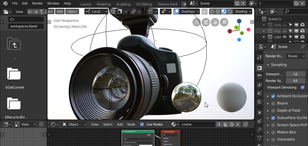
I checked out the latest build yesterday (9abcf56fa88-win64 d27 m11 y2018) and there are improvements to the Move tool and its manipulator.
- I noticed that the area inside and around the circle you can grab has increased which is good:
This is my quick test:
https://webmshare.com/play/d6grV
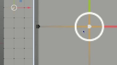
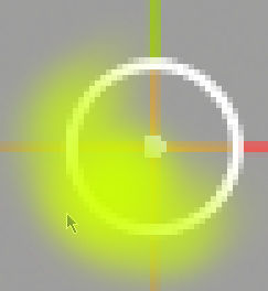
So in order to quickly move a vertex you should position your cursor several pixels away from the vertex in the south-west direction. This is the safest area. Here is a sort of rough map:
I would still prefer the whole area inside the circle to be grab-able but this is better than nothing.
I guess there might be some difficulty with the manipulator axes that are inside the circle as far as coding is concerned. But I don’t know. It would be interesting to hear from the developers whether this request is easy or hard to do.
- We also got “click outside of geometry to deselect” feature. Great, thanks for that.
It is interesting how the developers prevented an accidental movement of the element if your click is not perfectly on point and you drag the cursor a little.
If you accidentaly drag the cursor a few pixels the Move tool will not move the element but the movement is temporarily remembered untill you release the left button. If you don’t release the left button and continue with your dragging you will soon overstep a certain treshold (several px). From now on Blender will interpret it as a move command and will move your element. The complete movement of your cursor from the start (the temporarily stored movement) will be applied first. In the following video you can see how the pixel kind of jumps a certain distance - this is because Blender applied the previous “invisible” movement at once. There’s kind of a lag here by design.
So you have to keep this behavior in mind especially if you want to use the left-click-and-grab-anywhere trick but want to move your elements slowly and deliberately. There will be no feedback at first and then the element will suddenly jump a little. So I think the best strategy is to use the south-west quadrant of the circle for these precise movements because it doesn’t have to take into account any deselection feature and moves your elements with immediate feedback.
This is my observation. Correct me if I am wrong about something or if something is about to change.
Like I said it would be great if the whole circle area was a grab target - less confusion and quicker operation. It is almost there.
1 Like
Sure, but it already happens in 2.7x, when you have objects linked in different scenes, and it’s no problem. It woulb a bit of information more than now
In 2.7x there are no collections.
1 Like
I can see this is a problem in many common cases if you try and select and then move, it’s unpredictable. I added a task for this here:
4 Likes
i think that panel should dissapear and those options should be visible in the topbar when you select the 3D cursor tool
Thanks a lot, Bill!
When I wrote about that south-west quadrant I forgot that I am working only in orthographic view. You cannot take advantage of that in the perspective view since there is the third axis and various camera and manipulator orientations. So it is great to hear that it is on the task list.